Datama Compare Concepts
Learn the key concepts behind Datama to better understand how the solution works
1. What problems we solve
The Compare extension helps you identify the exact causes behind performance variations.
Whether you’re comparing different time periods or regions, this tool provides clear insights into what’s driving changes.
Results are presented through an intuitive waterfall chart visualization.
2. Required data types
The analysis requires two main types of business data:
- Business Metrics (revenue, sales volume, marketing campaign reach, etc.)
- Associated Dimensions (customer segments, product types, countries, vendors, demographics, time periods, etc.)
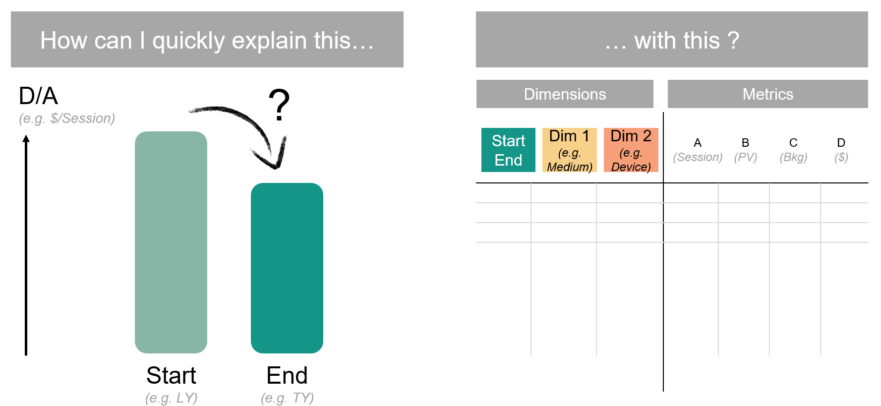
Specifically, you’ll need to configure four key elements:
- Main KPI: The primary metric you want to analyze (e.g., Revenue, Leads, Margin)
- Comparison Dimensions: The elements you want to compare your KPI across (e.g., Month-over-Month, Country-to-Country)
- By default, Datama selects the first two elements or splits a date range in two
- Steps: The funnel stages leading to your main KPI (e.g., eCommerce or Finance funnel) See dataset examples
- For help defining your steps (metric equations), read our dedicated article
- Explanation Dimensions: Additional dimensions that help explain performance variations, each with an interest score indicating its importance
3. Metric relations
A metric relation describes how different metrics in your data source combine to compute your target KPI.
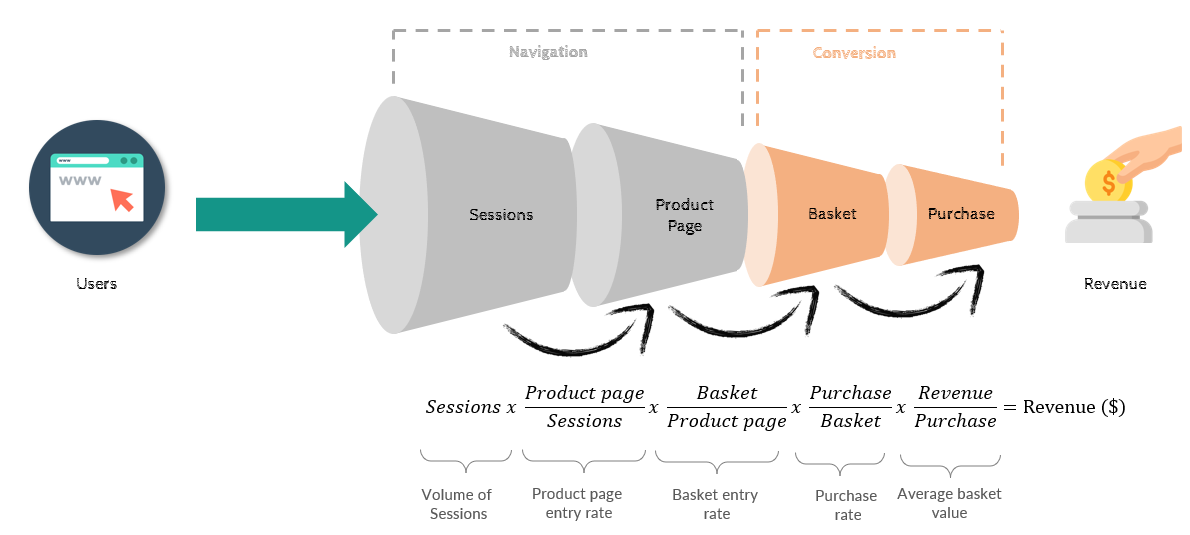
Simple Example
Consider a retail scenario where we want to understand Revenue. The main KPI is Revenue.
We can break Revenue down as: Revenue = Volume * Revenue/Volume. This creates two meaningful performance indicators (PIs):
- Volume (number of products sold)
- Revenue/Volume (unit price)
This breakdown helps separate effects managed by different teams (sales volume vs. pricing strategy).
Advanced applications
Each PI becomes a “Step” in your waterfall chart. While there’s no technical limit to the number of steps, we recommend keeping it under 10 for clarity.
A step represents a ratio between two metrics. For simple metrics like Volume, the denominator is 1.
For example, with 5 metrics (Metric1, Metric2, …, Metric5), your KPI equation might look like:
Don’t worry about complexity - Datama Compare lets you zoom into specific parts or aggregate components using the “Skip steps” feature.
4. How to interpret waterfall charts in Datama
The waterfall chart is the core visualization tool in the extension.
Datama shows how each data variation affects your Key Performance Indicators (KPIs):
Each step shows a performance ratio’s variance and its contribution to overall change.
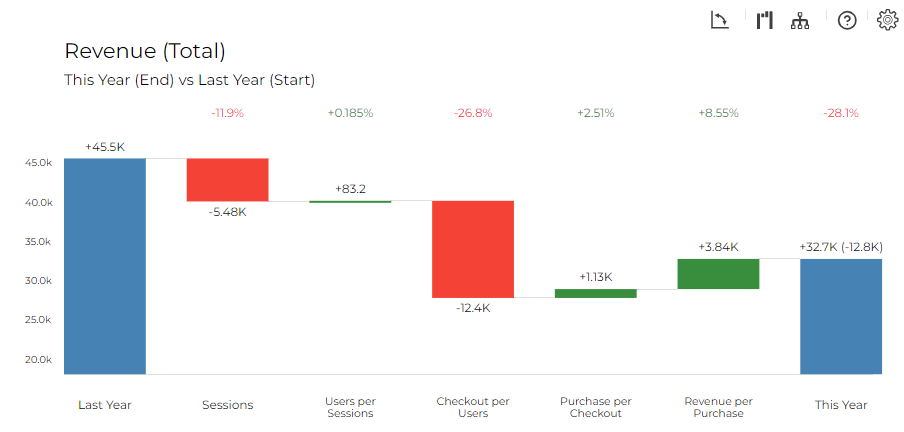
Example interpretation:
- The chart explains a -28.1% Revenue drop from last year (45,549€) to this year (32,747€)
- Key factors include -11.7% in Users and -26.7% in Checkout/Session rates
- The Checkout/Sessions decrease of -26.7% impacts Revenue by 12,298€
To dive deeper(demonstration with another use cas but the logic is the same):
- Click any step to see which dimension best explains its variations (In this case, we can see that Canada contributes most nagatively for the performance of transactions in this year compared to last year.)

By default, the waterfall will group segments with smaller effects into the ‘Remaining’ category to simplify the view. However, you can easily examine these categories more closely by simply clicking to expand any bars labeled ‘Remaining’, like below

- Use “Split by” (right-click) to view interest scores of other dimensions and change the display

- Each variation breaks down into mix and performance effects (explained in the next section)
Please share your thoughts with us. Whether you have questions about the solution, your analysis, or the documentation, we’re always happy to help and hear your perspective.