Concept of Datama Compare
Here is what you should know about Datama to understand what is behind the solution
Here is what you get on this page:
- What we are trying to answer
- What types of data you will need
- How to define your Metrics Relation
- How to read a waterfall chart
1. What we are trying to answer?
The Compare extension offers insightful analysis to pinpoint the exact causes behind performance variations.
Whether you’re comparing two different timeframes or two countries, this tool helps shed light on the reasons.
The results would be via a smart waterfall chart.
2. What types of data you will need?
This analysis is possible thanks to 2 main types of data collected from your business:
- Business Metrics data (revenue, sales volume, number of users impacted by a marketing campaign, etc.)
- and the dimensions associated with these volumes (customer segment, type of product sold, country, vendors, age, gender, device, year, models, …)
To go more in detail, you will need to consider these dimensions and metrics in four differents elements:
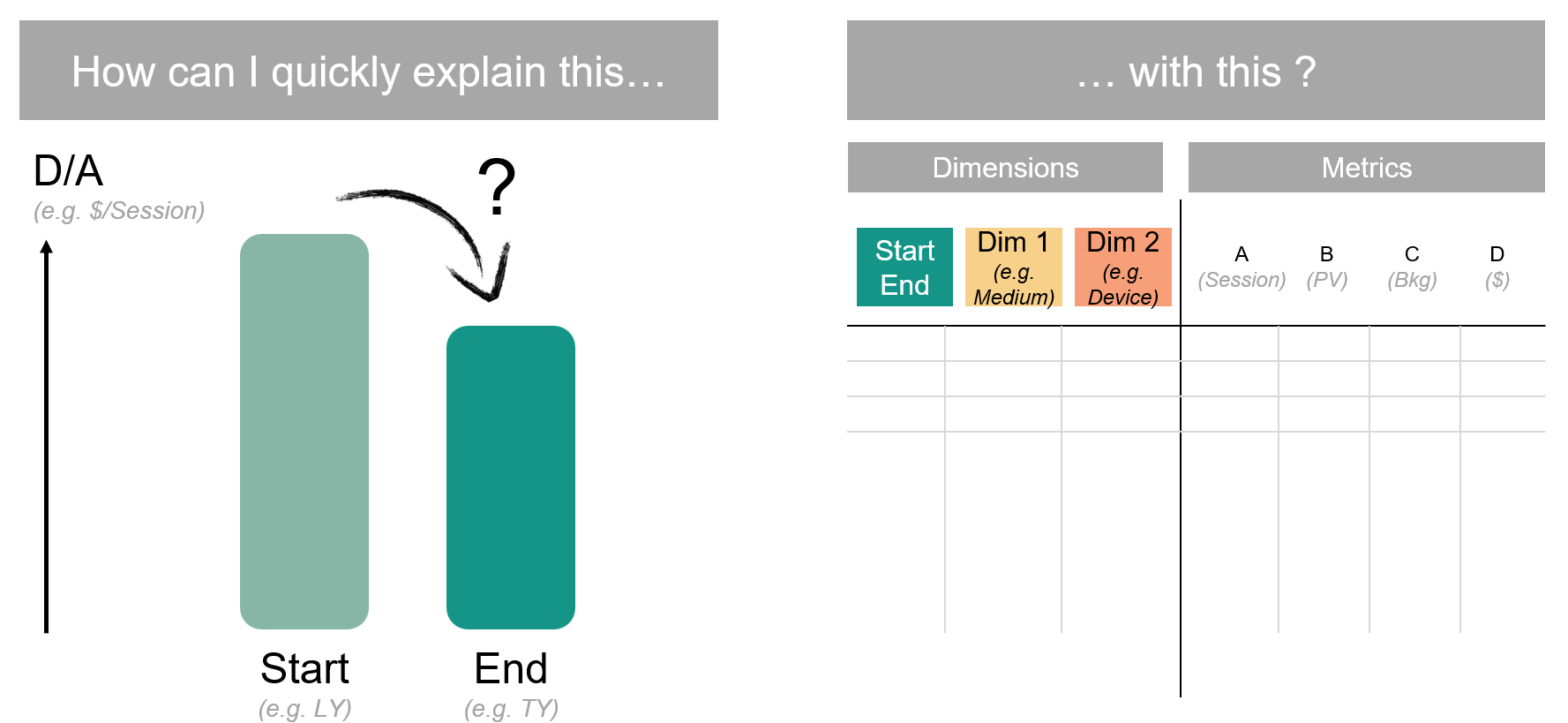
- Main KPI: Define the main KPI you want to compare (e.g. Revenue, Leads, Margin…), this is the main metric you want to focus on.
- Comparison Dimensions: Define on which elements you want to compare your KPI (e.g. Period: Compare Month over Month, Country: Compare one country to the other…)
- by default, Datama will select the first two elements of your dimension, or split a date range in two.
- Steps: Define the steps that correspond to the funnel that lead to your main KPI. For example (eCommerce funnel, or Finance funnel) See dataset examples
- To better defined your steps (or metric equation), you can read our dedicated article.
- Explanation dimensions: Add Dimensions that will be used to explain the variations of your performance. Each variation will have an interest score to see how important they are to explain your variations.
3. Metrics relation
Metric relation describes the equation between metrics of your source, in order to compute the KPI you want to explain.
Simplistic example
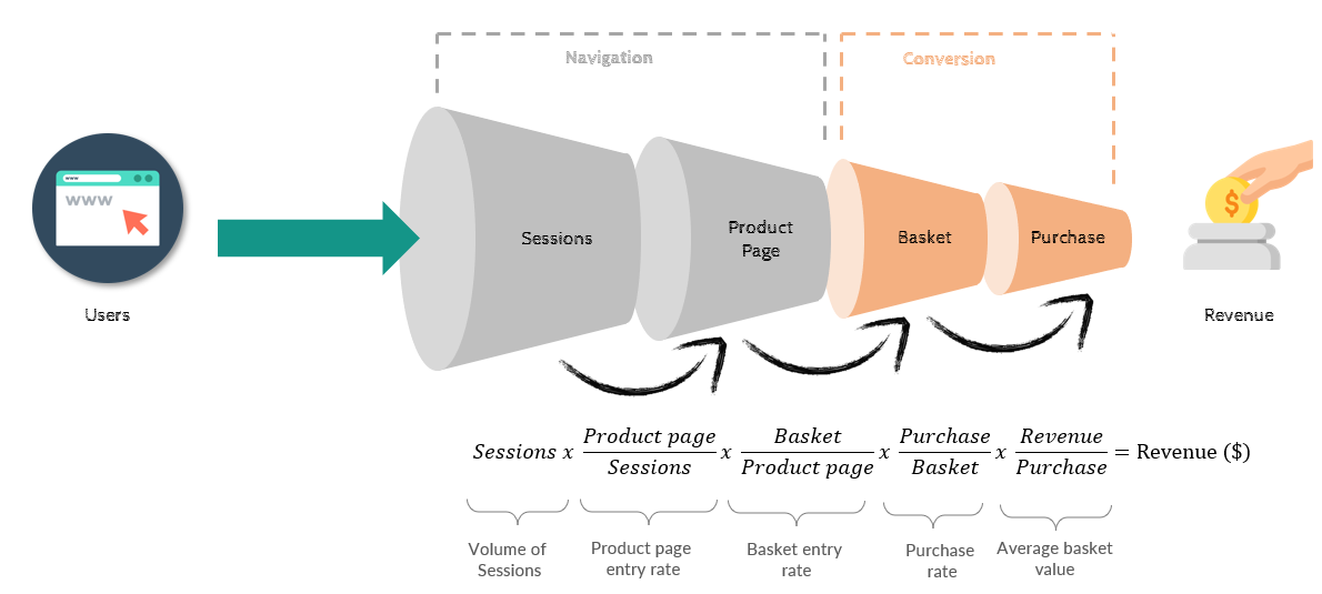
A simplistic retail example: As a retailer I want to understand my Revenue. So my main KPI is Revenue .
Now, I can easily split Revenue that way: Revenue = Volume * Revenue / Volume . That makes a lot of sense, because then I have two underlying performance indicators (PI) that actually helps me split the different effect behind what I observe on my main KPI Revenue . First underlying PI is Volume (the number of products I sell), and the other is Revenue/ Volume , which is basically my unit price.
Why do I want to split those? Well basically because it’s not the same team in charge of volumes and the one in charge of pricing. So, in order to be able to identify where I need to improve, I need to split those two effects.
Generalizing
We call each underlying PI a « Step », because it will be steps of the waterfall you’re building. Number of steps can be theoretically unlimited, but for obvious visual and business reasons, you probably want to limit to no more than 10 steps.
One « Step » is a ratio between two metrics of your source. You have a numerator and a denominator. When no denominator exists (e.g. Volume ) we just say that Denominator is 1.
Steps gets multiplied together in order to get your KPIs. So, if your file has 5 metrics (call it Metric1, Metric2, …, Metric5 ) and your main KPI is Metric5, Metric Relation would typically look like this:
Don’t be afraid of putting too many PIs in that equation: with Datama Compare, you can always zoom in to part of the equation, or aggregate some components using the « Skip steps » functionality.
4. How to Read a Waterfall Chart with Datama
Main element of the extension is the waterfall graph.
Datama reveals the impact of each data variation on your Key Performance Indicators (KPIs):
Each waterfall step represents a variance of a ratio of your performance, offering insights into their individual contributions.
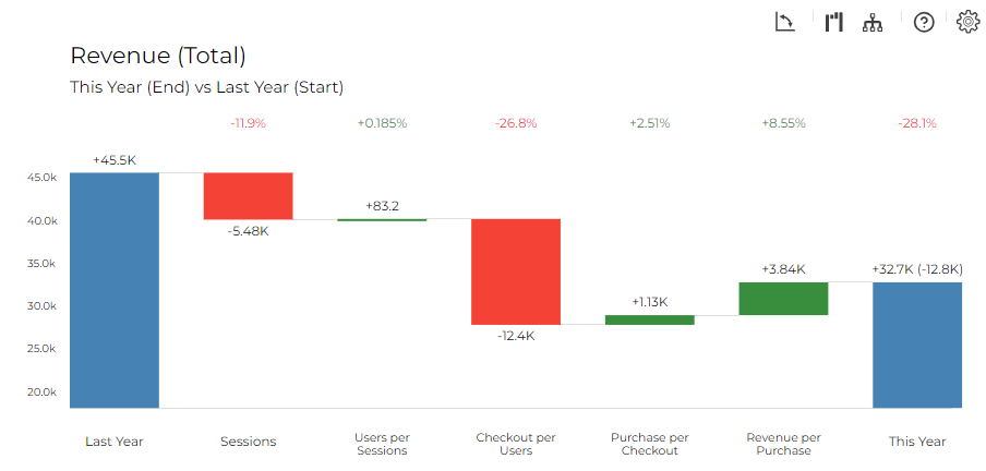
- The waterfall below is explaining the gap of -28,1% in Revenue from last year (45,549€) to this year (32,747€)
- Each step is a variation that explains the gap of -28.1% (mainly due to -11.7% of Users and -26.7% of Checkout/ Session)
- When the Checkout/ Sessions drops from -26.7% it has an impact of 12,298€ on Revenue
- After seeing the quantitative variation of your Revenue, it’s time to understand what causes this variation.
- By clicking on a step, the graph displays the dimension that best explains your variations and give the impact each element of this dimension has on that variation. (by clicking right then “Split by” you can see the interest score of other dimension and choose to modify the dimension that appears.)
- Each variation is split between mix and performance (see article or the next section to understand the difference)
Hope you enjoy it.
Please feel free to send any feedback and do not hesitate to reach us if you have any question about the solution, your analysis or the documentation. We will be more than happy to get your point of view.