Tips of the week !
Every week, Datama publishes a tip or a trick on how to best take advantage of the software
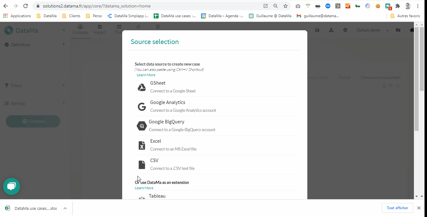
Tip of the week 172: Use Datama as a Google Sheet extension
Happy day for all Google Sheet users! 🤓
You can now use Datama Compare directly in Google Sheet 🎉
- Install it from Google Workspace here
- Open your favorite Google Sheet
- Select a range of data cells on which you want to analyse variations
- Click on Extensions > Datama Compare
- Define your settings & licence key and click on “See Chart”
- Save your use case with a name so that others can use it
➡️ Main advantages of using Datama in Gsheet are :
- Seamless & Self Service: Anyone with access to the Google Sheet can explain variations without leaving the spreadsheet
- Modelisation: Exploring live scenarios impact by changing the data and see the impact on analysis immediately in “Excel” mode
- Security: No data shared outside of Google Sheet
- Democratization: If installed in Google Workspace at the organization level, anyone will have access to Datama directly
🖱️Click here to learn more
PS: For Microsoft Excel users, quick teaser, this might come also soon on your side 😘 #Teaser

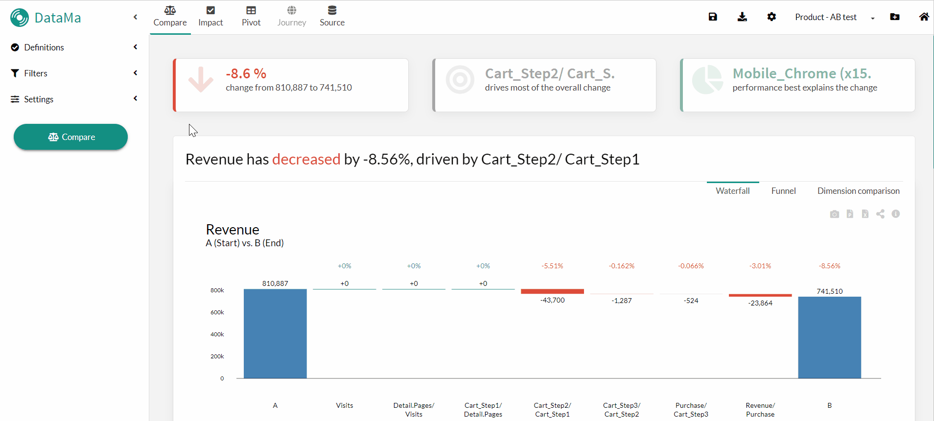
Tip of the week 171: Focused & Excluded Dimensions in the Market Equation
At certain steps of your market equation, you may want to:
- focus primarily on breaking down that step by a specific dimension 🔍
- or exclude a dimension that isn’t relevant to a given step 🔻
You can do this in the market equation menu by adding the dimension in question to the corresponding “Focused Dimension” or “Excluded Dimension” column 🤓
Note: For the main KPI, this prioritization or exclusion has an impact in “Dimension then step” mode 😉

Tip of the week 170: Create a New Workbook in Seconds
Using Google Sheets™ or Excel as your data source in Datama? You can create a new workbook with a simple Ctrl+C / Ctrl+V:
- 📋Copy - paste a range of cells from Excel or Google Sheets™ directly into a Datama workbook, then click Continue
- 🔗Paste your Google Sheets™ URL into a workbook, then click Continue
A new use case is instantly created with your data — no need to go through Prep!

Tip of the week 169: Dynamic filter enablement
In Datama Waterfall, you can refine your analysis in just a few clicks using the segment filter.
- Hover over the segment you want to focus on
- Right-click and select Keep only or Exclude
- The Waterfall chart is instantly recalculated based on your selected scope
A quick way to deep-dive into what really drives your performance 🚀

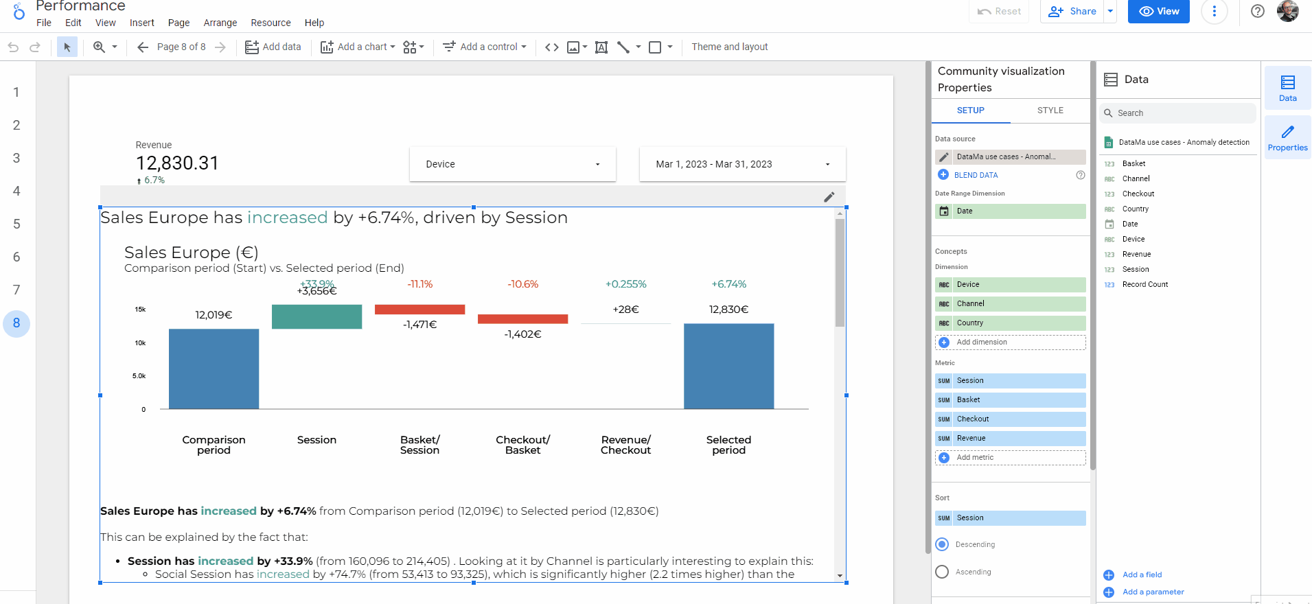
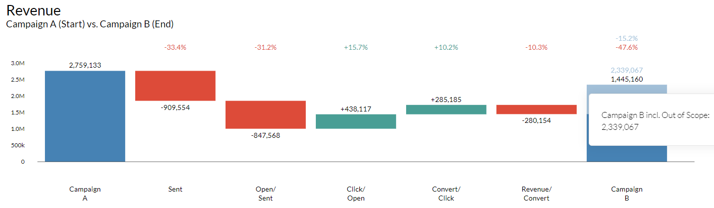
Tip of the week 168: Secondary Comparison fonctionality
Want to go further in your analysis on Compare?
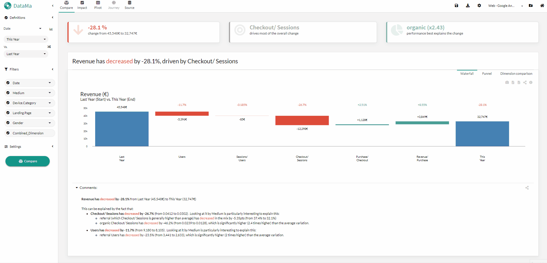
In Datama Compare, you can activate a second comparison. This allows you to display, in the background of your waterfall chart, the variations of another comparison or, if the periods are successive (comparison of period A to B and B to C), it will be displayed as two successive waterfall charts. 🤓
Ideal for highlighting your current results by comparing them, for example, to the same period last year… 📊

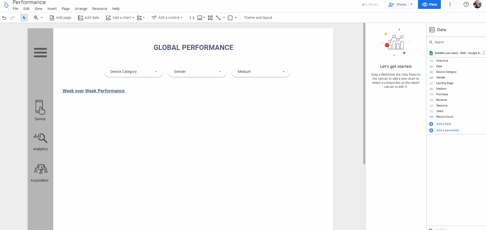
Tip of the week 167: Give context to your KPIs with Datama Calendar.
When detecting anomalies and explaining variations, behind the data correlations that Datama helps you find, there are often more “qualitative” or “contextual” root causes for changes in performance. Holidays, campaigns, product launches, incidents, etc. all have an impact on indicators, but they are rarely taken into account in the analysis. 🗓️
With Datama Calendar, you can easily add business events (internal and external) to your dashboards and instantly visualize their impact on your KPIs. 📊
Check out our online demo ▶️

Tip of the week 166: Connect your Metabase data to Datama
Good news for all Datama clients!👋
You can now connect your Metabase data directly to Datama 🚀
- Connect Metabase via API (see here to generate your API key in Metabase)
- Select the project you want to connect
- Copy the SQL query from Metabase and paste it into Datama Prep
- Apply to instantly load your data into Datama

Tip of the week 165: NEW GA4 Annotation available in Calendars
Good news: a new calendar connector is now available in Datama! 💡
Google Analytics Annotations can now be retrieved automatically via Calendars.
All events added directly in GA4 are imported into Datama and can be used like any other calendar 🗓️
This allows you to cross-reference Google Analytics annotations and business performance in your workbooks without having to re-enter data 😉

Tip of the week 164: Make the most of your calendars in Datama
Calendars are coming to Datama and will become a key tool for better understanding your performance by integrating events 🎇🎆
You can now create or connect calendars from different sources (Google Sheets™, Google Calendar, BigQuery, Excel, etc.) and synchronize them automatically.
By connecting them to your workbooks, you can find your events in:
- the Helpers 📊
- the enhanced comments 📰
- the Light extensions on Detect and Explore 📉
Bonus: from Tableau, Power BI, or Qlik, you can create an event with a simple right-click. Datama thus becomes your central repository for key events. 📅

Tip of the week 163: Heading for 2026
Happy New Year! 🎊
2025 was an intense year at Datama (Table Connect, Views, Datama Explore, AI Generator, Segment Detection, etc.) 🚀
2026 promises to be even more ambitious: multi-level KPI Trees & Market Equations, centralization and exploitation of events, Excel & Gsheet extensions, even better AI integration 🤖
Let’s discuss it during our Customer Success calls 📞
Datama loves you 😍

Tip of the week 162: AI-generated datasets 🤖
You can now generate a synthetic dataset simply by describing your use case via a prompt. In a matter of seconds, a complete dataset is created… along with the associated market equation This breakthrough is ideal for prototyping and testing ideas 💡 without the need for real data. Simply select the block ✨ in Datama Prep, describe your needs, validate the equation, and then generate your use case 🎯 This saves time for brainstorming and experimenting! 🧪

Tip of the week 161: Unlock dynamic insights with Datama Explore! 💡
Good news for all Datama clients! We’ve launched—now in beta—the new Datama Explore (aka Helper), available on Datama Web and as an extension to anyone with a Datama licence. This extension streamlines your setup while enriching your analytical capabilities with:
- Self-service flexibility ⚙️ Instantly select any dimension, metric (Market Equation), and visualization type—no need to pre-build complex parameters in your BI tool.
- Instant variation analysis 📈 Define comparisons on the fly to automatically generate Δ and % Change metrics across all KPIs.
- Advanced charts 📊 Leverage exclusive visuals such as Moves (to understand mix effects) and Mekko (to explore size and composition) for deeper insights.
Check out our dedicated webinar and documentationto learn more

Tip of the week 160: NEW AI generates your market equation ✨
With a single click from the output block in Prep, AI now suggests a market equation based solely on the names of your columns and any optional context you provide (to specify the currency, for example, or the analysis you want to perform).
- No data from your dataset is shared—only metadata (column name and data type, e.g., string, float, date, etc.)—to ensure complete confidentiality 🔒
- You can use your own OpenAI key to maintain control over the license 🔑
A first step towards integrating LLMs into data preparation and analysis…more to come soon 🚀

Tip of the week 159: Ensure Accurate GA4 Data with Datama Prorate ⚖️
If you regularly export data from GA4, you’ve probably noticed that some metrics can be double-counted when broken down by certain dimensions. For example, if you export your sessions by product type, any session that views multiple products will be counted more than once. With the Prorate feature in Datama Prep, this issue disappears💡 By enabling “Prorate metrics totals” before loading your GA4 data, you can safely pull metrics without inflating totals — whether overall or by dimension ✅ Give it a try and let us know what you think!

Tip of the week 158: Save your customized settings in Datama Extension
💡Good news for Premium users!
If you’re using Datama Extension in Looker Studio, Power BI or Qlik, you can now save your customized settings anytime with just a few clicks:
⚙️ Customize your settings → Click Save → the Config JSON is automatically copied → Paste it into the Config JSON field
For Tableau users, it’s even simpler — just click the Save button 💾
Next time you open this use case, it will automatically display your last saved configuration ✅.

Tip of the week 157: New Dimension Helper
New Dimension Helper is now available in Datama in Beta. You can access it by selecting the new version in the top-right panel of Filters or Comparisons. Here’s what’s new and improved:
- Split any dimension by any other dimension, including Comparison dimensions ✨
- View two metrics at once, across both market equation steps and original dataset metrics 📊
- Smooth animations with seamless transitions help you intuitively understand what’s being visualized 💫
- Table view that allows a quick access to a tabular version of your data and export to a spreadsheet with a single click (as CSV copy) 📝
- Easily switch between views like Bar + Lines, Overlay, and Moves thanks to multiple preset charts 💡
- Faster calculations and an improved legend compared to the previous helper ⚡

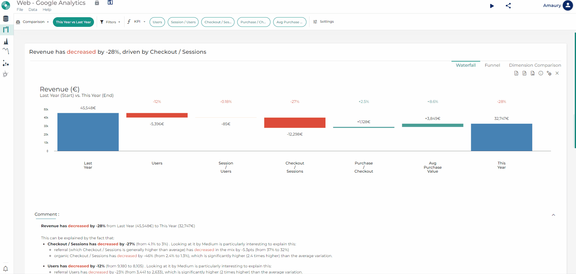
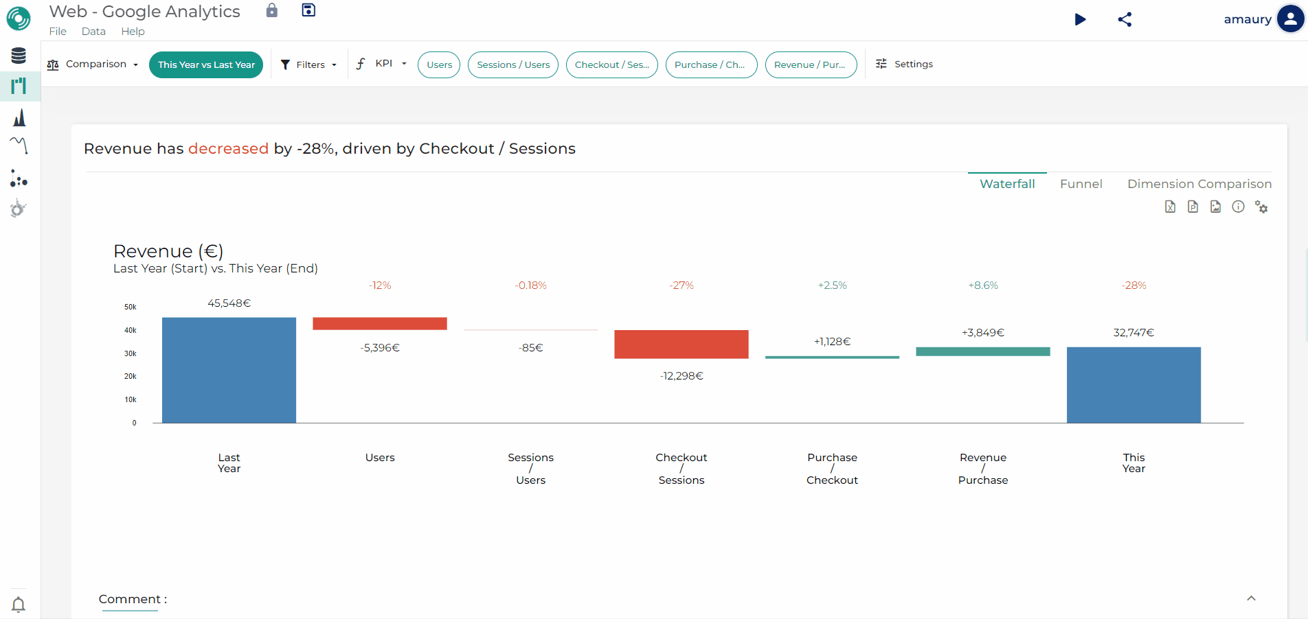
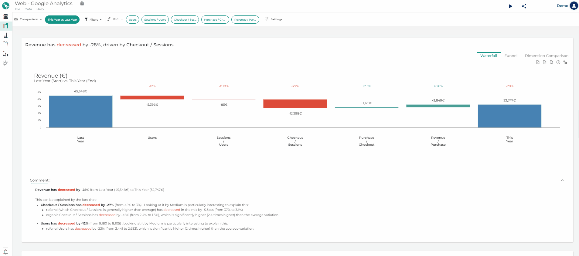
Tip of the week 156: Dimension then Dimension in Datama Compare extension
In the Datama Compare extension (on all visualization tools), you want to analyze a single metric with multiple dimensions (at least 3).
Datama allows you to automatically analyze your primary breakdown (e.g. Country), which will make up the stages of your Waterfall, and then the most relevant dimension (e.g. Channel) when you zoom in on a stage 🔍, all without any additional transformation 💡
Select your primary breakdown via the “Breakdown by” dropdown that appears at the top of the waterfall 🤓

Tip of the week 155: Metric comparison in Datama Extension
You can now directly compare two metrics (numeric columns) in Datama Extension!
For example, if you need to compare your Budget and Actual Revenue, it only takes a few clicks.
- ✅ Make sure both metrics are added in the Setup panel of your BI tool.
- ⚙️ Go to Settings → Comparison Definition → Compare by Metric, then select the metrics you want to compare, give this step a name, and click Apply.

Tip of the week 154: Customize Datama extension version in you BI tools 📊
If you use Datama Extensions in Tableau or Looker Studio, you can control which version of the extension is used in your dashboards.
This is useful when your dashboards are highly exposed, and you want to make sure the latest release doesn’t introduce unexpected features or bugs for your users. 💡
How to proceed:
- Go to Datama 👉My account 👉 Extensions, choose Tableau or Looker Studio.
- In the targeted extension, replace “Latest” with the version you want to keep (from the drop-down list), then click the download/copy icon on the right.
Your BI tool will automatically load the extension with the chosen version. ✅
You can check the applied version directly in the extension settings.

Tip of the week 153: New Cluster Method in Datama Prep
To reduce the size of your data, Datama offers several methods in the “Clean” block in the “New clustering field” section. The “Top X based on Rank” method has just been added 🆕
With this method, you can now:
- Keep only the best-performing segments of a dimension according to a given metric 🎯
- Group all other segments into an “Other” bucket.
This approach reduces the size of your data and allows you to focus on the essentials while maintaining the relevance of the analysis 📊

Tip of the week 152: Update on GA4 source filtering in Datama Prep
Great news for Datama Prep users working with a GA4 source: you can now build more advanced filters by combining “AND” and “OR” clauses, up to 3 levels deep 🤓 This makes it easier to extract the exact number of users or sessions who performed at least two different types of actions/events💡 Reminder 📝: the GA4 source is still subject to API limitations. Always make sure your chosen metrics and dimensions can be queried together (both in the data you retrieve and in the filters you apply).

Tip of the week 151: Use Datama’s extension in Looker Studio
Interested in Datama extension in Looker Studio? Here’s how to try it on with no hassle! 🚀
Step 1 — Get your Datama manifest link 🔗
1️⃣Log in to Datama https://app.datama.io/login
2️⃣Go to My account (left side)→ Extensions
3️⃣Under BI tools  (right side), pick Looker Studio
4️⃣Click the copy icon to grab the manifest URL (or license link) (in the middle)
Step 2 — Add it to Looker Studio
1️⃣In your report: Add a chart → Community visualizations → Explore more
2️⃣Click Build your own visualization
3️⃣Paste the copied link into Manifest path
4️⃣Submit → Allows adding → the Datama extension appears under Community visualizations

Tip of the week 150: One workbook, multiple exports
Want the same workbook to reach different teams in different ways? With Datama Export, schedule the same report via multiple channels, at different frequencies, times, and formats—all from one place. Before scheduling, you can:
- Preview : see exactly what will be sent 📧
- Test : send a test export that mirrors the scheduled run 🗓️
Make Datama work your way. 🚀

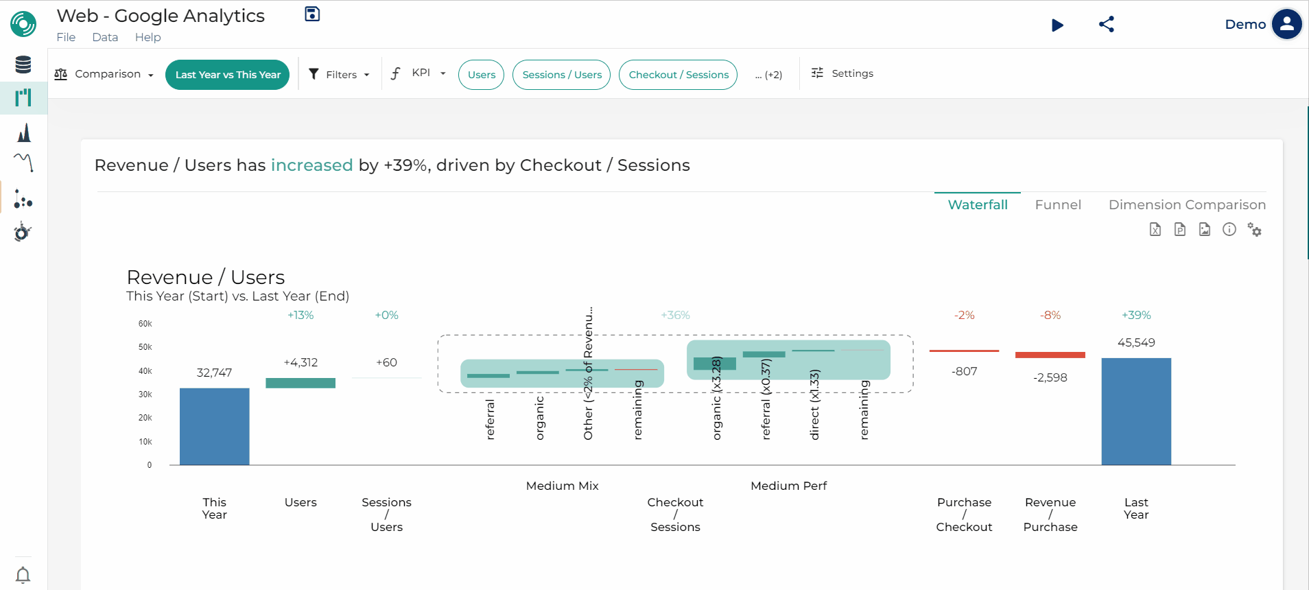
Tip of the week 149: Datama Assess tells you how significant your KPI changes are
When you’re tracking KPI variations between two periods (e.g., this week vs. last week), you usually know how much the KPI changed — but not how meaningful that change is compared to historical patterns.
That’s exactly what Datama Assess – Volatility helps with.
Let’s say your average basket dropped by x% from Week 45 to Week 46. With Assess, you can instantly compare this variation with previous week-to-week changes (Week 44 → 45, 43 → 44, etc.). This allows you to understand whether the drop is within the normal range — or whether it’s an outlier worth investigating.
🧠 In short: you stop reacting blindly to KPI movements and start knowing when they truly matter.
👉 Try it now on our website version or directly in the Datama extension (Looker studio, PowerBI, Tableau, and Qlik).

Tip of the week 148: Enable anomaly detection on the last X points
Until now, you had two options for anomaly detection on Datama Detect Light: either the entire dataset or only the last point. Not very granular, we admit 😓
Now you can choose how many points you want to monitor for anomalies! 🎯
Use case: do you send weekly reports? Set Detect to analyze only the last 7 days. Result: a prioritized list of anomalies over the last week, without unnecessary noise from past weeks.📅

Tip of the week 147: Get precise GA4 data: no more sampling
If you connect Google Analytics to Datama and work with large datasets, GA4 might sample your data — which can lead to inaccurate insights. Fortunately, the new “Avoid sampling” option in Datama Prep solves this! 💡 With one click, you can split your dataset into smaller chunks, so GA4 treats them as unsampled. You would get more accurate data, better decisions. 🎯 Try it now and see the difference in your analysis! 📊

Tip of the week 146: Datama Certification 🏅
Do you know you can get certified on Datama solutions 💡? It’s the perfect opportunity to test your skills, boost your knowledge, and showcase your expertise in data analysis with Datama. How to do? • Request for a questionnaire • About 20 minutes of assessment • Get your results and certificate! Ready to level up 👀? Contact your Datama representative today to get started!

Tip of the week 145: Detect anomaly on segment of your data (available on Datama Light Extension)
On Datama Light extension, a new feature is available to spot anomalies like never before! 🔎 Our latest update enables multi-dimensional outlier detection, giving you the power to uncover anomalies within any segment of your data dimension. Example 📊: Say you’re analyzing performance by device category. While the global average may look fine here on session, Datama can now detect an unexpected spike or drop in a specific segment (uplift on mobile compensated by a drop on desktop). Plus, each anomaly is scored for impact visible in the side table, so you focus on what truly matters first. ✨ Find an instructional video here 👈
")
💡 New article: Handle missing values with Datama Fill-in!
Missing data messing up your analysis?
Datama Fill-in makes it simple 🚀
In this article, discover:
- Real-world examples of incomplete datasets
- How to smartly fill missing values with Datama’s fill-in null value
- Clearer, more reliable and effortless analyses with Datama
Read the full story here 👈

Tip of the week 144: New functions available for calculated fields in Datama Prep!
Two new functions have been added to enhance your data transformation capabilities in Datama 🤓:
- CASE(): Works like a CASE WHEN in SQL.
- REGEX_CONTAINS(): Allows you to use regular expressions on strings and returns a Boolean ✅ These additions facilitate the segmentation, cleansing and manipulation of your data directly in Datama 🚀 Find all the functions available here 👈

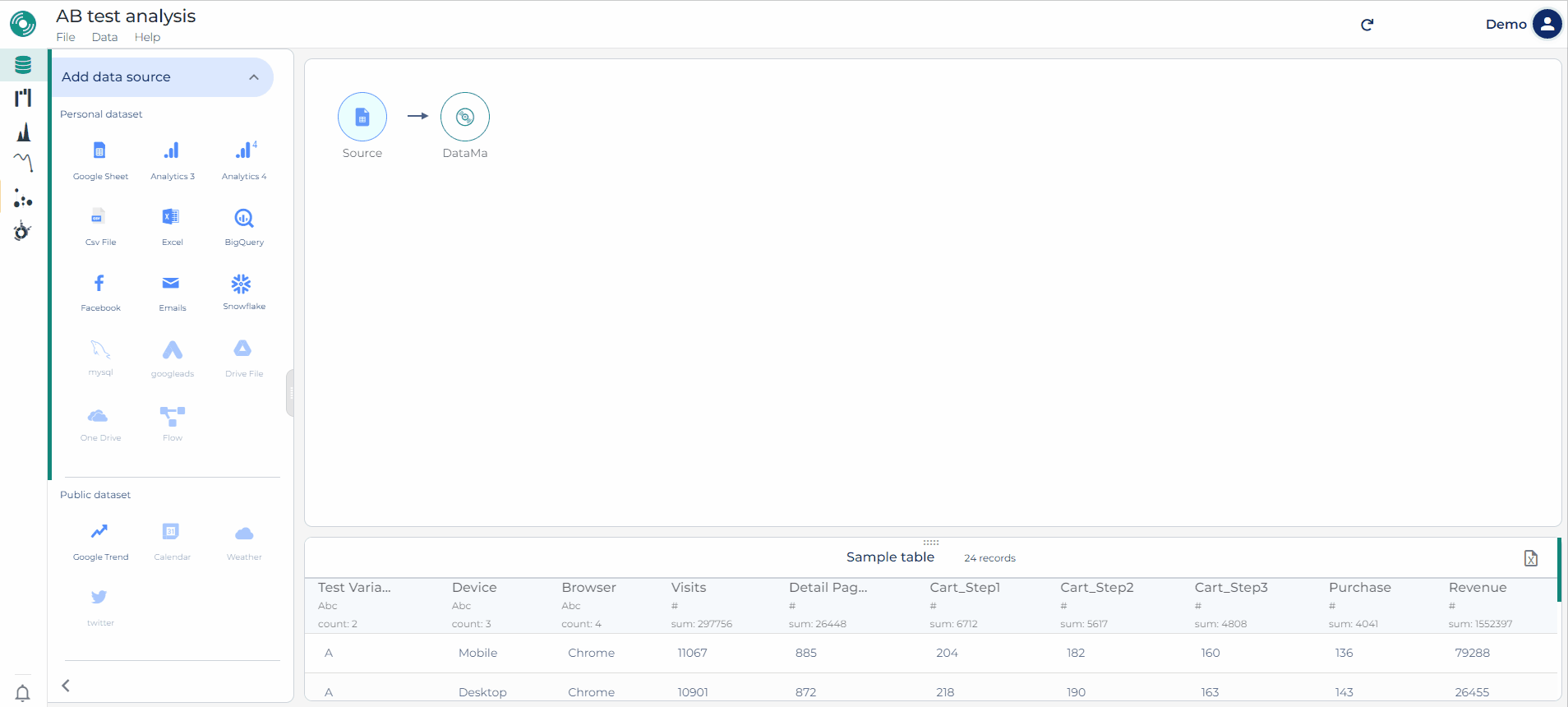
Tip of the week 143: New source block in Prep: Table Connect
You can now link Datama directly to a full table in Prep—no need to write a specific SQL query. Just connect your table in BigQuery, Snowflake, or Redshift, and handle all your filtering, comparisons, and clustering directly in Datama with our NoCode feature.
⚡Datama pulls only the data you need, auto-aggregates dimensions, and keeps things light and fast—so you can focus on insights.
🗒️Please note that after a table connect block, data refinement blocks cannot be used for the moment (e.g. “Clean”, “Aggregate” …).
Smarter connections, faster insights. Try it out! 💡

Tip of the week 142: (Reminder) CTRL + F 🔍 in Datama
Having trouble quickly finding the right workbook, functionality, or tutorial in Datama? Just hit CTRL + F on any Datama page!
Your search results will be smartly grouped into:
- ⚙️ Settings (only visible within a workbook) – Easily tweak workbook settings.
- 📂 Workbooks – Jump straight to your workbooks without navigating the home page.
- 📄 Documentation – Get direct links to helpful docs and tutorials.
 CTRL + F 🔍 in Datama")
Tip of the week 141: Datama Prep «multiple date ranges» available for GA4 and Piano sources!
🚀 New feature available in Datama Prep! It is now possible to define several date ranges in the same source block for GA4 and Piano connectors. 🎯
- This avoids the need to create several separate blocks (e.g. one for last year and another for this year) and then merge them.
- What’s more, you can add a «Date range» column to facilitate comparison, without having to use a date dimension. 🔥

🔔 [Reminder] Your opinion matters!
If you are Datama customer, you recently received an email with our NPS survey. In just 2 minutes, you can share your experience with our solution and help us improve our services.
A huge thank you to those who have already responded! Your feedback is invaluable.
And for the others, we’re eager to hear from you!
Take a moment to fill out the survey 📝 now!

💬 Tell all to Datama chat!
Hey there! Just a heads-up that Datama chat, your direct link to our support team, is here to answer all your questions, receive your feedback, and listen to your insights while you browse the Datama APP.
You can access the chat via the pop-up at the bottom right on the Home page, or by clicking into a use case, selecting Help at the top left, then “Chat with us” 💬—click it again to close it.
Can’t wait to hear from you! 😊

New article on blog: (Re)Discover the mix effect with Datama Compare!
Want to understand the mix effect on one of your KPIs ❓
It’s easy to discover with Datama Compare! ✨
In this article, one of our clients, whose business is sensitive to weather, wanted to understand the impact of outside temperature on their website’s performance. 🔍
This article helps understand how to:
- Correlate the number of sessions per day on the website with the weather 📈
- Calculate the mix effect on traffic between two years 🧮
- Convert all that into revenue impact 💰
Discover the mix effect with Datama Compare!")
Tip of the week 137: New Views feature!
Available in Beta 🧪, “Views” allow you to save multiple versions of parameters in the same workbook. For example, you can save one “view” filtered on a specific country and another for all countries, or one with a complex market equation and another with a simplified market equation 🤓
In this way, you can:
- easily create and switch between views using the entry right next to the workbook title 📖
- decide which view is sent for each export and it will point directly to the selected “View” 📩
Don’t hesitate to contact us to get access to this feature 😉

Tip of the week 136: Use the Datama What if block to test your hypotheses!
Want to see how changes in attributes affect KPIs ❓
Datama What if block in Datama Prep allows you to create scenarios based on your data by making assumptions about KPI variations within a given scope (for example, +10% on the mobile conversion rate compared to last month). ✨
The result? Find the levers that will contribute the most to your goals! ✨
Comment l’utiliser : 🔧
- Cliquez sur + en haut à droite de votre bloc source. ➕
- Select What if and set up the dimensions, the scopes and KPIs in the left panel. 📂
- Click Apply then click compare block to instantly get your hypothesis output! ✅
📊 Turn your analytical ideas into actionable insights !

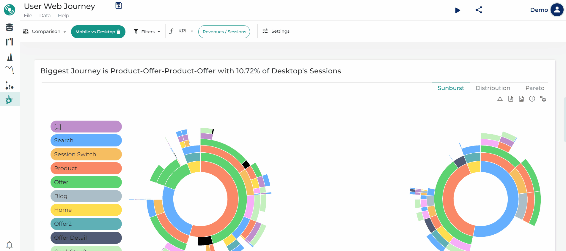
Tip of the week 135: New Journey Sankey visualization!
Besides Sunburst for visual observation of user journey, the Sankey diagram is available as an alternative option for journey’s visualization 🌍
This is particularly useful to visalize “loops” of multiple iterations on the same touch point. 💡
As with Sunburst, Sankey is available in comparison mode to study behavioral differences on two different segments 🕵️

Tip of the week 134: See how far the analysis of just one metric can take you with Datama auto unpivot function! 🌟
Got a single summable metric in your table without an suggested market equation? Unlock its full potential with the Datama Unpivot function! 🌟
This tool suggests you unpivoting your unique metric on a dimension of the dataset and automatically create the market equation to match the sum of each segment of that dimension. 👇
You can then easily analyse by “Dimension then Dimension” in Datama Compare! 👇
How to use it: 🔧
- Upload your data source with a single metric, and click “Apply” of the pop-up at the bottom right. ➕
- Select Datama block then click “Define steps” to review the automatically summarized metric equations by dimension categories in the left panel. 📂
- Click below “Open in Compare” to explore metric KPIs across dimension categories. ✅
📊 Make your limited data source tell more than expected!

Datama wishes you a happy new year 2025! 🎇🎊
As we reflect on 2024, we are proud to have reached here 133 tips shared with you 🌟 to help you maximize the value of our platform and personalize your data analysis experience. A heartfelt thank you to everyone who explored, engaged with, and incorporated these tips into their daily routine — your support inspires us every day! 💖
🎯 In 2025, we’ll be thrilled to bring you even more insights and updates about our solutions, enabling you to unlock the full potential of your data. Together, let’s continue to grow and explore the endless possibilities of data analysis. 🚀
Here’s to a new year filled with innovation, success, and collaboration!🥂✨

Tip of the week 133: Optimize your data with the Datama Aggregation block! 🌟
Struggling with massive datasets? Want to reduce them without losing key insights? ✂️ Discover the Datama Aggregation block!
This tool in Datama Prep lets you group by one or more keys (dimensions) and apply aggregations like sum, mean, or max… to your metrics. ✨ The result? A lighter, more manageable dataset.
How to use it: 🔧
- Click + at the top right of your source block. ➕
- Select Aggregate and adjust the keys and aggregation settings in the left panel. 📂
- Click Apply to instantly get a condensed output table! ✅
📊 Streamline your data—your way!

Tip of the Week 132: Cluster dimensions your way!
Want to cluster certain values in your dataset before analysis? For instance:
- Group small countries generating less than 3% of your revenue in a “Other” bucket.
- Group ages into ranges (example: 18–24, 25–34) for easier analysis. You can now compute Clustering Fields in Datama Prep using the “Clean” object. This feature allows you to group unique values from any dimension column into buckets using methodologies like Long Tail Aggregation or Regression Partitioning. It’s especially useful for large datasets!
🔧 3 Simple steps to get it done:
- After loading your dataset into Datama Prep, click the “+” icon at the top-right corner of the “Source” object, then select “Clean” 🧹
- Customize your Clustering Field: edit the group column name, select the base column and define your aggregation method on the left 📝
- Apply and save changes: click “Apply” at the bottom-right to instantly see the new aggregated column ✅
🎥 Check out our GIF guide for a step-by-step walkthrough.
📊 Refine your data preparation—your way!

Tip of the Week 131: Datama is now Power BI visualization certified!
Datama is continuing its efforts to integrate with your visualization tools (Tableau, Power BI, Looker Studio, Qlik), and this week we’re delighted to announce that we’ve been certified on the Power BI 🎊
What does this mean for you?
- 🌟 Our certification attests to the quality of our code and the relevance of our solution.
- 🔐 Datama complies with the highest security requirements for visualization tools.
- 🌐 No data is sent to our servers, and the extension can operate even offline.

Tip of the Week 130: Customize comments in your Datama extension!
✨ Want to add your personal touch to comments while interpreting comparison analytics from the Datama extension in Looker Studio, PowerBI, or Tableau? 🤔 Yes, you can! 🌈 Say goodbye to default comments and hello to your custom insights below the waterfall chart ! 🎉
Only 4 steps to get it done:
- Right-click on the sentence you’d like to modify and select “Edit Sentence” to open the settings panel.
- 📝 Edit the relevant text in the left coding panel. Check out your changes with a 📺 live preview on the right!
- When ready, ✅ click “Apply” at the bottom right to save your changes and see the update instantly.
- Need to Reset? Click “Reset” (left of “Apply”) to return to the default style if you want to start over or if an error pops up.
Advanced customization: Click “+Available Variables” for even more options!
🎥 See below our GIF guide for a step-by-step walkthrough.
📊 Make your Datama Extension uniquely yours! Humanize your analytics tools and bring clarity to your data insights!

Tip of the Week 129: Retrieve your Datama license keys and extension for your visualization tools 🔓
Log in to Datama, go to My account > Extensions, and retrieve your license keys and/or extension to integrate Datama into your preferred tools (Tableau, PowerBI, Looker…) 🔑
2 integration options:
- Web App: Enjoy all the features of Datama directly in your visualization tool and edit your analyses without leaving this environment ✨
- Marketplace: Integrate our serverless plugin into your data visualization tool, fully autonomous and secure, optimized for performance without any external dependencies ⚙️
With Datama, combine flexibility and augmented analysis in a single solution! 🎯

Tip of the Week 128: Organisation shared credentials 🗝️
As an admin of your organization, you can now share the identifiers of the data sources you have connected with all other users in the organization. 🤝
What to do?
- On the home page, select the “Credentials” page in “Organization” 🔐
- Enable sharing for connected sources 🔓
- In Prep, other users can now select “MyCompany” to use logins that have been shared at organization level. 🏢

Tip of the Week 127: Detect anomalies faster than ever! 🌟
Want to stay ahead of the curve and catch anomalies the moment they happen? 🤔 Datama’s enhanced anomaly detect service now lets you monitor customer behavior and its impact on your KPIs on an hourly basis! ⏱️
🚨 What’s new?
You can now get notified 📩 within just a few hours of an anomaly occurring, rather than waiting days to discover it. Simply change the alert frequency to “Hourly” in the “Schedule” configuration 🕔 (located at the top-right of the “Anomaly Detect” page). This ensures you’re immediately informed when something goes wrong. ⚠️
🔧 How it works?
This feature is available for any dataset 📊 with hourly updates, making it ideal for users working with tools like GA4, ERP, CRM, CDP, DMP and more. 🖥️
For those who wanna test with GA4, click the link below to explore more: https://github.com/DataMa-Solutions/GA4-Hourly 🔗
📈 Stay proactive and empower your analysis with faster alerts! 🚀

Tip of the Week 126: Take advantage of Smart Interval for more accurate anomaly detection 📈
In Datama Detect, when using observed volatility to detect anomalies, the “Smart Interval” button is enabled by default (Settings > Detect methodology > Use smart interval). 😊
Smart Interval calculates a theoretical confidence interval using the Wilson method. This improves the accuracy of anomaly detection, especially for values close to 0 and/or for detecting hourly anomalies. 🧠
Try it out to optimize your ratio analysis! 🎯

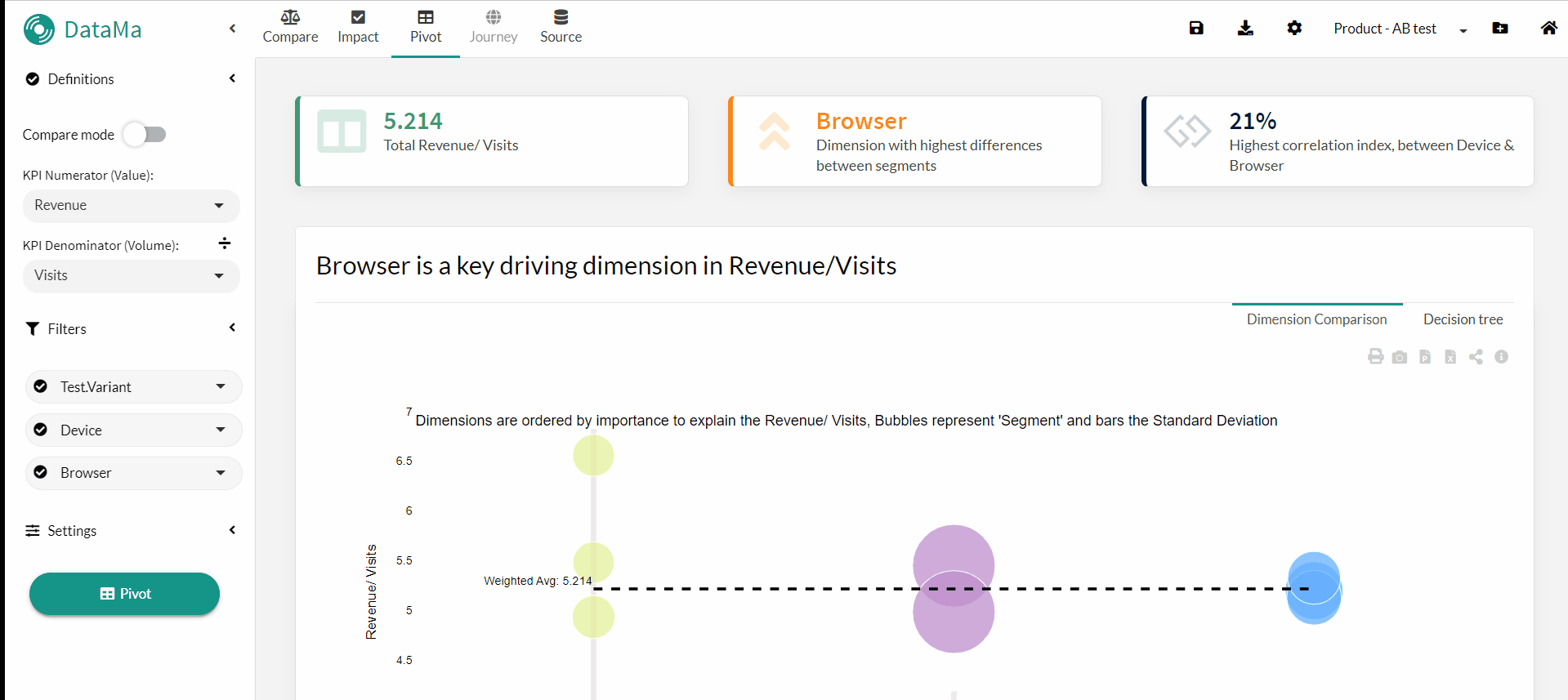
Tip of the Week 125: A new Radar Chart!
The radar chart is available in Datama Pivot when analysing all stages of the market equation 🤓
At a glance 👀, you can see how each segment of a dimension is performing on each KPI in your market equation and compare that performance to other segments using a radar chart 🕸️ (aka ‘Spider Chart’). Just click on the second tab of the first Datama Pivot slide to try it out! 🧪
Make sure that no comparison is active, otherwise the slide will not appear. 😉

Tip of the Week 124: Leverage our tips to simplify your analysis🌟
Not familiar with Datama Solution? Looking to explore existing features or discover new ones? 🤔
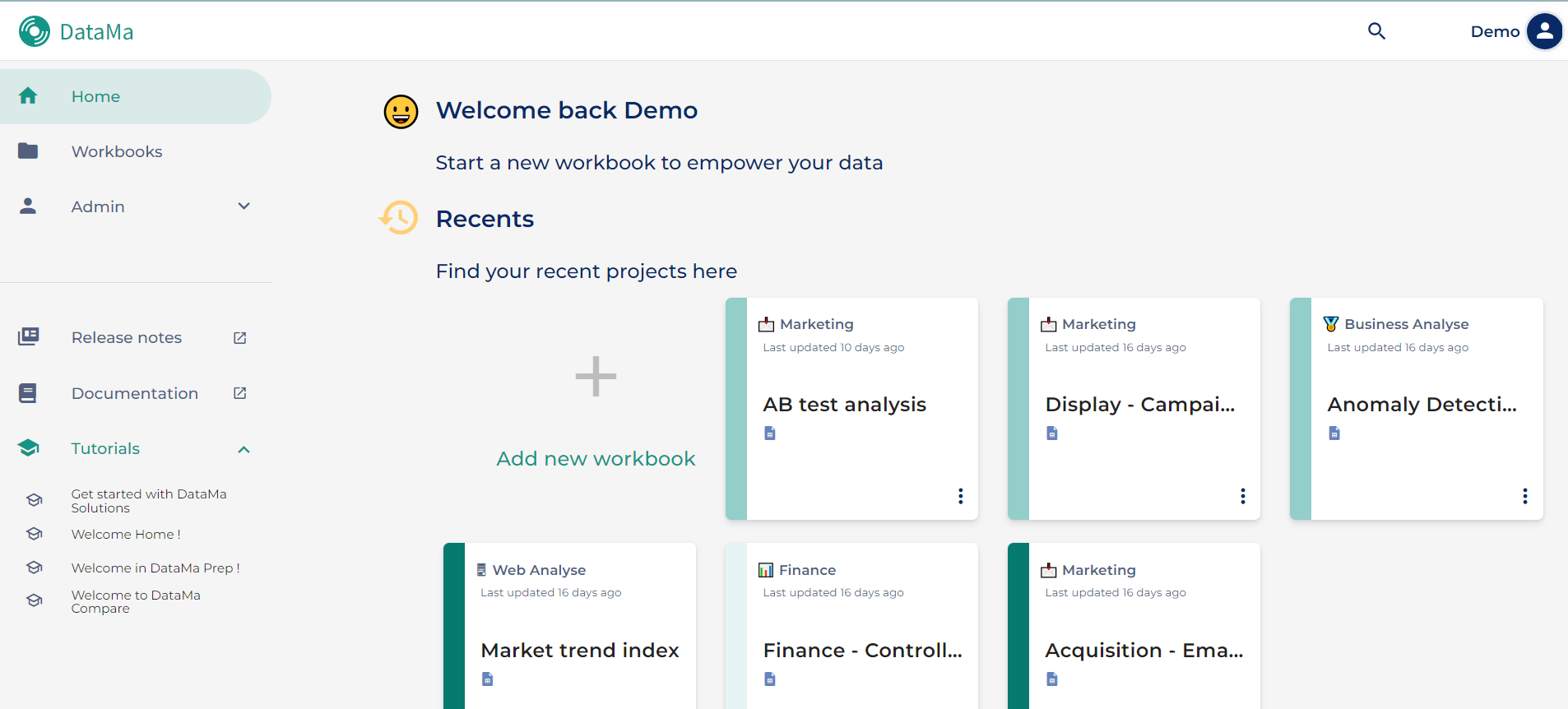
Every week, Datama sends out a “tip of the week” to help you make the best out of the software.
Don’t hesitate to browse our “tip of the week” section to find valuable insights! Here’s how you can access them:
- 🌐 Home page: Scroll down to find “Our tips”.
- 🔍 Search tips: Type “tip of the week” in the documentation on the left-hand side of the home page.
- 📧 Email updates: Receive tips regularly via email/ slack/ gchat/ linkedin!
🆘 Need help?
If you’re unable to find the tips you’re looking for, give us feedback for additional support.
📊 Empower Your Analysis with Expert Tips! 🧠

New article on blog: GA4 and BigQuery - Mind the Data Gaps!🚦
Noticed differences between your GA4 reports and BigQuery exports? ⏳
One of the reason might be that you are using incomplete intraday data, before it transitions to interday tables 📊
To get accurate Datama notifications, you might want to either postpone your schedules later in the day or switch to “fresh daily” tables ⏲
Need to check when your tables are fully updated?

Tip of the Week 122: Customise your exports 📨
Whether it’s Slack, Teams or email exports, you can customise each export with parameters that are independent of the use case backup.
Here are a few examples of what you can change:
- Change the comparison dimensions to send a Compare in Month over Month and an other in Week over Week 🗓️
- Add filters to set up an export by country or by acquisition channel 🎯
- Adjust the style and language to create exports tailored to your audience 🤓
- And many other cases that we’ll leave you to imagine 💭

Tip of the Week 121: 🛠️ Customize parameters once for all future workbooks 📊
Wanna set up your preferred parameters just once and have them apply to all new workbooks? Don’t forget to configure your “User Preferences”.🛠️
To get started, click on your name in the top-right corner of your homepage and head over to “User Preferences” ⚙️. Here, you can find all the parameters available for customization. For instance, if you prefer to set the “Confidence Interval” to 90% instead of the default 95%, simply click on “Detect Model” 📊 in the “User Preferences” list, adjust the percentage 📈, and save your changes by clicking on “Set As Default”. 💾
From now on, every new workbook you create will automatically apply the 90% confidence interval. 🔄
Make your workbooks work for you! 📝✨

Tip of the Week 120: New ‘Dimension’ menu in settings
When setting up a comparison or filters on a Use Case, you can now configure them in more detail 😀
To access this, when you’re on a Datama solution, go to the ‘Settings’ ⚙️ at the top right and then select the ‘Dimension’ section, you’ll then be able to configure three subsections:
- Comparison: where you can define your comparisons and, in the case of relative saving, view the indexes and choose the order in which they are defined (Ascending 📈 or Descending 📉)
- Filter: in the same way as in Comparison, you can apply filters and use relative saving on the selected dimensions 🎯
- Auto-generated dimensions: to activate the dimensions calculated by Datama (combined dates, combined dimension or smart dimension) 🧮

Tip of the Week 119: Create Your Organization and Invite Your Team Members!
By creating your own organization, you can now have a collaborative space where you can work and share your use cases with several users 🤝
In a few clicks:
- Create your Organization 🏢
- Invite your team members 📧
- Manage all accesses 🔐
The feature is in beta for now, so ask for Beta access from your CSM and then click on “Organization > Information” to start creating your organization! 👥

Tip of the Week 118: Discover the New Ranking Functionality! 📊✨
In Datama Compare, you can easily see how different segments in one dimension affect your key metrics. By adding ‘Ranking’ and ‘Ranking Change’ to your table view, you can easily see the ranking of a segment on a KPI and the ranking change between the two values you are comparing.🥇🏆
For example, you can see for the dimension “device”, “mobile” changed from rank 2 in the previous period, to rank 1 in the current period. This is equivalent to a ‘Ranking Change’ of +1 ⬆️
To use this feature, click the “Table” tab, click the gear ⚙️ on the top right, and check the boxes for “Ranking” and “Ranking Change”. Try it out now and easily analyze performance trends! 🚀 Happy ranking! 🎉

Tip of the Week 117: New UI Comparison and filter
The latest release brings a host of new features, including a new approach to filters and comparison! 🎉 How does it work? 🤔
First access the comparison: click on “Comparison” then select the dimension you want to compare on (Optional: select “Secondary Comparison” to add an additional comparison).
Then select your segments: choose the segments for each of your comparisons to refine your analysis as much as possible.
What’s new?:
- The interface has been clarified to give a better view of the filters applied to each of the comparisons. Click on ‘Filters’ to tick the different choices available for each of your comparisons ✅
- New operators: use a new operator in the filters to refine your searches (by inclusion or exclusion criteria, “contains”, etc.) 🎯

Tip of the Week 116: Reverse waterfall colors for 'negative' KPIs
When using Datama Compare, you can now use the “Reverse palette” toggle to switch the bar colors 📊 This is helpful in cases where you’re using a “negative” KPI where an increase is not good news, so it should be displayed in red instead of green (such as cost) 💸 The “Reverse palette” toggle is available in the Settings > Workbook Style > Language and colors section ⚙️

Tip of the Week 115: Quick set up of the market equation
If you have modified your market equation and you want to return to the basic one, a “Quick set up” shortcut ⏩ exists to recreate the basic market equation for your dataset 💡
In the menu for defining the market equation, whether in Datama Prep or in the advanced settings ⚙️ of the solutions, you have at the bottom of this table two quick set up options with:
- the button Π to create a market equation based on a product of all the metrics in dataset order (the solution most commonly used on a funnel)
- the button Σ for a market equation which sums all the metrics ➕

Tip of the Week 114: Only flag anomalies above or below the confidence interval
Using Datama Detect, you can send instant notifications for when your key metrics fall outside of the confidence interval 🔔 Now, you can decide to flag anomalies only above or below confidence interval using the appropriate input in the settings ⚙️ This allows to get notified only when a KPI goes down (aka “bad news” 😅) , for instance. Of course, you can also choose to only keep those above ⬆️, or keep the default of showing both ⬆️⬇️

Tip of the Week 113: Dig deeper into your segments analysis
In Datama Compare, the waterfall will group segments with smaller effects into the ‘Remaining’ category to simplify the view 📊 However, you can easily examine these categories more closely by simply clicking to expand any bars labeled ‘Remaining’ 🔍
You can also customize how many segments appear per dimension before they are put in the ‘Remaining’ category in Settings ⚙️

Tip of the Week 112: Set automatic opening of waterfall steps
In Datama Compare, by default, the waterfall will open on the step and dimension most interesting to investigate 🕵🏽
If you want to have all the steps closed by default, there’s an option in the Waterfall settings: go to the settings icon ⚙️ at the top right of the Waterfall slide and uncheck the “Open biggest/focused element by default” option and that’s it 😉

Tip of the Week 111: New Products page
A new page is available on the Datama Home page 😀
By going to “My Account” and then “Products” in the left-hand menu, you will arrive on the page with all the integrations in the data visualization tools like Tableau, Power BI and Looker Studio 📊
Here you will find the following information:
- your licence keys 🗝️, which can be copied in one click
- extension download links ⬇️
- as well as links to the documentation to find out what you can do and how to install them 👀

Tip of the Week 110: Give your feedback
In Datama, you can give your feedback on a problem you have encountered or a potential improvement you have identified 💡
A “Feedback” banner is accessible by hovering your mouse over the right-hand side of the screen at half-height, or by clicking in the “Help”>”Feedback” menu. 📝
We’ll receive the message immediately, along with all the technical details needed to reproduce your environment and, if you like, a screenshot!

Tip of the Week 109: Display the exit in Journey
Would you like the answer to the question “How many sessions have left the site?” 🤔
Datama has created the option that allows you to have the answer in Journey, by activating “Display exits” in the settings ⚙️
This allows you to display the “output” of journeys on the sunburst ☀️, so you can hover your mouse over it and get the share of volume (in %) exiting your journeys for a given path.

Tip of the Week 108: Reverse sunburst
In Journey you can change the reading of your sunburst ☀️. By going to the options, you can tick “Reverse sunburst” 🔄️ , reversing the reading direction from external to the center of the sunburst.
This allows you to pose the problem in reverse by no longer answering the question “What does the user do after reaching a milestone?”, but elucidating “What led users to reach this milestone?” 😎

Tip of the Week 107: Display Main KPI trend
If you use Datama Detect 📈 to detect anomalies, you may have noticed some new features in the interface or in the email exports:
- Datama now shows the trend of the main KPI in dotted lines on the graphs, so you can see whether the variation in this indicator really influences your overall performance.
- In the event of an anomaly, a quantified overview of the impact on the main KPI is displayed, allowing you to quickly understand in what proportion a variation in a sub-indicator affects your main indicator. 🤓
These features are enabled by default. You can deactivate them in the ⚙️ settings by unchecking “Compute Main KPI impact” and/or clicking on the “f” icon in the top right-hand corner to remove them from the main chart.

Tip of the Week 106: Customise your decision tree
In Datama Compare, you can customise your decision tree 🌳 according to your needs, for example by highlighting the variation in % instead of the impact in value to simplify the discussion with the business 😉
You can make these adjustments by going to the parameter menu ⚙️ and then to the “Label” section:
- choose the order of the indicators
- activate the colours 🎨 according to the variations for each indicator
- add a variation arrow ↗️
- limit the appearance of a field to the hover only 🥷🏽
- completely hide certain fields

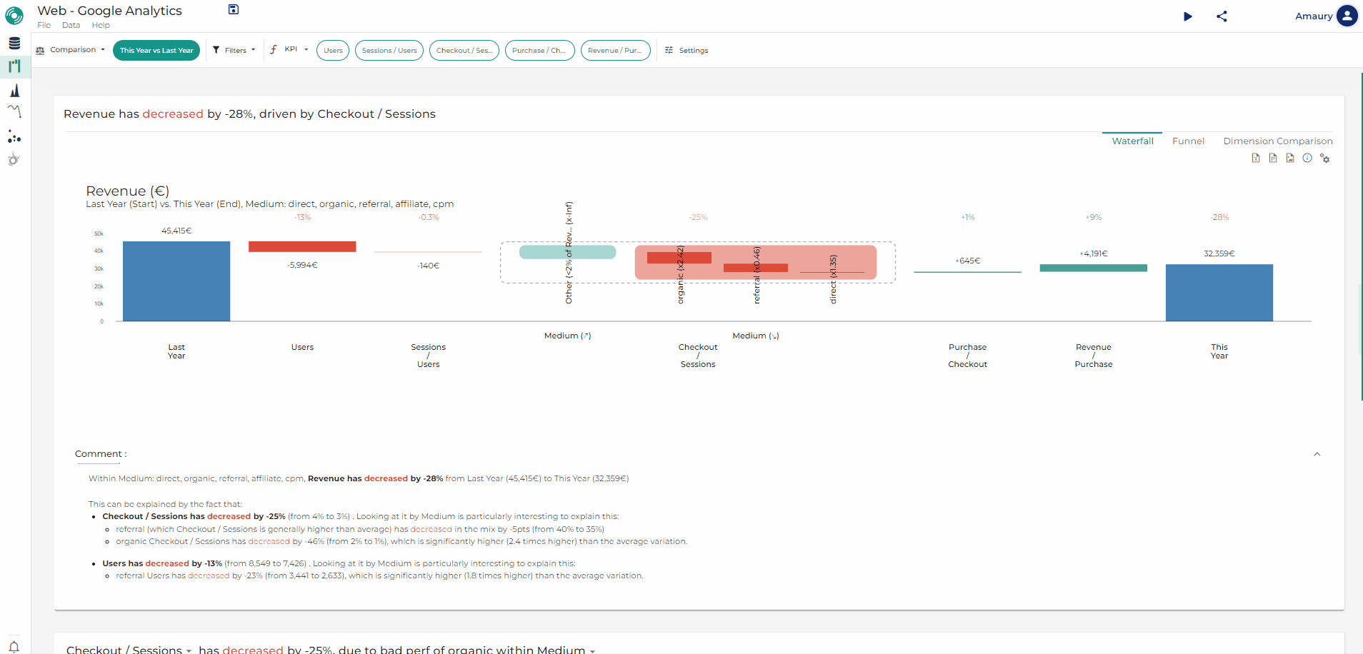
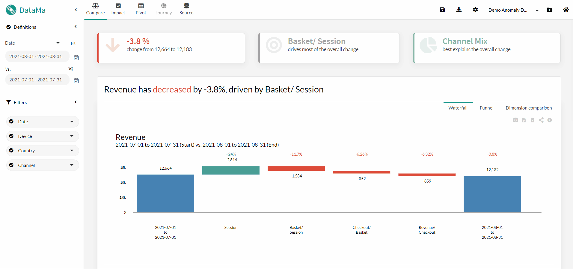
Tip of the Week 105: Find the segments that explain the variation in a KPI
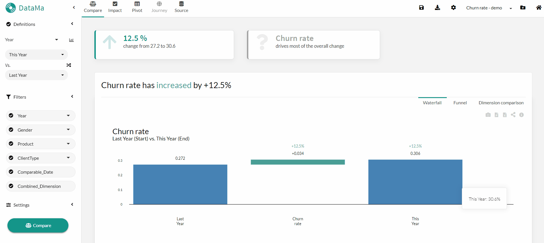
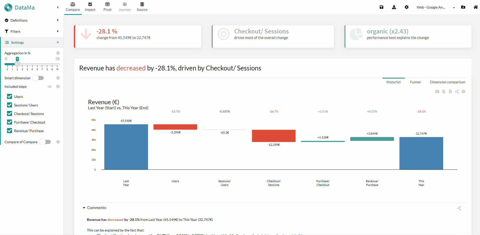
A question that often comes up is: which segments drive change among all the dimensions? 🕵️♀️ Change can be explained by several segments. It would therefore be interesting to have a ranking of these segments according to their impact on the KPI.
In DataMa Compare, thanks to the “Decision Tree” 🌳 that you will find on the first slide, it is possible to right-click to change the exploration method, which is by default in “hierarchical” order, to “Top X” drivers. The X can be selected from 1 to 50 😉
Useful when you want to find the Top 3, 5 or 10 segments that explain the variation 🤓

Tip of the Week 104: Change Waterfall colors for a specific workbook
When you carry out an analysis where a downward variation is seen as positive (e.g. analysis of purchasing costs), it is then possible to change the colours of the workbook in question to show increases in red 🔴 and decreases in green 🟩.
Go to Settings ➡️ Workbook Style ➡️ select Colors palet=custom ➡️ then define each of your colours for the Waterfall 🎨

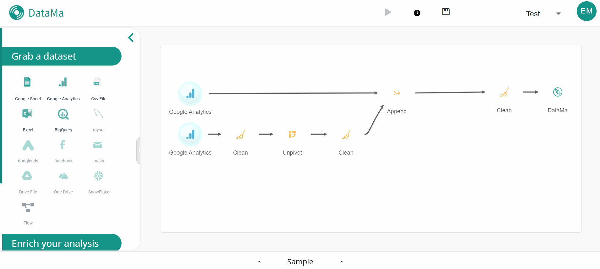
Tip of the Week 103: New block Join in Datama Prep
A new block has appeared in Datama Prep: the ‘Join’ block, which lets you simply perform a join between two sources 🥳
Very simple to use, it will be configured in two steps:
- Choose the type of join you want to perform (Inner, Outer, Left, Right, Cross Join) 🔗
- Define the dimension(s) that will be used as join keys for each of the sources and apply 😉

Tip of the Week 102: Pivot Check All steps
The Datama team wishes you a happy new year 2024 🎉 Datama Pivot now lets you analyse all your KPIs at once! The “Check All steps” functionality is available as an option in the Datama Pivot menu:
- it allows you to explore a visual “market equation tree” for an overview in the first slide 🕵️♀️
- a new “KPI Interest Score” prioritises impactful steps based on distribution and standard deviation 🤓
- perfect for quickly identifying business drivers and finding optimisation levers!

Tip of the Week 101: New Clustering Tree in Pivot
The clustering tree is now available in the new interface on Datama Pivot, with improved visualisation 🌲->🎄 It helps you create clusters within your dataset across multiple dimensions using a “regression tree machine learning” algorithm 🚀

Tip of the Week 💯: Datama Prep Export
Want to easily export your favorite Datama graphs to your preferred channels? 🚀 You can automate exports from any Datama solution to Slack, email, or as a URL, directly in Datama Prep ⚡ Clicking on the corresponding bubble opens settings, where you can customize your export by frequency, time, and more ⚙️

Tip of the Week 99: Download your Prep data in Excel format
Want to check the data source you’ve created or imported into Datama Prep? ️🕵️ Here’s how to do it in two simple steps:
- Go to the Prep tab of the Use Case you are interested in
- Click on the Excel logo at the top right of the table 🖱️

Tip of the Week 98: Duplicate your source blocks in Datama Prep
🔥New this week: the “Duplicate this bloc” function is now available in Prep! Here’s how it works:
- Select the Source Block you want to duplicate.
- Click on the Three Small Dots “…” located on the Source Block.
- Choose “Duplicate this block” 📚: With one click, create an exact copy of your block, with all the parameters already configured.
✨ Why is this handy? Imagine: you have a GA4 block configured for last month. With duplication, easily create a version for last year. Time saving and efficiency guaranteed! Take advantage now and boost your productivity with Prep! 😉

Tip of the Week 97: Attach links to documentation to your workbooks
In Datama, you can add a link 🔗 pointing to internal documentation linked to your workbook (for example a Wiki page, a Readme, a Notion page, or a Gslide presentation presenting the use case). There are two ways of doing this:
- From Home, click on the three little dots of a workbook card ➡️ “Edit” ➡️ and fill in the “Learn More” field.
- In the workbook in “File” ➡️ “About this workbook” ➡️ and fill in the “Learn More” field in the same way.

Tip of the Week 96: Slideshow mode integrated into Datama
By clicking on the “Start presentation” icon in the top right-hand corner (or by using the keyboard shortcut Ctrl+F5 ⌨️), you enter slideshow mode, which allows you to display any slide in Datama full-screen, just as you do in PowerPoint. You can then present the different graphs by navigating from one page to another while continuing to interact normally with the solution 😉

Tip of the Week 95: New methods for Anomaly Detection
Datama Detect now offers you new methods for spotting anomalies in your data:
- Methods based on estimated confidence interval
- Forecast (only available in “Analyse latest point only”)
- Observed volatilty (method by default)
- Methods based on manually configured thresholds (the new ones 🥳)
- Relative variation threshold: for example, if the threshold is set at 50% then any relative variation in excess of 50% will be considered an anomaly.
- Absolute variation threshold: using the previous example, here we are not defining a percentage threshold but a fixed value (2k) and any absolute variation in excess of this value (-2.1k) will be considered an anomaly.
- Absolute value threshold: for example, if the threshold is set at 50k and the baseline value is 40k, if the value considered is 60k, this will be considered an anomaly.

Tip of the Week 94: Merging Secondary Comparison
Last week we talked about secondary comparison. If you’re in the overlay mode when you do a Secondary Comparison, there are two types of visualisation:
- The first is where each segment/period is different, there are four segments A, B, C and D and you end up in the overlay view with A-B in the foreground and C-D in the background. This is the classic case when you are looking at a variation between two months and you want to compare them to the same variation the previous year.
- The second, which is new and allows you to combine comparisons, is the format where you have two periods that follow each other (in an A-B and B-C format). In this case, Datama will combine the two views into a single foreground view, giving you a single view of the two waterfalls in the continuous A-B-C format. This is useful, for example, when you are looking at three consecutive weeks/months and want to compare their evolution. You can return to the superimposed view by right-clicking on one of the blue bars and selecting “Unmerge waterfalls on common bars”.

Tip of the Week 93: New Secondary Comparison displays
You may be using secondary comparisons in Datama Compare - for example, to compare the variation of one country against another. Datama then displays 2 waterfalls: by default the display is superimposed with the first comparison in the foreground and the second in the background. Now you can change the display by separating the second comparison into a new Waterfall, which will appear either on the right or below. To access this, right-click on a block of the Waterfall, then Secondary Comparison and finally the display option you want from “Right”, “Above” or “Overlay” 😉

Tip of the Week 92: Datama Compare Tree Chart
Have you seen the tree chart view in Datama Compare? 🌳 By clicking on the Tree chart button in the top-right corner of your standard waterfall graph, you can visualize your data in a new way, showing the impact of all your dimensions at a glance 👀 Right click on a box to explore top contributing segments across all dimensions and change other settings 🔧 (in particular the exploration mode which, by switching to “Top X” mode, allows you to view the largest contributing segments across all dimensions)

Tip of the Week 91: Piano Analytics Connector
To prepare your data in Datama, you can plug in your data source and transform it in Datama Prep. Many connectors were already available, such as GA4, Facebook Ads, Bigquery… and now a new connector has joined them: Piano Analytics 🤩

Tip of the Week 90: Exploring in Compare from Pivot
In Datama Pivot, when you are on the “Importance Chart” graph, you can look to see what opportunities there are for optimising a KPI 🤔 This is now possible by right-clicking on one of the bubbles in the graph and selecting “Compare this”, you can easily switch to Datama Compare to explain the over-/under-performance of a given segment compared to others 🤩

Tip of the Week 89: User preferences
You already had the option of customising your preferences at workbook level to choose the language or colour scheme to apply to the graphics.🎨 Now, although this option is still available at workbook level, you can define the settings at user level, from Home. Select ‘User Preferences’ and the configuration will apply to all new workbooks you create. 😉

Tip of the Week 88: CTRL + F Search shortcut
A search shortcut has been introduced on all Datama pages by pressing CTRL + F. When you do a search 🔍 the results will be divided into the following sections:
- Settings: (only when you are in a workbook) which allows you to edit a workbook setting ⚙️
- Workbooks: to find your workbooks without going through the home page 📂
- Documentation: to get links to the documentation 📄

Tip of the Week 87: New workbook view on the HomePage
A new view of your workbooks is available on the Datama Home page. By clicking on the list icon at the top right, you can switch from a “Grid” view with the workbooks in the form of a map to a “Detailed” view in the synthetic form of a table Your choice of view will be saved for future sessions 😉

Tip of the Week 86: Send exports only when there are alerts
You can set up your Slack or Mail exports so that they are only sent when there is an alert. To do this, click on the export button, select the export you want to modify, then activate the “Send on Alert only” toggle and save the export 😉

Tip of the Week 85: Redesign of the Settings menu
The new version of the settings menu is now available in Datama. To access it, click on the “Settings” button in the top bar. The new structure is as follows:
- “Solutions Model”: this groups together all the parameters specific to the solution (Compare, Detect, Journey, etc.)
- “Workbook Style” allows you to modify parameters which are global to the workbook whatever the solution, such as the colour palette 🎨, the language or the display characteristics of the numbers
- And finally you will find your market equation in the “KPIs & Market equation” menu.

Tip of the Week 84: A new version of Waterfall available
A new version of Waterfall is available as an experimental version 🧪, how it works is explained in this short youtube video where you’ll discover the new capabilities of the famous Datama waterfall, which can now be transformed into a decision tree to further simplify the explanation of variations to your customers, while comments are generated automatically. To activate it you need to access the Waterfall settings and, at the top right of the window that appears, activate the “New Waterfall” toggle. If this button is not available, contact Datama to be granted the experimental role 🥼 to discover the new features in advance 😉

Tip of the week #83: Smart Dimension
In Datama Compare’s Waterfall, when you zoom in on a step you can see the variation in each segment of a dimension. But it can be interesting to focus on a combination of dimensions, so Datama offers you the Smart Dimension 🤓: which will, for each stage of the Waterfall, identify the pair of dimensions most relevant to explain the variation in performance.
For example: Consider the scenario in which your performance is entirely explained by a drop in performance on mobile users with the Firefox browser. By enabling the Smart Dimension option, Datama Compare will identify the Device*Browser dimension as the most relevant dimension 🎯. However, if the Smart Dimension option is not enabled, Datama Compare will attribute the performance variation to the Device or Browser dimension.
NB: there is a Combined Dimension which overlaps not 2 dimensions but all the dimensions available in the dataset.
Tip of the week #82: Looker Studio extension “Save in Datama”
Datama is available on Looker Studio as an extension, if you’re not using it yet and you’re interested here is the link to the documentation to add it to your Dashboard and don’t hesitate to contact Datama Customer Services to get the licence key associated with your account 😉 You can now have your Use Case in both Looker Studio and Datama thanks to the “Save in Datama” option 💾 which you’ll find in the three little dots at the top right of the extension. This option will allow you to customise your Waterfall with all the parameters available in Datama in order to improve the visualisation in LookerStudio, you will be able to change, for example:
- colours 🎨
- the level of aggregation
- step names
- …
Tip of the week #81: Drill Down by Dimensions then Steps
Until now, Datama Compare analysed variation first by steps in the market equation, then by dimension within a step. You can now decide to reverse this pattern and breakdown the total variation by the segment with the greatest impact in any dimension, then by step within each segment. To activate this option, go to Settings, then choose one of the following three options:
- Auto”, which lets you right-click on the blue bars of the Waterfall to switch from one state to another 🖱️
- Steps than Dimensions (default)
- Dimensions than Steps (to force the view to Dimensions then Steps)
When you’re in ‘Auto’ mode, Datama even gives you an assessment of what might be the most interesting scheme with an interest score ranking the two approaches 😉
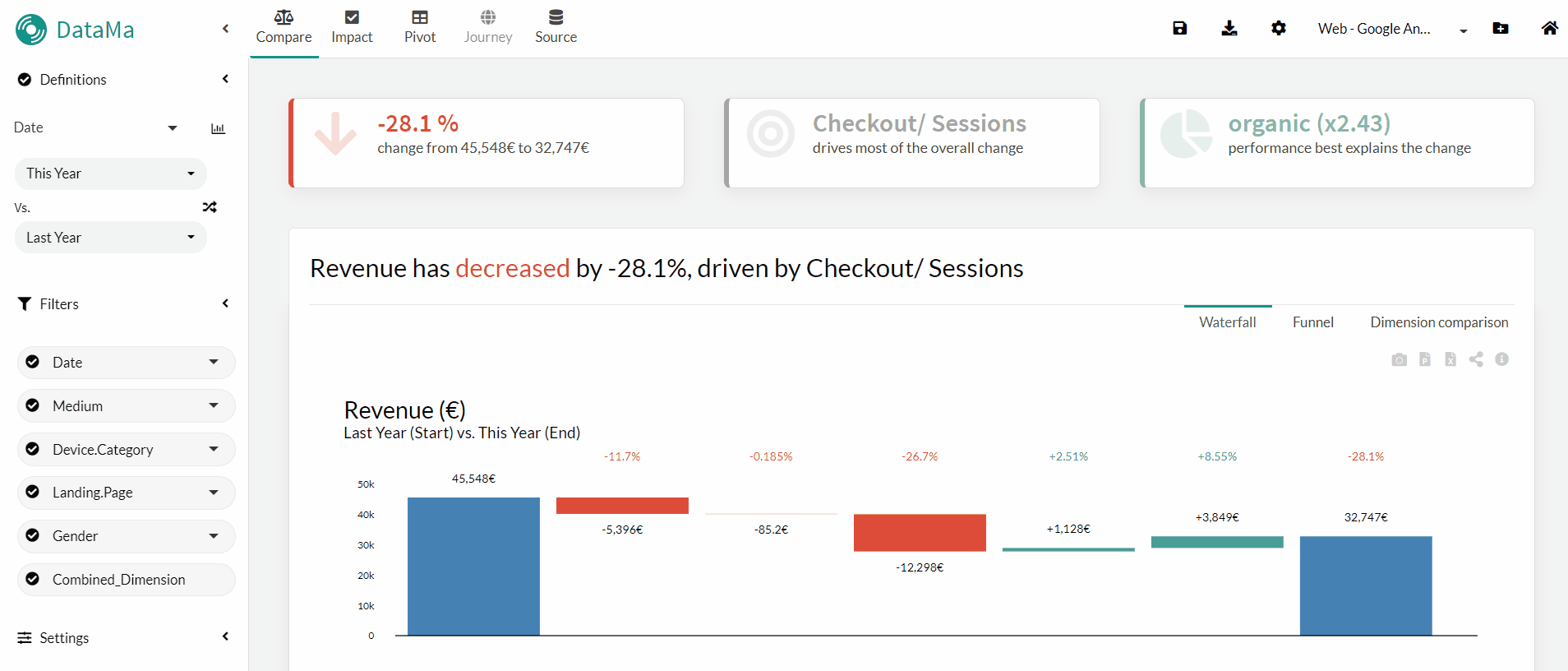
Tip of the week #80: Compact Numbers
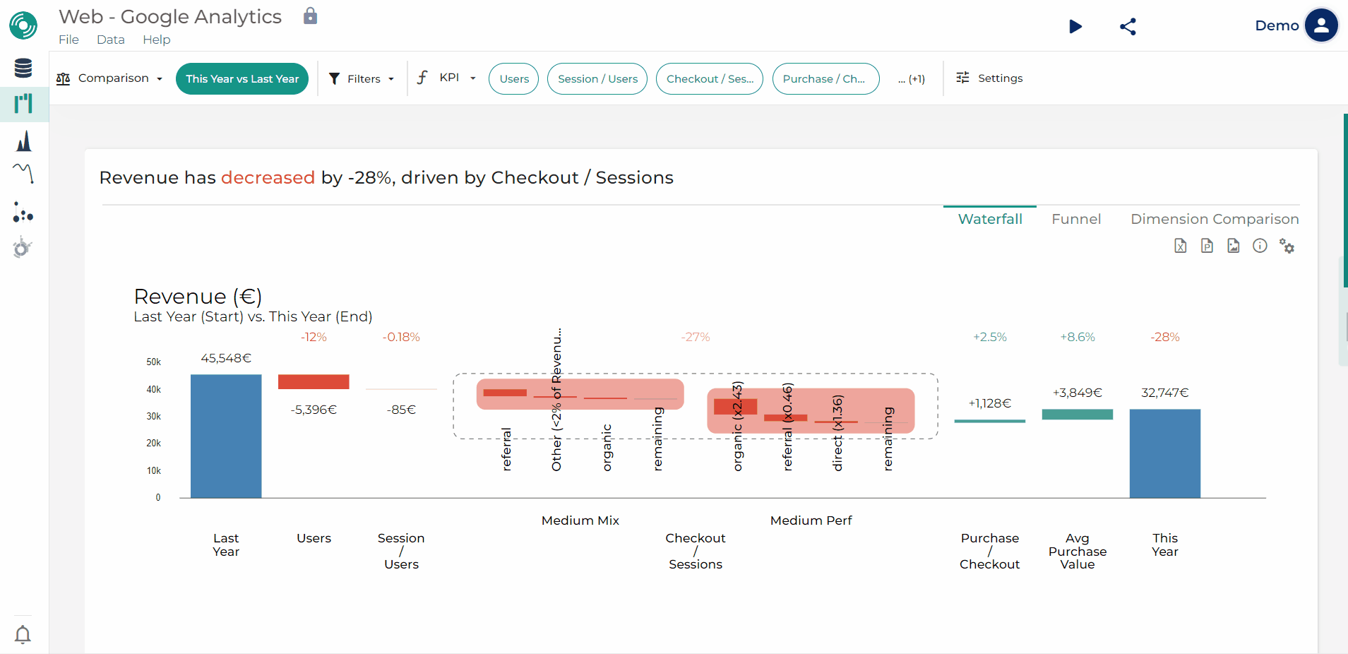
Here’s a little trick to lighten the visual of your graphs when you have large numbers. Go to “Settings” and select the “Compact Numbers” option to transform the labels into thousands, millions or more in increments of a thousand 😉 For example:
- if you have an income of €45,548, with the “Compact numbers” option it will appear as 45.5k
- if you have 11 342 764 visitors it will become 11.3M
- …
Tip of the week #79: Personalising the performance indication of a Waterfall segment
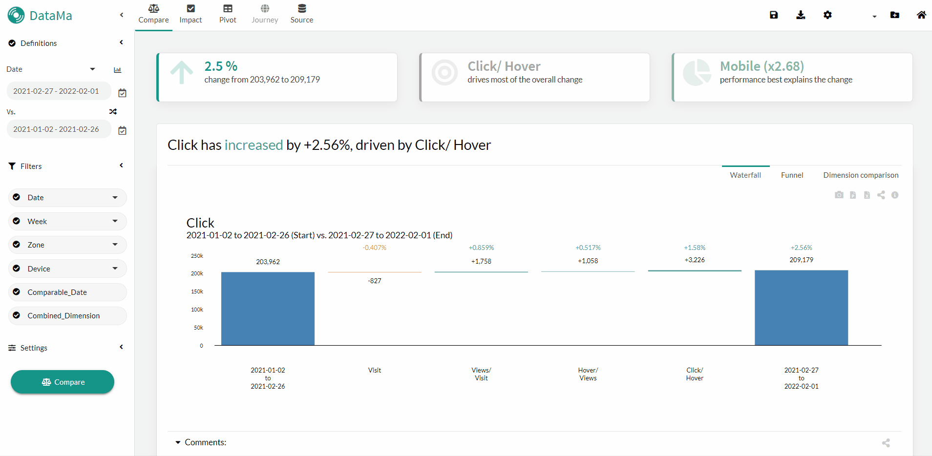
By default, Datama displays after the name of a segment its relative variation compared to the average variation (e.g. organic (x2.43)). You now have the option of modifying this additional text in the “Settings” by one of these three options:
- Display the variation relative to the average (default)
- Display the variation as a percentage
- Disable it
Whichever option you choose, all the information will still be available in the label when you move the mouse over a segment 😉
Tip of the week #78: Comparison Table in Datama Journey
While performing a user journey analysis in Datama Journey, discover our new feature: The interactive table 😎 By hovering your mouse over the different stages of the Sunburst, this table will allow you to :
- View the proportion of users at each stage of the selected route.
- For benchmarking purposes, the table provides a percentage view of users between your two comparables, as well as a view of the differential in points. 😉
Tip of the week #77: Filtering with REGEXPs
In a dimension when you have many segments, it is time consuming to select/deselect the segments you want to filter, nevertheless you have the possibility in the “advance settings” to filter with a REGEXP (Regular Expression) to save time 😉 Here are some use cases:
- On user journeys in Journey, if you want to filter all the journeys that have passed through a certain page (e.g. ^Search corresponds to the journeys of users who started with the Search)
- On dates, if you want to filter only dates containing the year 2023 or a certain month (e.g. 2023-03-.* for the whole month of March 2023)
- On media campaigns (ex: paid_search_.* for search campaigns)
Tip of the week #76: Dimension Helper
Do you know the “Dimension Helper”? 🤔 This will allow you to see in a synthetic way the value (in line) and the distribution (in bar) of the KPIs of your market equation on the segments of a dimension 🤩 To open it, just go to the “Filters” tab in the top bar, you will then be able to :
- select your dimension
- select the step of the market equation you want to follow
- have a better comparison, select the “Overlay” view
- apply filters on the different dimensions at your disposal
Tip of the week #75: Display waterfall in points
In Datama Compare, you can now display your waterfall in points (%) instead of the volume view of the total KPIs 🤩
To switch between the two views, simply right-click on the blue total bars and select “% Display impact in points” 😉

Tip of the week #74: Comparison date range available in Datama’s LookerStudio extension
Datama continues to improve its extensions in the visualisation tools. In Looker Studio you can now enable the “comparison date range” feature to compare B (the period you select in the filter) vs A (the comparison period you select in the dropdown menu: previous period, previous year,…), which will make it more dynamic to use 😃
Tip of the week #73: Secondary Comparison available in the Table
In Datama Compare you have the possibility to compare one variation with another variation, this is what is offered with the “Secondary Comparison”. This is useful when you compare for example one period to another and want to highlight this comparison with what happened in the same periods the year before.
The last release added the “Secondary Comparison” to the Table, now when you activate it a line will be added under each segment corresponding to the variation on this second comparison 😉
Tip of the week #72: CSV Skip Raw
Small improvement in Datama Prep, now you have an option to skip a certain number of lines in your CSV. For example, if you have a title when you export the CSV, no need to delete the first few lines of the file before importing it into Datama, you can select the number of lines to skip 😉
Tip of the week #71:
On the new version of Datama in the Compare solution, the table available in the second slide under the Waterfall has been improved 🥳
- With the addition of an expansion of each column and a small lock 🔒 allowing you to block the opening of a column to have several open
- With the addition of new columns: Rank and Rank Change, which allows you to know the ranking of a segment on a metric (eg. the desktop is #1 in conversion) and the variation of this rank between the two points of comparison (e.g. the desktop was #2 in conversion and it is now #1)
- With the implementation of a table configuration menu that will allow you to:
- Change the order of the columns
- Display the columns you want to see
- Apply conditional formatting (colour, bar, up & down arrow …)
Tip of the week #70
With the arrival of the new version of Datama, in addition to the graphic redesign, we have also improved the functioning of the “Use Cases” 💡
- Indeed, Datama Prep has become a unique tool for loading and transforming data
- And we combined the “Use Cases” and the “Flows” to create only one element the “Workbooks” And this has impacts (positive ones, of course 🤩):
- Only your old flows created via Datama Prep have been switched to the new solution
- fortunately the Datama team will accompany you to help you migrate the other Use Cases during the next months 😉
- But above all this evolution allows you to clarify the information of your analyses, by displaying from the home page for each Workbook :
- a clear view of the connected data source(s)
- the various scheduled exports (Mail, Slack, statistics URL, …),
- the favourite solution used for this analysis
- the folder it belongs to
- and many other information to come 🎁
Don’t hesitate to contact us to know more about this migration… and above all… go have a look at the new platform!!!
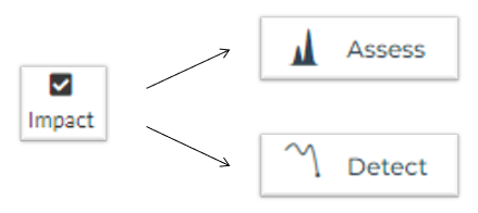
Tip of the week #69
You may have noticed that in the new version of Datama,the “Impact” solution no longer appears. It has been split into two separate solutions “Assess” and “Detect” in order to meet two needs:
- Assess: will allow you to determine the significance of your variations through different tests (Bayesian, Bootstrap, Frequentist) at the global level and on each of your dimensions
- Detect: will focus on the detection of anomalies, whether it is one of your KPIs or all of them, with an explanation of the origin of the anomaly 🔍
Tip of the week #68
In the new version of Datama, the old left-hand menu, where the filters were defined, is now in the top bar.
By clicking on the “filters” button, all filterable dimensions existing in your dataset will appear.
The “Helper” 📊 is a graphical aid to see the distribution of the elements of your dimension on one of the steps.
The applied filters will appear in the top bar next to the “Filter” button. You can then edit a filter by clicking on it or delete it by clicking on the small bin 😉
Tip of the week #67
In the new version of Datama, Flow Prep is an integral part of your use case. Therefore, you can navigate from it thanks to the left side bar to the solution(s) (Compare, Detect, Pivot …) you want to use.
Moreover, a favorite icon ⭐, allows you to define the solution you want to open by default from the Home Page 😉
Tip of the week #66
With the new version of Datama comes a new Home 😃 In addition to the existing features, you can now:
- Organise use cases in folders with pretty emojis 📁
- Visually find out which sources they are connected to (under the name of your use case, there will be the logos of the sources, for example: that of two Google Sheets™ and one Google Analytics)
- See when they were created/edited last
- Add a link in the worbook description to internal documentation (by clicking on the three small dots at the bottom right and adding a URL to “Learn More…”)
Tip of the week #65
When comparing two segments in the case of an AB test or when comparing two time periods, you can ask yourself the question: is the variation significant? :pensif: In Datama, all you have to do is activate the “Significance test” toggle in Settings, then you can choose
- the level of confidence you want to have
- the type of test (forecast / volatility when comparing two periods, frequentist/ bayesian when comparing two variants of AB test)
On the waterfall, an asterisk will appear next to the variations that are significant, this applies to both the main KPI as well as to each of the steps 😉
Tip of the week #64
In case you have some of your data that is “non-comparable” in your Datama Compare analysis (e.g. closing a market), but you still want it to appear separately in your Waterfall, to compare your KPIs only on comparable things (🍎 to 🍎):
- Create a “Scope” column containing “In” for what you want to keep or “Out” for what you want to exclude
- Datama will automatically exclude the “Out” from the analysis and show it in a separate block in the Waterfall, in light blue “Out of Scope”
Note: you can also treat the “Out of Scope” as a separate step by making it appear explicitly in the market equation. For information the covariance is now redistributed only on the steps that are not independent (not to mix pieces of 🍎 with 🍐)
Tip of the week #63
To facilitate the communication and sharing about augmented analysis, Datama is deploying a new Data Visualisation solution:
- After the Tableau Software extension,
- Datama arrives on Data Studio/Looker Studio 🥳
- The next step on Power BI!
Tip of the week #62
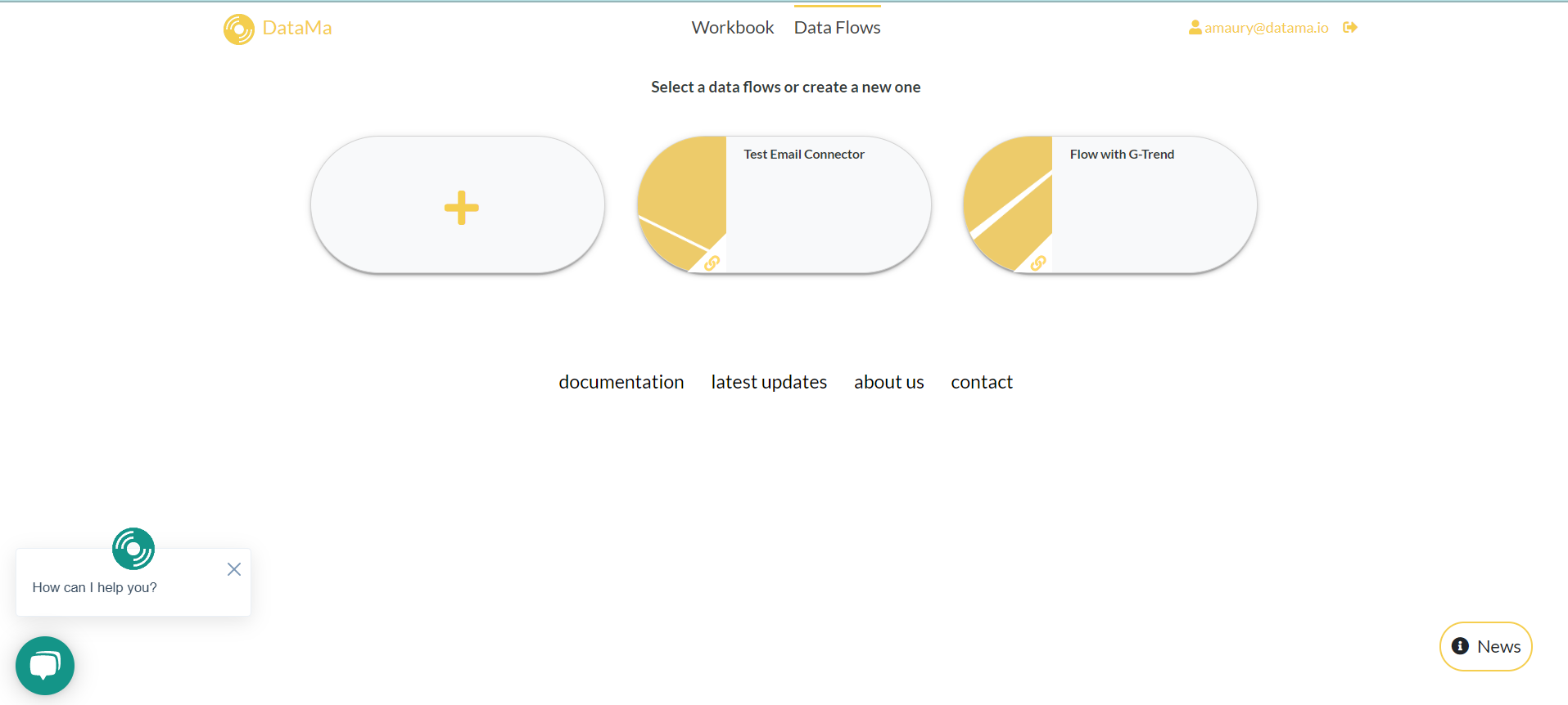
The new Datama interface is coming soon! (Stay tuned 😃) Spoiler: it’s based on the Datama Prep interface you already have access to. This is your chance to test Datama Prep if you haven’t done so yet! 😉 On the HomePage, click on Data Flows then on the ➕ and you will be able to:
- Find all the connectors you had and many more (BigQuery, Snowflake, Google Trends …)
- Clean and prepare your columns
- Scheduling the update of your data source
Tip of the week #61
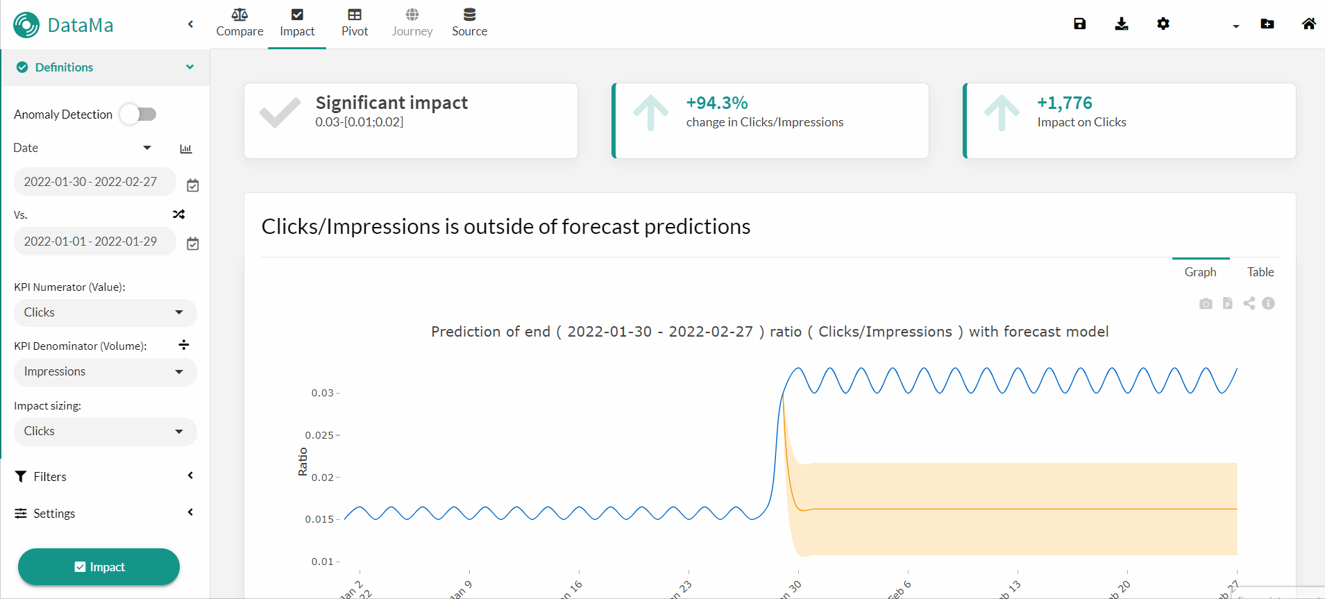
In the Impact solution, Datama offers you the possibility to analyse the pre-post variation of an intervention on a test group. You will find use cases whenever you want to test:
- a new SEO strategy
- the impact of a new advertising campaign
Find the detailed analysis in our documentation
Tip of the week #60
As in many countries, last weekend we switched to winter time ⌚ To avoid confusion in the schedulers on Datama (e.g. for Datama Prep, statics exports or by mail), the time displayed is the time in UTC +0, so it’s independent of your time zone.
PS : stay informed of the latest information thanks to the notifications on the home page 😉
Tip of the week #59
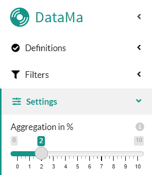
Whether you’re on Compare, Pivot or Impact, you’ve probably seen a segment named “Other (<2% of the total)” which aggregates all the smaller segments into one to lighten the visualization and interpretation of results. Nevertheless, you can adjust this setting by going to “Settings” → “Aggregation in %”, you can then:
- either increase this aggregation level up to 10%
- or decrease it to get into the detail of this segment
Tip of the week #58
Do you know the dynamic filter on the Waterfall? After zooming in on a step, right click on one of the displayed segments and select either :
- “Keep only”: to filter only on the selected segment
- “Exclude”: to exclude the segment in question
The corresponding filters are automatically updated in the left menu :clin_d’œil:
PS: to return to the initial state, you must reset the filters in the left-hand menu
Tip of the week #57
In Datama Compare, if you want to zoom in on several steps at the same time, you can force the open step to remain visually open on the selected dimension, either:
- with a click on the lock 🔒 at the top right of the zoomed step
- with a right click on the step, then select “Lock”
To unlock the step, do the same thing by clicking on the lock or with the right click you will have the option “Unlock” 🔓
Tip of the week #56
In your waterfall, if you want to visualize the variations more finely, you can shift the Y axis so it doesn’t start at 0, for that you just need 3 clicks:
Go to “Settings” → then “Display Options” → disable the toggle: “Y Axis Include 0” and press “Enter” 😉
Tip of the week #55
Don’t forget to save you workbook 💾
Did you know that all you had to do was press the “Ctrl + S” shortcut on your keyboard to save your workbook in Datama?

Tip of the week #54
New connectors are available in Datama Prep 🥳
- The Email Connector: it allows you to load CSV files from your emails, which helps you to easily retrieve data from different platforms such as Teads, Forms, Pinterest and many more.
- Snowflake Connector: with a simple connection to your account, you can directly import your Snowflake data into Datama
Tip of the week #53
Tip of the week #52
A little ad for a change, but that might interest you… Do you know the Datama sponsorship system? Because our customers are our best spokespersons, a little reminder for those who don’t remember:
- you earn -20% on your Datama license for 1 year for any subscription of a customer referenced by you! 🥳
- and the goodies that go with it… the Datama down jacket is yours 😊
By the way, we share with you some Q2 references at home or elsewhere, to give you news and ideas 💡
Tip of the week #51
Little tip for Datama users, in Datama Compare when you want to do a breakdown of a Waterfall step, Datama will by default make you a split by the dimension with the highest “interest score”.
However, you can choose a breakdown by another dimension by right-clicking on the step you choose and clicking “split by…” and you will see the available dimensions appear with the associated “interest score”. Higher is the latter, more relevant the variations of the segments will be.
Tip of the week #50
You want to integrate Datama directly into your dashboards? Are you working on :
- Tableau? Use the Datama extension in Tableau (see documentation)
- Power BI? Follow this process to use the Datama extension
- For any other online data visualization solution like DataStudio, you can use static exports, that you can schedule (with the “Automatically Schedule” option) so that the graphs update with your source.
PS: if you want to export all the exportable graphs of a solution, do the export from the export button next to the “Save” button, otherwise export only the desired graph with the button at the level of the graph “Export graph as Public URL »
Tip of the week #49
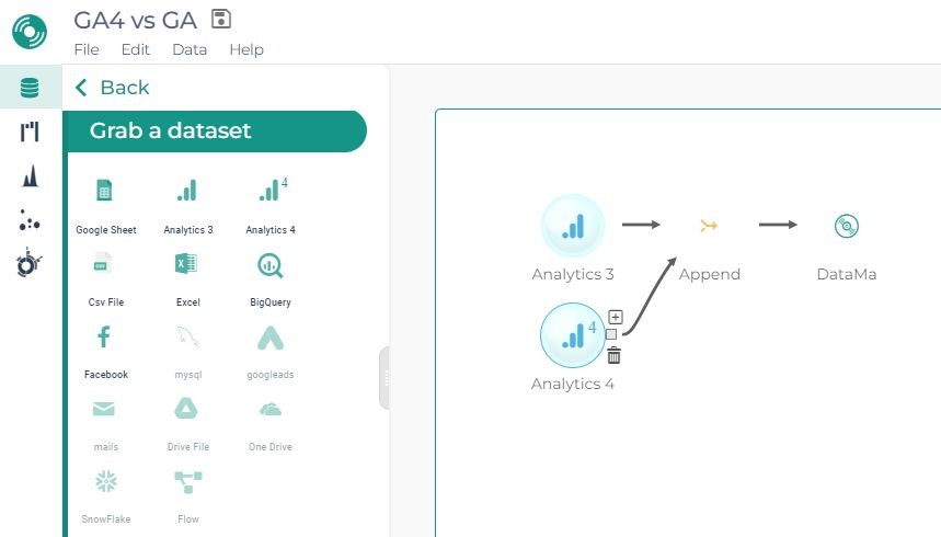
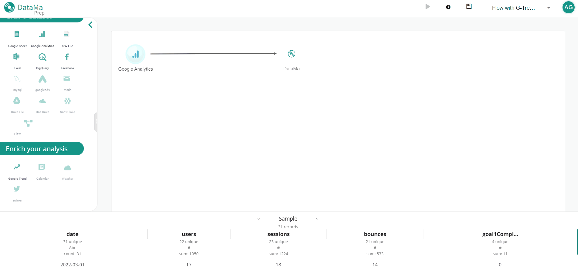
A new Datama release includes a new connector! Test the GA4 connector in a very simple way, for example to check the consistency of your data with that of GA3, for this:
- Prepare your DataFlow in 3 clicks as in the image
- Open it in Datama Compare
- Identify what needs to be improved/corrected
Tip of the week #48
You want the date range of your use case to evolve according to the update of your source, it’s very simple when creating your use case, select the desired period, then when saving, check that the “Dynamic saving of Start & End” box is checked ✅ If your source is updated daily 📅 and you want to do, for example, a weekly analysis compared to the same week last year, you need to create a Year-Week dimension and repeat the above operation by defining this new dimension in Start/End. This use case can be set up for analyses:
- Weekly
- Monthly
- Quarterly
- Annual
- Custom (if you want to update the data not from the most recent but from the oldest, you can uncheck the option “Use decreasing order” which is under “Dynamic saving of Start & End” in the Save As menu ) ⚠ Note: your data source must either
- include Full Last Year and This Year To Date data
- or have exactly the same number of weeks/months/… at each update
Tip of the week #47
Did you know ? You can download the source used by Datama, to do this go to the Source tab, then just below “Full Data Source” click on the Excel icon to download your source in Excel format.
Useful when the source was created in Datama Prep or via the GA connector and you want to check its figures!
Tip of the week #46
Datama Prep continues its expansion with the arrival of the Facebook Ads connector in addition to those existing 🥳
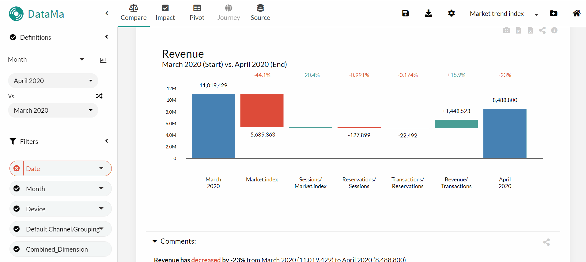
A little reminder for those who want to take into account the effect of the evolution of their market in their analyses, nothing could be simpler on Datama Prep, you can do it in a few clicks with the right Google Trend index, for more precision do not hesitate to consult this article
Tip of the week #45
Did you know, you have the possibility to see your ratios or the value of your steps thanks to the “Ratio Definition Helper” available by clicking on the “chart” 📊 next to the Include Step in the Settings in Compare or the “division” ➗ next to KPI Denominator in Pivot.
To have a vision with the two segments selected, consider activating the Compare mode in Pivot 😉
Tip of the week #44
To complete your analysis in Datama Compare, discover the “Comparison Definition Helper” available by clicking on the “chart” icon next to the Start/End Dimension. It allows you to follow the evolution over time of the chosen ratio (in curve) and its denominator (in bar 📊).
An “Overview Overlay” is also available to compare the Start and End periods.
Tip of the week #43
Today a little tip to go further in your analysis on Compare, it’s possible for you to activate the “Compare of Compare” option in the settings.
This visualization will allow you to see in the background of your Waterfall the variations over another period
So you can highlight the results you are analyzing by comparing it, for instance, to the same period of the previous year.
Tip of the week #42
The Datama Prep beta, which allows you to work on your sources directly in Datama, is evolving. A small overview of recent features:
- Direct connection to Bigquery
- Creation of filters
- Addition of calculated fields
If you haven’t discovered it yet, request access to your Datama CSM, then go to the “data flow” tab on the Datama home page.
Tip of the week #41
You are afraid of missing the abnormal evolution of one of your indicators, Datama allows you to automate anomaly detection. You will then benefit:
- For each anomaly, a notification by email or Slack
- An explanation of the reason that drives the variation
- Time saving and a better responsiveness when an anomaly occurs Find out how to implement it in the article: Anomaly detection and explanation with Datama
Tip of the week #40
We have improved our wonderfull Waterfall, a first step in our technological overhaul that will facilitate the creation of new uses in the future. You can now:
- open the details of several steps at the same time
- have static exports of the Waterfall which are interactive
- drill down easily within boxes
Find the latest changes in our last release!📑
Tip of the week #39
Get inspired in your analysis with those new articles 📰 on our blog!
- Measure the impact of your consent tool: here
- Monitor the performance of your acquisition campaigns: here
- Take into account market trends in your analyzes: here
Do the same at home! Then send us your results 😉
Tip of the week #38
Latest release of Datama hapenned this weekend :slightly_smiling_face: Among others, Datama prep is now available in beta:test_tube: , which allows you to generate a dataset for Datama in a simple and visual way, conbining multiple sources No more time wasted with 25 worksheet in Gsheet :nerd_face:
- Multiple connectors for Datama, including Google Analytics and Google trends
- Easy data manipulation including Pivot/ UnPivot/ Renaming/ Column Ordering/ Append
- Scheduleur available to get data fresh and ready for analysing in Datama Test it by asking to your Datama CSM, then go to the “data flow” tab on the home page of Datama
Tip of the week #37
It’s hard to keep up with the frantic release pace of the product team :sweat_smile:
The latest release was a few weeks ago (see the release note)
On the menu is the anomaly detection in Datama Impact, which allows to quickly identify an abnormal point in the monitoring of a KPI, and then to understand its drivers.
Compatible with the classic Datama sources, you just need to activate the ‘anomaly detection’ toggle at the top left of Impact to see the results appear, which will soon be automatically exportable in a slack or an email :bell:
Read this article to learn more, and contact us for a demo!
Tip of the week #36
📢 Lots of new stuff on the platform this week! You have the full list here.
In particular, a great news for analysts whose beautiful graphs always end up in slides (we know some of them 😅 ): you can now download all Datama graphs and comments on PowerPoint in one click. Just click on the “ppt” icon on the top right of the graph.
Boom 💥
Tip of the week #34
Whether in Tableau or Power BI, transparently display your Datama graphs 🤓
- Datama directly retrieves your data in your dataViz tool
- You only need 3 tabs in Tableau:
- 1 for data
- 1 for Datama configuration
- 1 to make a beautiful dashboard
Find more information on our online documentation ! 📕
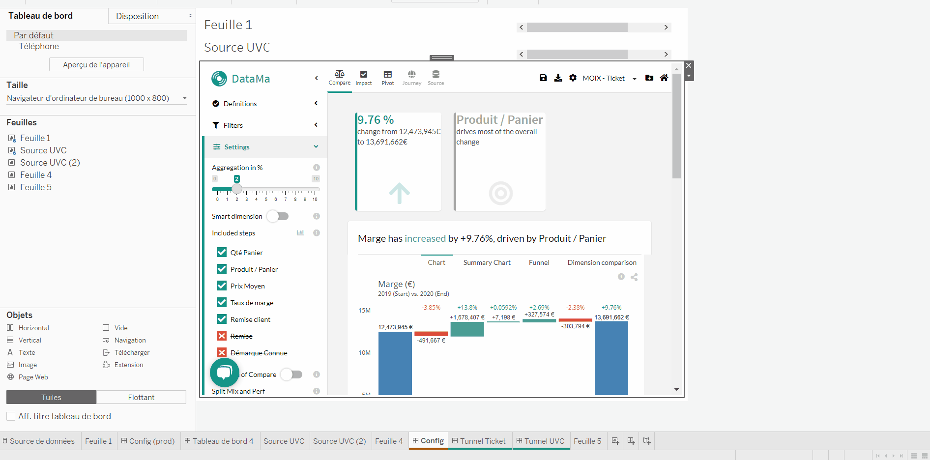
Tip of the week #33
Again, another release this week 🎉 !
Within the news, the ability to visualize ratios of your ‘market equation’ side by side.
For instance, the click through rate of each page of a funnel on the same bar chart
📊
Named ‘Ratio helper’, this visualisation is useful to know which ratio is under/ over performing even before trying to understand the drivers in Pivot.
You can see it by clicking on the ➗ in the settings.
To learn more, click here.
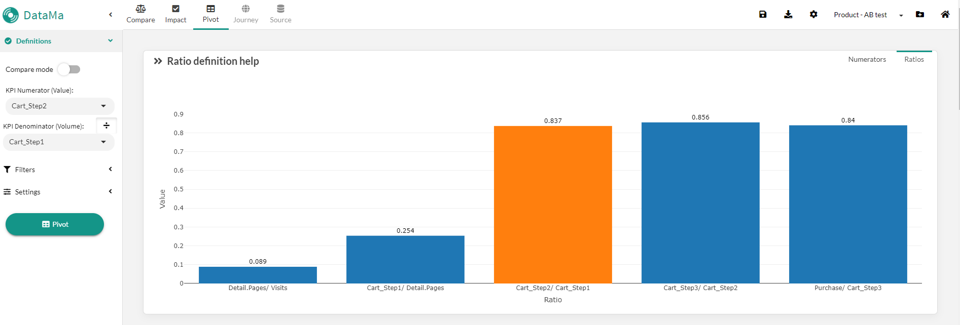
Tip of the week #32
🤔 We often try to improve what drives its performance downwards rather than showing what is already going well … and that’s why we have implemented the functionality: Negative drivers first: ↘️ !!
- By activating this feature in the settings in the left menu, the solution will display as a priority for each step the segments that are driving the performance down
- This feature comes in handy when you have a growing stage, a lot of different segments, and you would like to focus on the ones that have gone down rather than seeing the ones that are doing well.
- We also take the opportunity to redo the scoring of the dimensions by looking first at the dimensions whose segments best explain the decrease (even for the increasing stages)
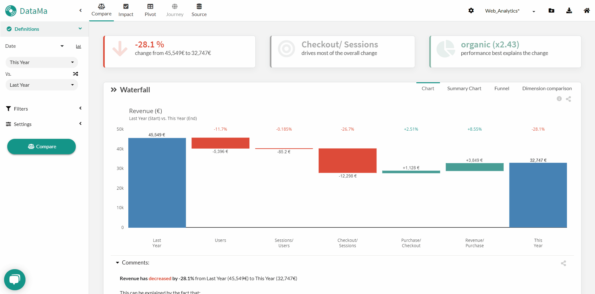
Tip of the week #30
🚒 Following the events at OVH, here is some information on the situation of Datama hosting:
- Being hosted at OVH, we were impacted by the shutdown of services following the Strasbourg fire, but ultimately without much consequence because we were able to switch the solution to other servers in Europe.
- A few hours after the shutdown, everything was back to normal, the backups worked fine, everything was restored on solutions.Datama.fr 🤓
- We even took the opportunity to increase the power of the platform. 🚀
- Do not hesitate to come back to us if you have any access problem.
- Thank you for your understanding and again sorry for the inconvenience.
Tip of the week #29
🆕 Multiple news on Datama this week, including some great features. Within them, “right click” 🖱 on Datama Compare waterfall is now available. You can easily decide to:
- Zoom on a given step to see the details of a dimension (left click equivalent)
- Skip (collapse) a step in the funnel
- Filter/ Exclude a given segment
- Change breakdown dimension
- Show more segments in a dimension
Your turn to test it!
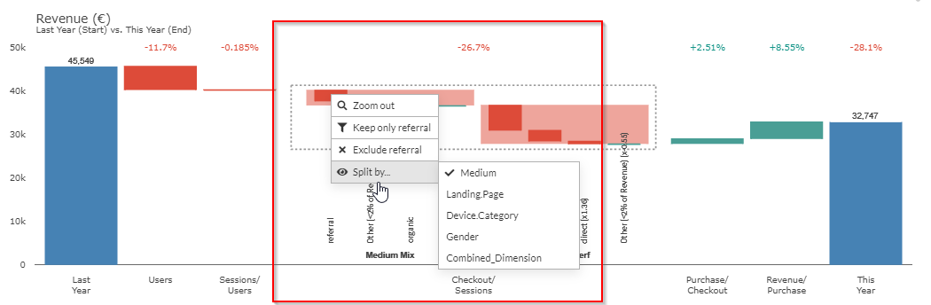
Tip of the week #28
Afraid of explaining what’s a mix effect in that meeting with the Datama Waterfall 😨 ?
Good news, you don’t need to show it. Just de-activate the split between mix and perf in the settings. Datama will then group the two effects and just show negative and positive total variations instead.
Tip of the week #27
Datama Pivot now has its own smart comment 📝! You can find your insights in bullet points under each chart of Datama Pivot, as if an analyst would have work to get what you need!
This new feature is part of a set of releases from this week that you can see on https://Datama-solutions.github.io/docs/#/news
Enjoy 😄
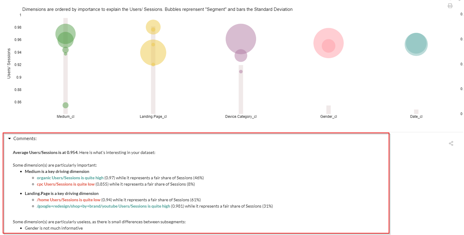
Tip of the week #26
The Datama team wish you a happy new year 🎉 ! In case you want to filter out and forget this 2020 year 😷 from your analysis, we have what you need… with the new filter interface you can, in 2 clics:
- ✔️ select segments that you want to keep
- ❎ exclude a dimension from analysis using left button
- Combine the two previous points
The launch the calculations by hitting the button at bottom left (‘Enter’ shortcut on your keyboard)
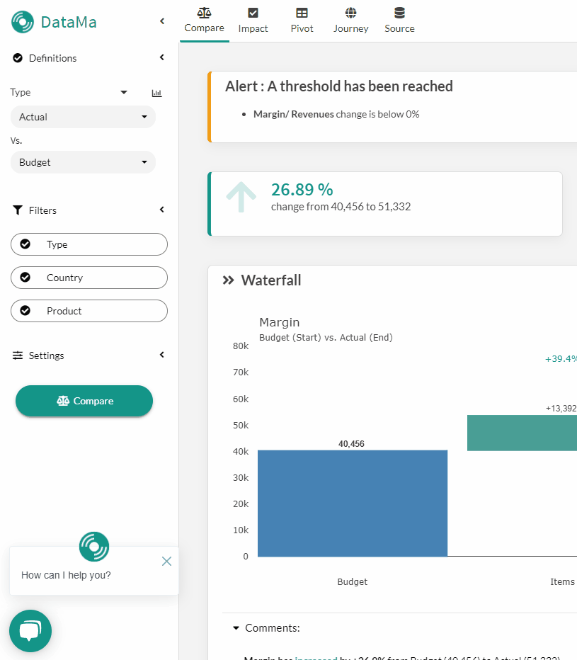
Tip of the week #25
At Datama, it’s Christmas every day. 🎅
Why? Because you don’t need to wait for December the 25th, to write a wish list to Santa.
Why? Because you don’t need to wait for December the 25th, to write a wish list to Santa. You just need to send us your ideas for features/ improvements by chat, directly in the app or through this channel, and it will go straight in the product pipeline. And pipeline sprint is typically less than 2 weeks for prod… ⏩
Now you’re turn ✏️ and merry Christmas 🎁!
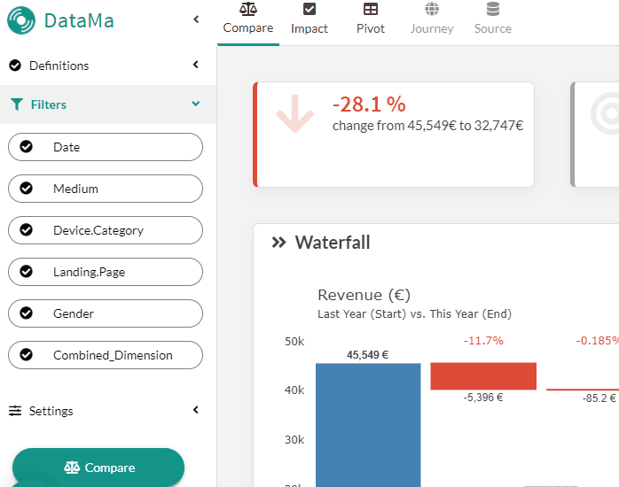
Tip of the week #24
As annouced, new UI of Datama is now in production on solutions.Datama.io 🎉
You can find everything that’s new in the release note here
Within the news, we introduce a home page 🏠, which shows all your workbooks.
Each ‘Card’ is a use case.
From the home, you can easily:
- ✏️ Edit a workbook
- 🔒 Block a workbook to avoid edition
- ❎ Delete a workbook
- ⚖️ Launch any workbook on any Datama Solution!
Learn more on the Home here !
Tip of the week #23
Datama is getting a new look! Christmas comes early this year 🎁
In a few days, you will discover the new Datama interface, including:
- Your use cases directly accessible from the home page
- New experience in the use of filters
- A “source” tab to be able to view a summary of the data
- A more beautiful interface ! 😊
And a multitude of small improvements which are the fruit of your constant feedback… Thank you for your feedback and keep sending us your improvements wishes! 🙏
Tip of the week #22
A quick - yet not dirty - analysis from a spreadsheet into Datama?
✂️ Just copy the cell range (Ctrl+C) and paste it straight in Datama (Ctrl + V).
Easy enough?
Tip of the week #21
When you save an analysis in Datama, and if that analysis is linked to a “live” source (e.g. a Gsheet), Datama suggests to save the “Start” and “End” settings as dynamic.
Although that might look a little technical 🤓, this feature is quite useful for recurring analysis, because it allows to automatically adjust the time window 🗓.
For instance:
- At time t, you have in your data source a “Week” column with possible values week 24, week 25 or week 26.
- Still at time t, in Datama COMPARE you’re comparing week 25 to week 26 . You save this use case dynamically. Datama records that it is the last 2 values in the alphabetical order that you want to get in your comparison
- Now, at time t+1, your data is updated with one additional week. Now in your “Week” column you have week 24, week 25, week 26 and week 27.
- Datama will now automatically update your comparison (in the app, but also in your exports, by email, slack etc), taking the last 2 values in the aphabetical order. So you will move the comparison automatically to week 26 vs week 27
➡️ Therefore your analysis keeps up to date in a automated way, without having to change the settings 🤙!
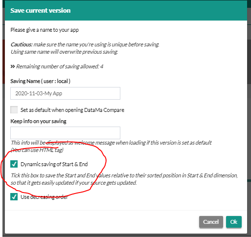
Tip of the week #20
Because September has just passed and we’ve been working hard all summer, the new backtoschool version 🎒 of Datama is available in production!
On the agenda:
- Dynamic Google Analytics connector
- Extension of shareable widgets on viz tools
- Bootsrap test in Datama Impact
- Datama Journey UI redesign and performance improvement
- Interactive table in Compare
- and many more listed here: https://Datama-solutions.github.io/docs//#/news
Thanks to all contributors for their ideas and your constant feedback on the tool!
Stay tune, there’s a lot more to come… 🚀

Tip of the week #19
When we analyze a variation via Datama COMPARE, we sometimes need to check its significance 🧐
- Datama COMPARE gives you the size of the effect also called amplitude of the effect 🌊
- and Datama IMPACT will give you the combination with the power analysis (which ensures that the impact reaches a sufficient number of individuals) 👨👩👦👦
To find this combination of amplitude and power analysis you can of course use Datama IMPACT, but also within Datama COMPARE, where you also find the Significance Test functionality. A very useful feature when you want to ensure the interest of the variation that you observe! 💥
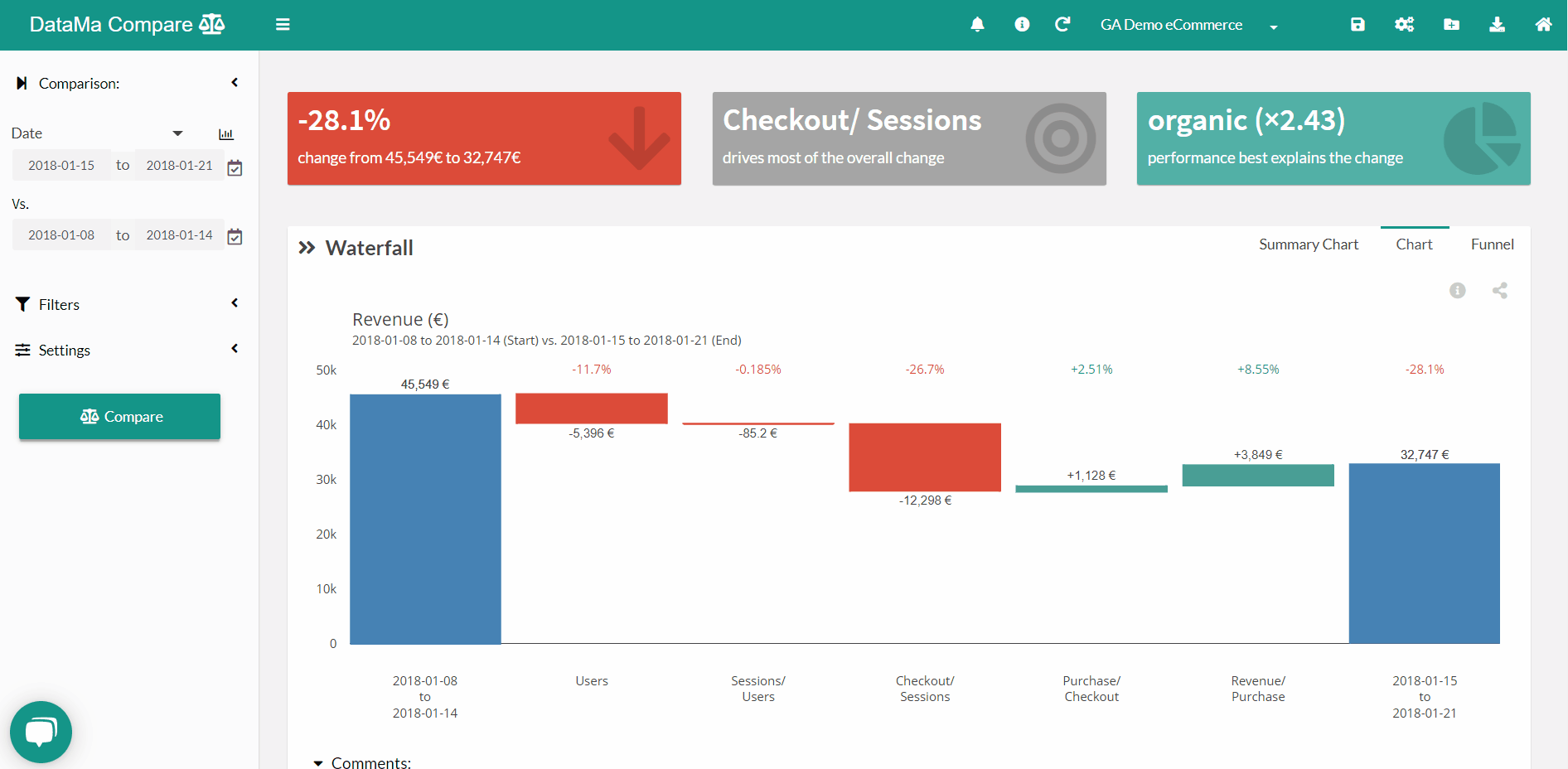
Tip of the week #18
In case you’re getting bored at the beach 🏖, we have what you need: Datama documentation 📖 …
➡️ 🔗 here is you’re best summer read!
And as we acknowledge that we sometimes don’t manage to keep up with the crazy pace of releases in the product, we’ve made you able to contribute on each page and suggest your own modifications by clicking on the “Edit document” link at the top of the page ✍️ ! #communitycontribution #thanksforyourhelp!
Tip of the week #17
As an analyst, we often try to analyse the performance of a segment compared to the rest (for example the performance of the Mobile compared to other devices) … Datama has just implemented a new feature that does just that! 🤓
- When you filter on a particular segment, you now have access to the “Display other segments” function just under the filter,
- This function will show as main information in the waterfall chart the segment that you have isolated and behind it, the variation of the other segments.
Very practical when you don’t want to open 2 windows on your computer to compare variations between them 😉
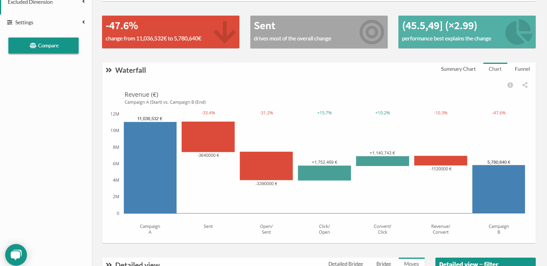
Tip of the week #16
You don’t have time to open the Datama interface … receive your analyses directly in your mailbox or on a Slack channel 📨
- By using the menu “export result” you can schedule for you or your boss an export directly to a mailbox at the frequency you want. 💡  Tip: as seen above you can just as easily share your Datama graphs in a Data Studio (or others) and configure the sending of emails from your data viz tool!
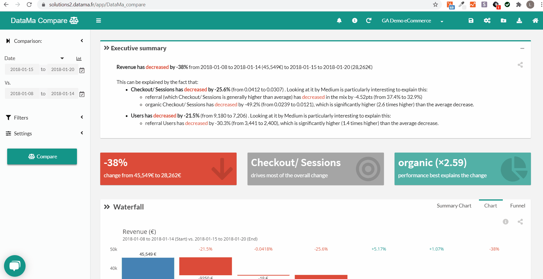
Tip of the week #15
➡️ Want to find new ideas to leverage Datama 💡?
Here is a set of ideas and corresponding dataset examples:
- Period to period conversion comparison
- Email campaigns comparison
- AB test analysis
- Finance Budget vs. Actual controlling
- In page product analytics between two pages
- Media display campaigns ROI
- NPS evolution
- Churn Rate
- … and much more that we can build together!
Feel free to reach out if you have new ideas that you want to share or build together!
Tip of the week #14
In the new features released during the containment, we find the functionality: Export graph as public URL :bar_chart:
All graphs from Datama solutions can now be exported to your Tableau, Data Studio dashboards… or to your web browser!
This allows you to enrich your usual reporting with Datama charts:
- In Datama, at the top right of each graph, select the icon: “Export Graph as public URL”
- Authorise the rights to share this secure URL
- Then use this URL as a block “URL” in your usual data visualisation tool and voila!
The data in this new widget is constantly updated with the data loaded into Datama.
Note: This feature is enabled on demand, contact us if you want to enable this feature.
Tip of the week #13
When you want to use Datama, you often wonder about the data… 💻
How do I connect my data into Datama? How do I get my data (and therefore my charts) updated as I go? One of the solutions…is Google spreadsheet! 💡
- In Google Spreadsheet, you can, thanks to the extensions available in the solution, connect any data source (here for example Google analytics)
- Once in Datama, by creating a new Use Case from the URL of the Gsheet, you can specify (by checking the box: Keep Live connection with Gsheet) that you want the data to be automatically updated….
- And that’s it…
You can also use other extensions such as “OWOX BI BigQuery” for your BigQuery queries or the “Supermetrics” add-on for connection to all other applications on the market!
Tip of the week #12
🆕 New header has been released on the platform !
Not only it makes admin functions (new data source, export etc) easier and more intuitive to access, but it also adds some cool features:
- Switch between Datama Solutions (Compare, Impact, Pivot, Journey…) in the same page 🔄
- See if workbook has been saved or not easily with workbook name at top of page
- Quickly save under same name (with “Save” on top of “Save As”)
Happy to have your feedbacks while testing it!
Note: this new header replaces the “Admin” menu that used to be at bottom left of the page
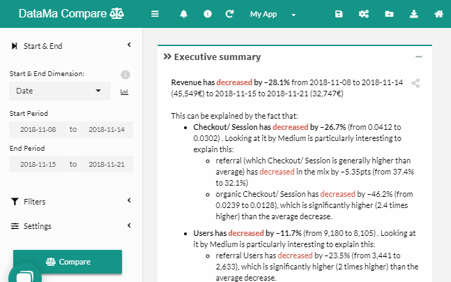
Tip of the week #11
In these troubled times 😷, you have some of your data that is “non-comparable” in your Datama Compare analysis (like a distribution channel… that no longer exists 😕!), but you still want it to appear separately in your Waterfall, to only compare your KPIs on comparable things (🍎 to 🍎)?
➢ Create a ‘Scope’ column with ‘In’ for what you want to keep or ‘Out’ for what you want to exclude
➢ Datama will automatically exclude the “Out” from the analysis and make it appear in a separate block of the waterfall, in light blue “Out of Scope”
See a concrete example ici !
Prepared with ❤️ from home, we think of you and accompany you on all your subjects from a distance!
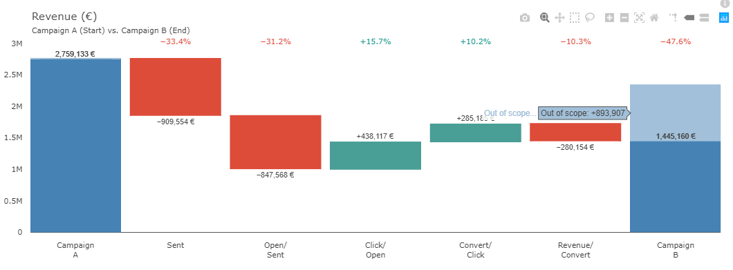
Tip of the week #10
When using Datama COMPARE to compare two time periods. You can set up the solution so that your analyses in Datama are always up-to-date with your latest data. 🏃♀️
All you need to do is:
- Load a new source (“Change source” menu) via a “Google Sheet”.
- Then select the option “Keep Live connection with Gsheet”.
- Once the analysis is in place, you must save the use case by leaving the option “Dynamic saving of Start & End” selected. Be careful that the dates used as Start and End exist in the dataset!
- From the interval used for Start and End (1st week compared to the 4th week of the dataset for example), Datama will reproduce this same interval according to the last existing data…
Once your data updates itself, all you have to do is set up a regular send to your mailbox or a Slack channel and you’re done!
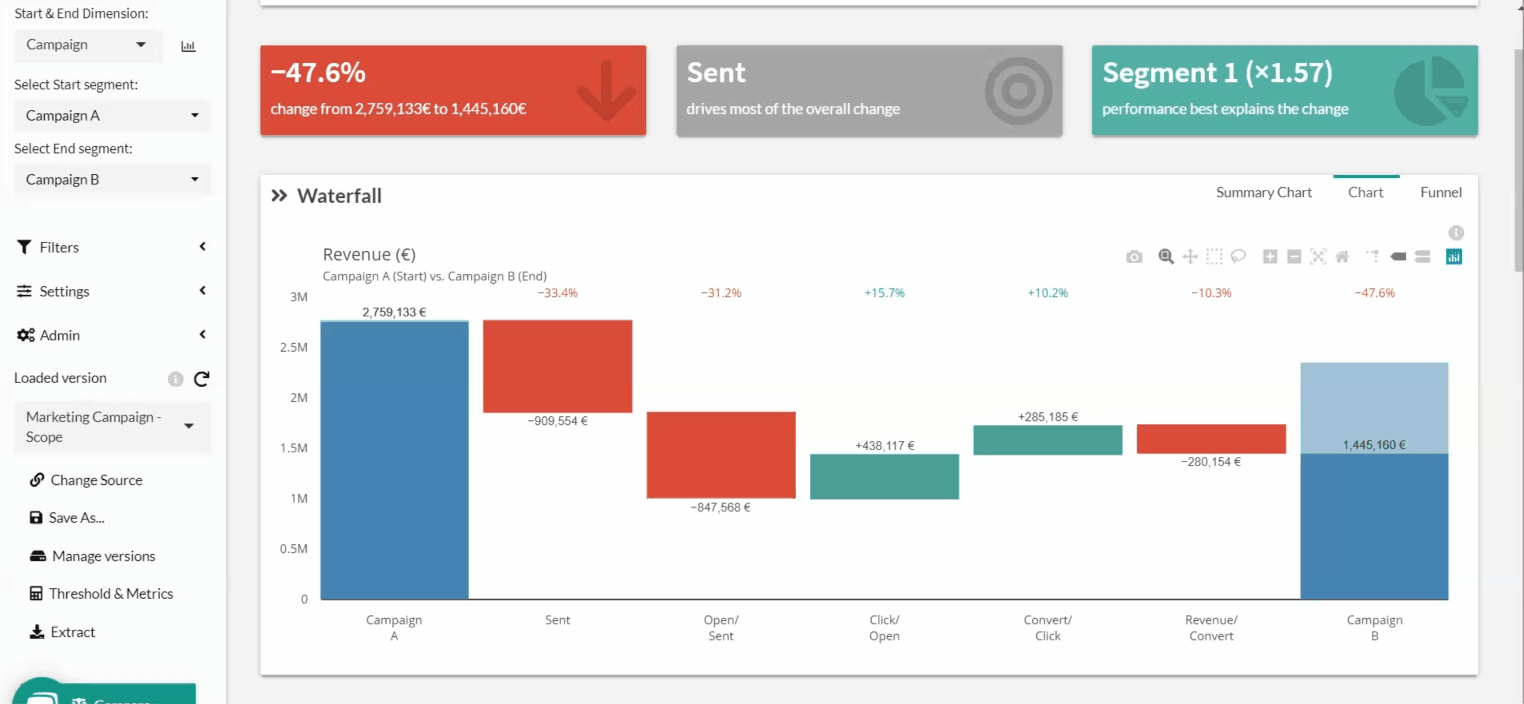
Tip of the week #9
To speed up your analysis we have accelerated the loading of your data. 🚀
In Datama, you can now:
- Copy & paste your Excel tables or Gsheet URLs.
- drag & drop your data files (excel, csv).
Datama recognizes the source directly and offers you to launch the analysis directly!
Tip of the week #8
You can now use Datama as a Tableau extension ➕ !
You drag and drop the extension provided by Datama into your Tableau dashboard, and you access from Datama the data viewed in a Tableau worksheet.
Not only is your data up-to-date with what you already have in Tableau, but your filters and other actions in Tableau are then active in Datama! 🔄
For more information: https://www.docs.Datama.fr/docs/extensions/tableau-extension/
Tip of the week #7
-
Did you know that all you had to do was press the “Enter” shortcut ️ in your keyboard to update the calculations in Datama?
-
Now yes 🙂

Tip of the week #6
Lost in Datama :question:
In addition to the documentation, there is now a tutorial that interactively guides you through your first steps on the app 👣
- Click on “Launch tutorial” at the top right of the screen to get you started! 🧗♂️
Tip of the week #5
You can easily filter your analyses in Datama on a part of your source dataset.
- Simply exclude an entire dimension from the analysis using “Excluded Dimension”. Datama will no longer report this dimension as the one that can explain the variation in your performance, but this does not change the total performance you are explaining.
- Filter on only part of your data by using the filters, selecting the dimension and then the segment(s) of that dimension to keep. You can filter on two dimensions at the same time (Level 1 and Level 2). These filters will appear in the titles of your graphs for more context.
Tip of the week #4
As you know, in order to explain your overall performance variation, Datama independently analyses for each stage each of your dimensions to bring up those that best explain the variation in that stage. But the tool also analyses combinations of dimensions. Either all dimensions combined together (Combined Dimensions) or all pairs of dimensions (Smart Dimension). 👨🔬
- The Combined Dimension is enabled by default but the Smart Dimension option must be enabled in the Settings menu.
- Once enabled, the Smart Dimension function will identify for each step, the best dimension combination. When a pair of dimensions makes more sense for your variation than a single dimension it will be displayed with an “x” sign between the 2 selected dimensions. 💑
- The combination chosen by the Smart Dimension function is available in the different graphics of the tool.
Tip of the week #3
In all Datama solutions, you have the possibility to group together elements of a dimension that represents almost nothing on your performance. 🧐
-
In the Settings menu, the “aggregation in %” bar corresponds to the level of aggregation you can choose. This allows you to group together items that represent less than 2%, 3%, 4%…of the total of your overall indicator. (By default Datama aggregates what represents less than 2% of the total)
-
This functionality corresponds to the mention “Other (<2% ot the total)” that you can often find in the charts!
Useful especially when your data has dimensions with hundreds of different values.
Tip of the week #2
In Datama Compare and Impact, you can preview the definition of “Start” and “End” using “Overview chart”
- Click on the small graph icon to the right of the Start & End Dimension
- The bars represent the metric you are trying to track. Blue is ‘Start’, orange is ‘End’, grey is ‘other’, neither Start nor End
- The “Overview summarize” tab allows you to have an aggregated view
Useful in particular if you are not sure of what you want to compare!