Datama Compare on Tableau Dashboard
Using Datama Solutions as a Tableau dashboard extension is a great way to make your report more insightful with the benefits of both Datama and Tableau.

Here is what you get on this page:
- Overview
- Features
- Installation
- Free trial Period
- How to use
- Read your analysis
- Settings
- Get more insights
- Support and Resources
1. Overview
This document provides detailed documentation for the “Datama Compare - Smart waterfall” Plugin, a powerful extension for Tableau dashboard. This plugin enhances data analysis capabilities by explaining performance variations with easy to understand data visualization graph.
2. Features
- Waterfall & Tree Analysis: Explore detailed waterfall charts, complemented by a performance tree, for in-depth data examination.
- Smart Scoring Engine: Automatically identifies and displays key factors that explain performance variations, simplifying complex data.
- Mix Effect Analysis: Assess the specific impact of Mix effect on your performance metrics.
- Interactive Charts: Engage with your data through zoom, click, filter, and drill-down options for deeper exploration.
- Customization Options: Tailor your experience with adjustable colors, units, fonts, and chart types.
3. How to use it
In order to use Datama in your report, you need to add a dashboard extension using a custom trex file.
Follow these steps to add Datama in your report :
- On Tableau Desktop, create a source worksheet See getting started to know how
- Create a new dashboard page, and add the source worksheet to the dashboard
- Add an extension object to that same dashboard
- Use the .trex file provided by Datama, or download it here
4. Get a free trial period
You can get a free trial period of 7 days allowing you to test the full version of the extension by following these steps :
- Click on “Trial version” link of Datama footer
- Click on “Upgrade now”
- Create your Datama account
- Select your plan and get your licence key
- Add the licence key to the “configuration” of the extension by clicking on the “configure” in the top corner
5. Getting started
Once you’ve imported the extension, here is how you can use it.
1. First think at your use case: You need first to consider which KPI you want to analyse and what are the steps that lead to the main KPI.
2. Prepare your dataset in a separate worsheet:
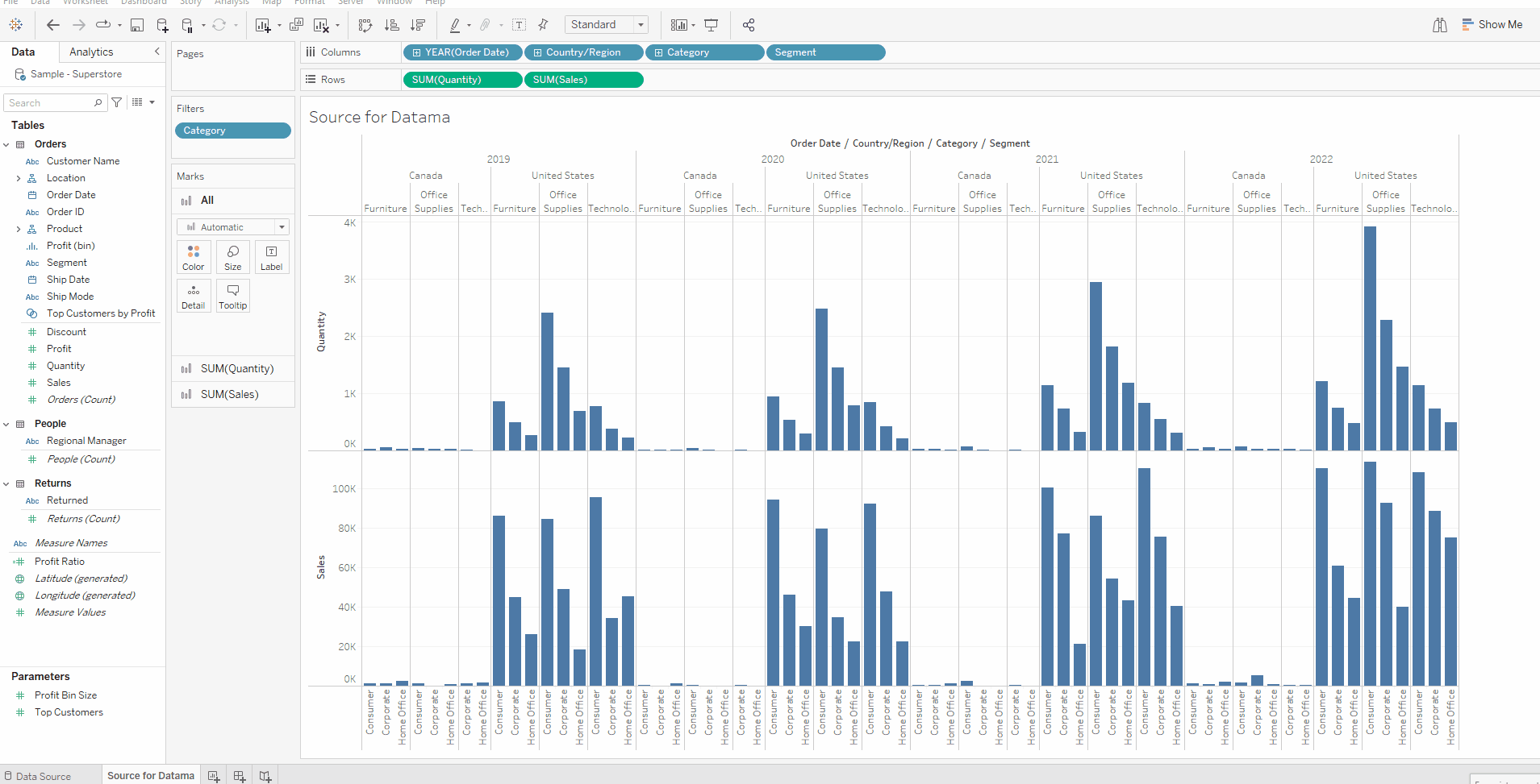
In Tableau Desktop, create a new worksheet a source for Datama.
A source worksheet should have all the metrics and dimensions you want to analyse in Datama. Typically a source for Datama will have
- A set of dimensions in Rows
- The dimension you want to compare on should come first
- Note: By default, Datama will compare the last 2 values for discrete dimensions or split in two the dates dimensions. Makes sure to leverage Tableau parameters or filters to get the right comparison.
- A set of metrics in columns
- Datama sets up a relation (product of ratio) among metrics by default. Ensure they’re in a “funnel” sequence.
- Since Tableau provides metrics to Datama in alphabetical order (and not the displayed order), adding a “1..”, “2..” in the naming of your metrics should help to get the dimensions in the right order.
Here is an example of a source from The SuperStore default dataset of Tableau.
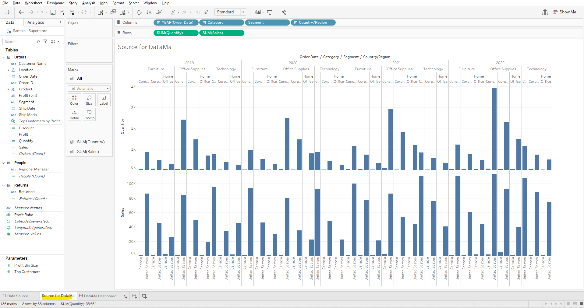
Please refer to the full documentation to learn more about sources
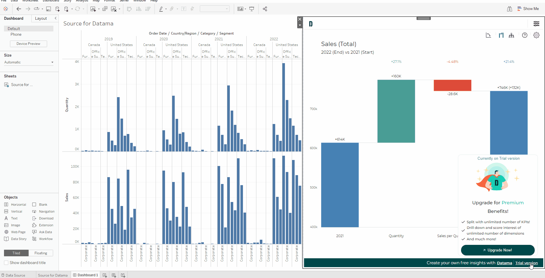
3. Add the worksheet to a dashboard tab
4. Add the dashboard extension to dashboard
See gif detailed above in How to use section
6. Read your Analysis
- Performance Overview: Each blue bar represents the performance of your main KPI, using your chosen comparison dimension. helping you quickly gauge performance across different segments.
- Intermediary Step Analysis: Intermediary steps depict the ratio evolution of your KPI. The impact is quantified in the units of your main KPI, allowing for a consistent measurement of progress or regression.
- By default, the most interesting dimension will be selected for this zoomed step. You can change the selected dimension for this zoomed step by changing right clicking on the boxes of a segment and select the appropriate dimension in the “split by”. You can unzoom by clicking on other steps or clicking on the box again.
- In-Depth Exploration: By interacting with a step—simply click on it—you’ll delve into the underlying dimensions that are most influential in explaining your performance variances at each stage of your funnel.
To discover more about how to read Waterfall, you can read our dedicated section
7. Advanced Usage
Follow this link to get the full view of the extension Settings.
8. Get more insights
Explore related documentation to understand how to generate insights in Datama Compare
9. Support and Resources
If you require assistance or have any questions, feel free to reach out. We’re here to help! - 📧 Email: Send us an email at contact@Datama.fr for any inquiries or support issues. - 🌐 Contact Form: Prefer to use a form? Fill out our online contact form, and we’ll get back to you promptly.