Pivot - Interface
Understand what is in the interface of Datama PIVOT
1. Importance Chart
The dimension importance is the first element of the Datama PIVOT interface. It sorts all the dimensions by importance from left to right, regarding the KPI you are following.
- Dimensions are sorted according to the Standard deviation which is weighted according to the volume. This basically means that dimensions on the left of the charts have segments that differ a lot on the selected KPIs. Depending on the dimension you’re looking at, one could then identify business opportunities in increasing the performance of low bubbles on this chart, if that is feasible.
- Size of the bubble represents the volume and height of the bubble represents the value of your KPI for that specific segment.
Example: The AB Test example below shows the importance of 3 dimensions to measure the rate of transition to the next stage. Browser is the most important dimension and Test_variant is the least important. Each bubble of browser, represents a type of browser (Chrome, Firefox, Safari …), the gray bar represents the value of the Weighted Standard deviation used to sort the dimension.

2. Simple chart
The bars show for each element of a dimension the contribution of this element to the global performance (primary numerator). You can change your dimension using the drop-down menu on the title of the slide. This is a non-aggregated view of the data. The line is the average KPI of this element (ratio: numerator / denominator)

3. Clustered Chart
The bars show for each element of a dimension the contribution of this element to the global performance (primary numerator). You can change your dimension using the drop-down menu on the title of the slide. The line is the average KPI of this element (ratio: numerator / denominator) Aggregation:
- For non-continuous elements, a cluster is created aggregating the element having a similar average KPI and representing less than “Aggregation in %” (see in the Settings menu)
- For continuous elements, multiple clusters are created aggregating elements having a similar average KPI.

4. MariMekko
This aims to represent how one dimension is distributed in another dimension.
You can change dimension by using the drop-down menu on the title. The first element corresponds to the splitted segment and the second one is the dimension you want to investigate (represented in each column).

5. Sankey Diagram
This aims to discover how dimensions are correlated. Show the distribution between 2 dimensions, understand for 2 dimensions how the elements of these dimensions are distributed together. You can change dimension by using the drop-down menu on the title. The “% distrib” option allows you to represent the distribution by percentage instead of absolute value. This represents each element at the same size which helps you compare the distribution.
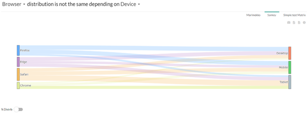
The « % Distrib » option makes the segments on the right of the window all at the same size. This helps to compare segments between each other.
6. Simple Test Matrix
The calculation is made using a simple correlation rate to determine whether dimensions are independent. Higher the score is, higher the correlation is. These figures are the percentage of correlation.When you click on one of the figures, it will filter automatically on the corresponding dimension (column and line).

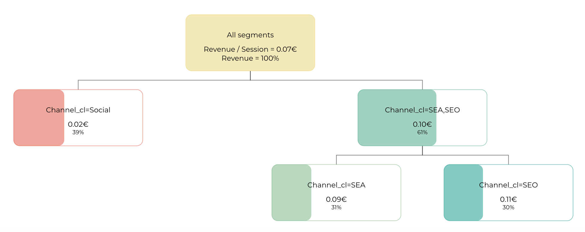
7. Decision Tree
The decision tree is based on a Rpart model (Recursive Partitioning and Regression Trees) It helps you identify the optimal characteristic of the sample that has the best performance. This decision tree helps you understand your dimensions and the importance they have in the explanation of your performance. The figures in the square is the average KPI for this specific population and the percentage is the ratio of the population having this characteristic.
Steps of the decision tree are ordered according to the importance they have on the KPI. On the right find the more important dimension to follow and the worst on the left. In the box, see on the top the value of the KPI for the concerned population and on the bottom the percentage of population concerned by this selection.
Here is what it looks like in Pivot:
8. Market equation Tree
The market equation tree is available when you select Analyse all metrics relation steps. This tree is based on your market equation, it decomposes your main KPI on all the steps of your metric relations, then on your dimensions, and finally on your segments. You can specify your KPIs units in the metrics relations.
Here is what the tree looks like:
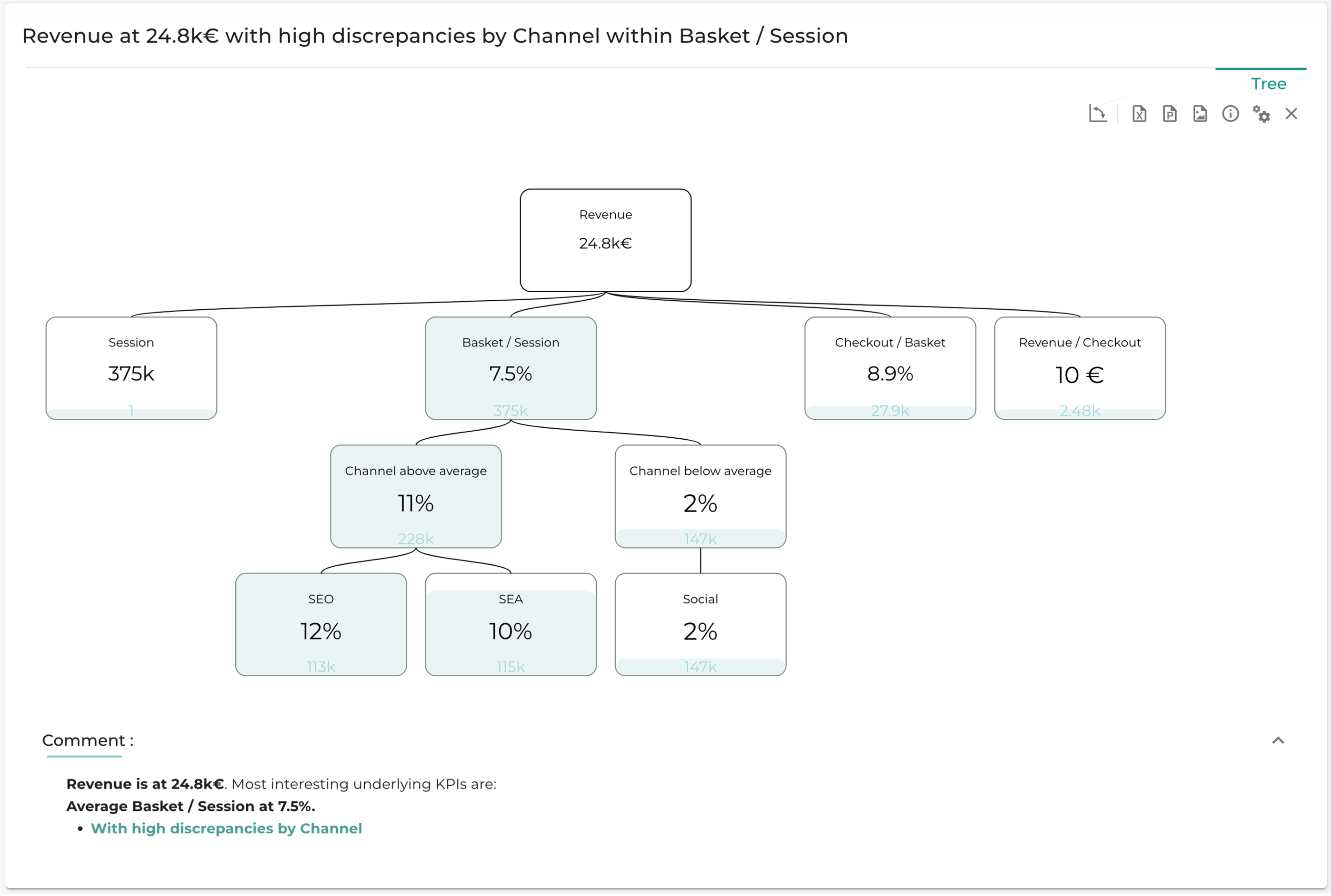
Steps of the market equation tree are ordered according to the importance they have on the KPI. The importance of a step is a criteria you can choose in the settings of Pivot subheader. The options are detailed in the settings of Step interest criteria.
For each step, the mean of each dimension is computed, and the segments are sorted by their value compared to the mean, whether it is above or below the average.
The Comments section sums up the most interesting parts of the tree with a level of analysis that can be changed in analysis depth.
9. Radar Chart
The Radar chart is available when you select Analyse all metrics relation steps. The chart is based on your market equation. It decomposes the selected dimension on all the steps of your metric relations, for each segment of the dimension.
Here is what the Radar chart looks like:

You can choose which dimension to decompose and decide whether to analyze it by value (showing the value of each segment at each step) or by rank (displaying the rank of each segment at each step). In the chart, each line represents a segment of the selected dimension, while each axis corresponds to a step in the metric relation.