Journey - Settings
The header in Datama Journey helps you manipulate and refine your Use Cases
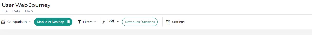
Find here the main elements of the solution Header in Datama Journey:

1. General settings
1.1. Choose column containing Path for Journey Analysis
You can choose which column of your dataset to do the journey analysis.
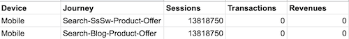
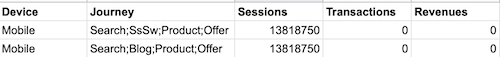
1.2. Journey Separator
By using the text input, you can change the seperator between steps of your journeys. Initially, the separator is “-“.
From
To
2. Sunburst
2.1. Reverse Journey
By activating Reverse Journey, you can display the users’ reverse journeys. This is useful to know where they come from.
2.2. Display exits in Sunburst
By default, journey exits are displayed. It shows the proportion of people who have exited the journey.
2.3. Simplify Sunburst
By activating the dropdown menu, you can simplify your journeys by removing duplicate journeys and removing duplicate steps in journeys.
This is very useful to simplify your display and decrease computation time.
2.4. Maximum Number of steps in Sunburst
By default, only 6 steps of user journeys are represented. This can be changed by modifying this setting.
3. Attribution
3.1. Attribution
To accelerate the time to run the analysis, you can deactivate the attribution part.
3.2. Model
By using the dropdown menu, you can choose your attribution model and thus consider various distributions of your money in the various steps of your journeys.
4. Advanced settings
4.1. Journey Deduping
Attribution must be activated
By using the dropdown menu, you can simplified your journeys by removing duplicates journeys or removing duplicates steps in journeys. This is very usefull to simplify your display and decrease computation time.
4.2. Maximum Number of Points analysed
By default, the algorithm will analyse the top 50 steps in your journey</is> column.
4.3. Analyse Sequences
Instead of analysing steps, you can toggle this setting to analyse sequences of steps
For example, Search-Product-Cart contains 3 touch points: Search, Product and Cart, and when Sequences is activated it will become 2 sequences Search-Product and Product-Cart
5. Basic settings
5.1. Comparison
Datama Journey can be used with a comparison. To activate this mode, select a dimension and the element you want to compare. Each graph and the comments will be in Compare mode, reflecting the difference of the elements you are comparing.
5.2. KPI
In Datama Journey, there is only one ratio to be defined to run the module. This ratio will be used to understand the performance (Numerator) and the volume (Denominator).