Descriptive Comparison (Journey)
Descriptive Comparison is a group of 4 tabs. See articles below for details on each tab:
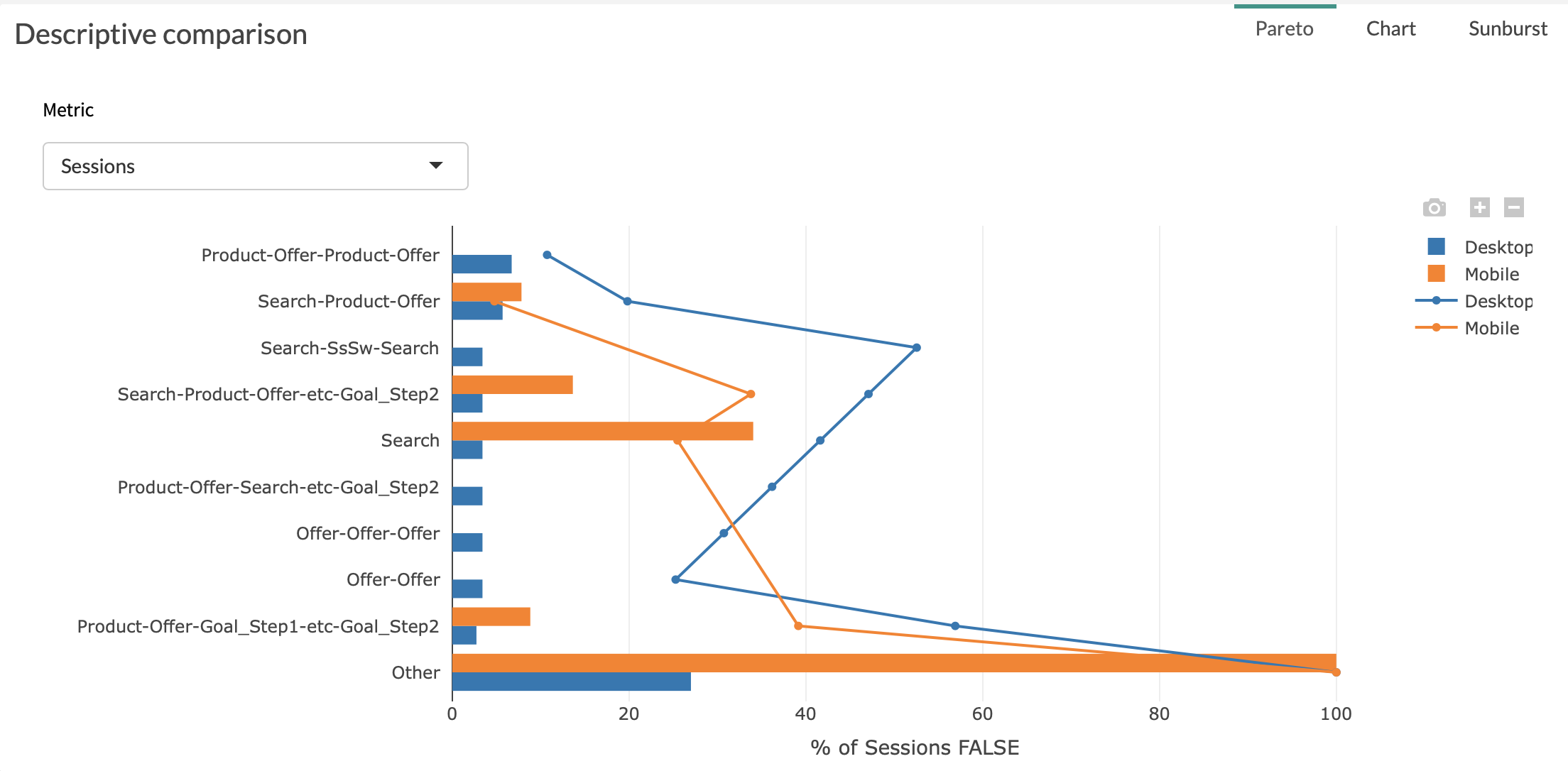
1. Pareto
The Pareto tab is a graph allowing you to see the first 10 journeys contributing to a selected metric, and the share of the total metric that it represents, as well as the cumulated share of the selected metric of top X journeys.
You will be able to quickly identify the steps representing the highest volumes thanks to our decreasing ranking.
Two parameters are used in order to build this graph:
-
The X-axis is % of the metric you have chosen
-
The Y-axis is point
Example:
2. Sunburst
Sunbursts are commonly used to represent sequential data, such as customer journeys. You can learn more on sunbursts and how to use them here
Start End Sunbursts:
We use sunbursts to represent the various customer journeys and their frequency of appearance (size of slices) in your data source.
The left one is your Desktop segment.
The right one is your Mobile segment.

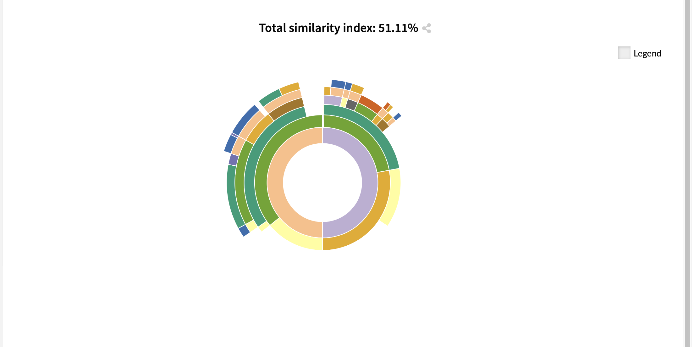
3. Sunburst difference
This view is only available when Compare mode toggle is activated on Datama Journey
Similarity Sunburst:
This sunburst represents the differences in appearance of the various journeys between Desktop and Mobile segments.
On the left part of the sunburst (starting by “positive”) are the journeys that have increased in % between start and end. You have more of this type of journeys in your Mobile segment than what you had in your Desktop segment
On the right part of the sunburst (starting with the negative) are the journeys that have decreased in %
Obviously, as this is a 0 sum game, you have as many decreasing journeys as increasing ones,due to the left part and right part (positive and negative) having exactly the same share (50/50)
4. Sankey
Sankey chart is another way to display flows between touch points which is convenient in particular to visualize repetitive loops on a given point.
You can move the nodes of the Sankey by drag and dropping the nodes with your moves
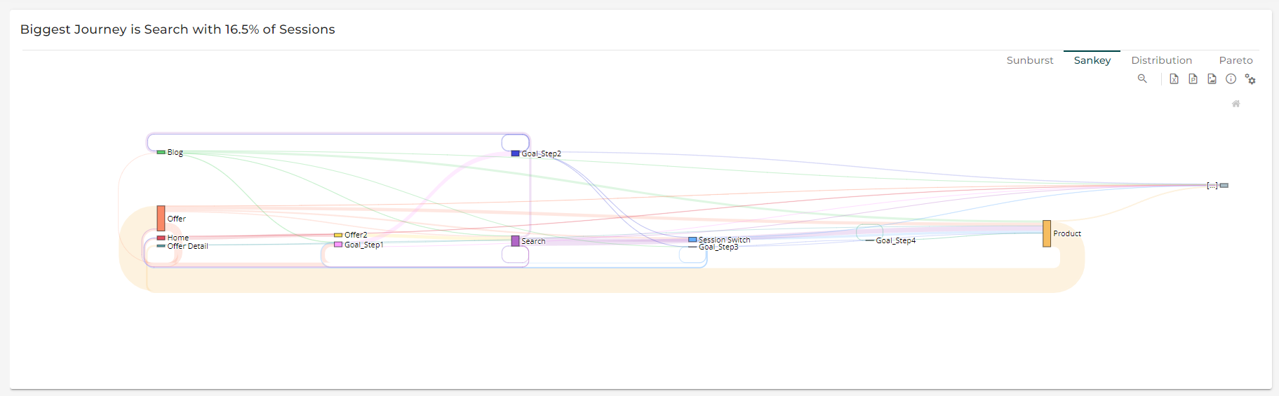
Tip of the week 135: New Journey Sankey visualization!
Besides Sunburst for visual observation of user journey, the Sankey diagram is available as an alternative option for journey’s visualization 🌍
This is particularly useful to visalize “loops” of multiple iterations on the same touch point. 💡
As with Sunburst, Sankey is available in comparison mode to study behavioral differences on two different segments 🕵️
