Attribution
Attribution is a group of 5 tabs. See details below on each tab:
1. Priority
The Priority tab is a graph that allows you to visualize the steps of your customers’ journeys to improve first.
Priority with Compare Mode
Three parameters are used in order to build this graph:
-
The X-axis is feasability
-
The Y-axis is opportunity
-
The size of the circles is normalized value
Example:
Here, the first step to improve is “Search” because it has the highest feasibility (#3-feasability-ratio) and opportunity (#2-opportunity-value).
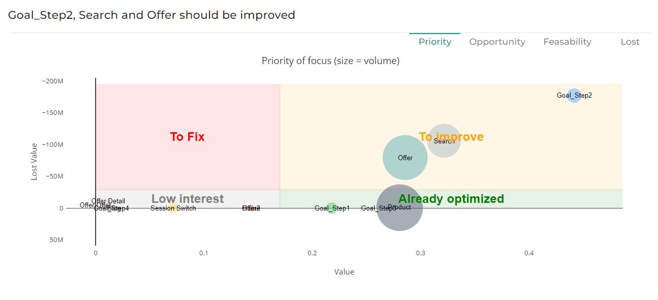
** Priority without Compare Mode**
Three parameters are used in order to build this graph:
-
The X-axis is opportunity
-
The Y-axis is lost value
-
The size of the circles is normalized value
Example:

Here, the first step to improve is “Goal_Step2” because it has a relatively low opportunity for the lowest lost value.
2. Opportunity (Value)
The Opportunity tab is a graph allowing you to visualize the value attributed to each touch point of the customer journey based on the selected attribution model.
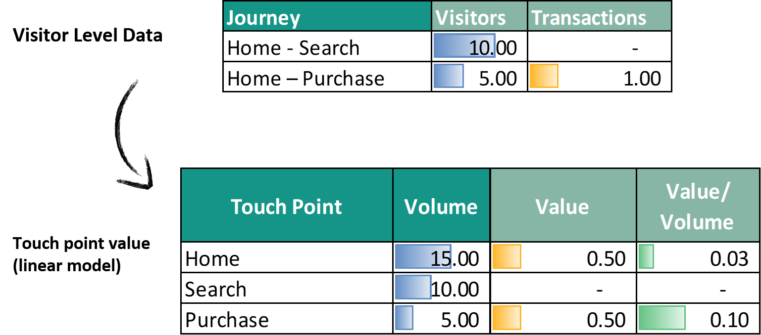
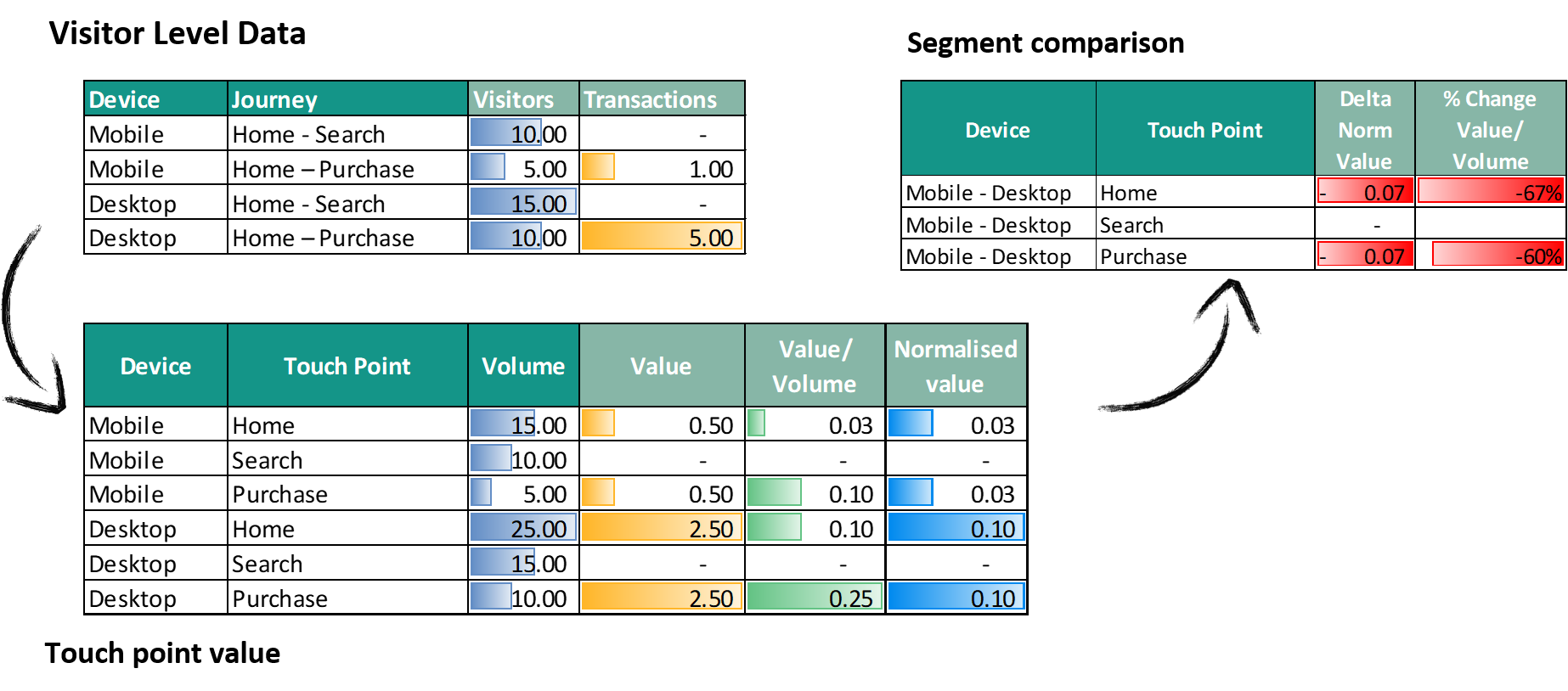
When Compare mode is ON, the gap of value between start and end is a good valuation of the opportunity behind improving the customer experience for a given touch point. It takes into account both the efficiency of the touch point (i.e. the value it brings each time it is seen) and the volume it represents (i.e. the number of users that are actually exposed to this touch point)
Example:
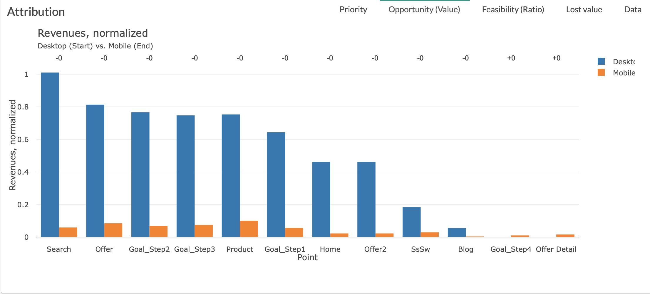
The biggest opportunity is “Search” then “Offer” , “Goal_Step2”…
You will be able to quickly identify the steps presenting the biggest opportunity thanks to our decreasing ranking.
Two parameters are used in order to build this graph: <!–
3. Feasability (Ratio)
The Feasability tab is a graph allowing you to visualize the Value/Volume of the various touch points of the customer journey.
You should read this ratio (value/volume) as the value brought by a given touch point each time it’s seen in journeys with value.
Steps are ranked by ratio when Compare mode is OFF, and by gap of ratio when compare mode is ON.
When Compare mode is ON, the gap of ratio % could be interpretable as the “feasibility” of reducing the gap between start and end: if the gap is big, it’s probably easier to reduce this gap by improving the experience of users on the considered touch point for the lower segment, since it seems feasible (based on the other Start End segment benchmark) to have a higher ratio.
You will be able to quickly identify the steps presenting the biggest feasability.
Example:
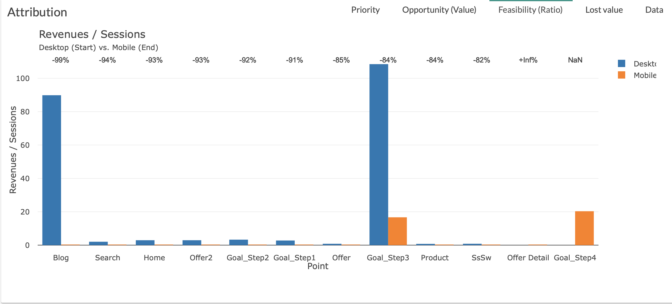
The biggest feasability is “Goal_Step3” then “Blog” , “Goal_Step2”…
Two parameters are used in order to build this graph:
4. Lost Value
The Feasability tab is a graph allowing you to visualize the Value/Volume of the various touch points of the customer journey.
You should read this ratio (value/volume) as the value brought by a given touch point each time it’s seen in journeys with value.
Steps are ranked by ratio when Compare mode is OFF, and by gap of ratio when compare mode is ON.
When Compare mode is ON, the gap of ratio % could be interpretable as the “feasibility” of reducing the gap between start and end: if the gap is big, it’s probably easier to reduce this gap by improving the experience of users on the considered touch point for the lower segment, since it seems feasible (based on the other Start End segment benchmark) to have a higher ratio.
You will be able to quickly identify the steps presenting the biggest feasability.
Example:
The biggest feasability is “Goal_Step3” then “Blog”, “Goal_Step2”…
Two parameters are used in order to build this graph:
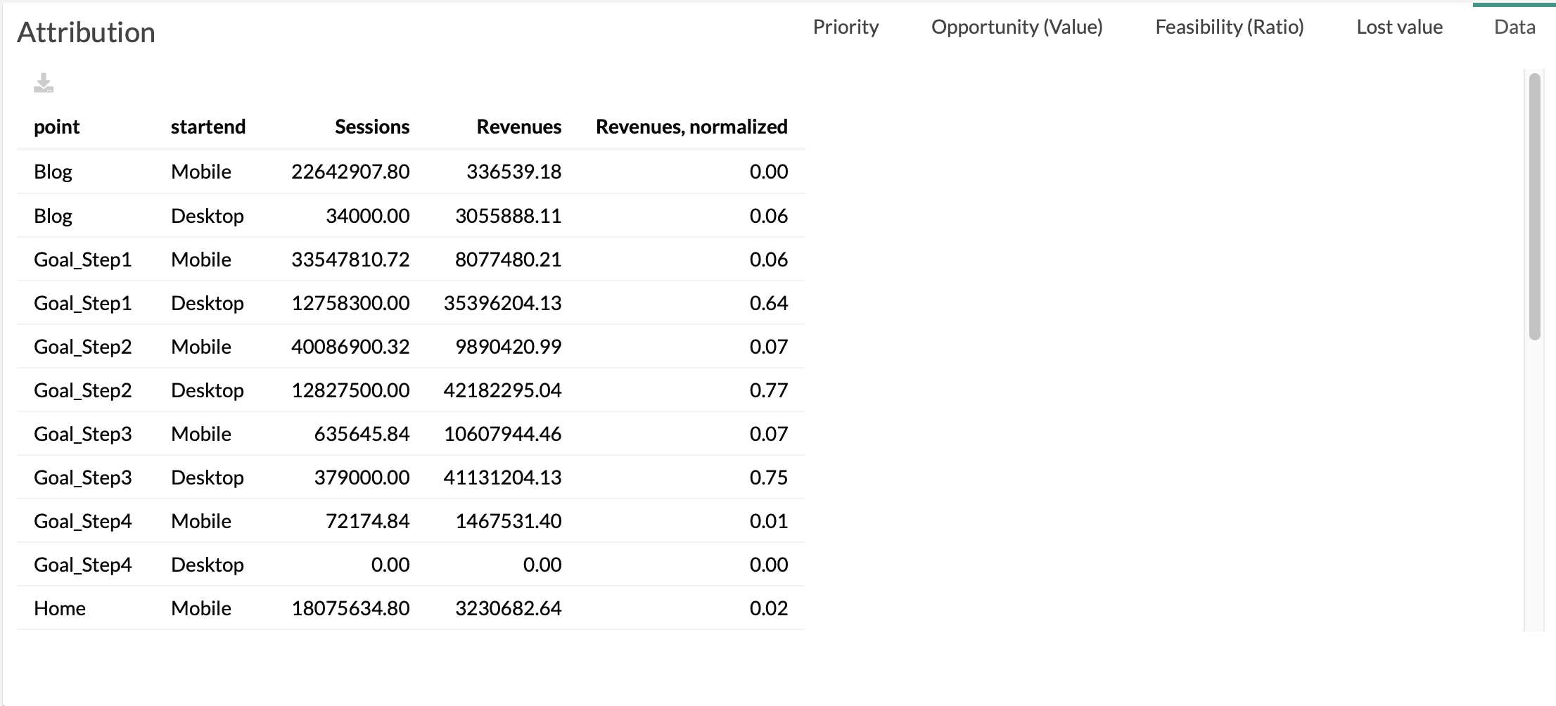
5. Data
The Data Tab is the table used to generate the others tabs of Attribution
With :
- point: name of the touch point of customer journeys
- startend: start and end dimensions (selected in the menu)
- Volume: value of “Volume” (selected in the menu), i.e. the number of times this touch point happened
- Value: value of “Value” (selected in the menu), i.e. the attributed value, based on selected attribution model
- Value normalized: same as before, but divided by total volume, to be able to compare touch points in Compare Mode