Helpers
Find here how you can use the Dimension helper overview of the solution**
Helper charts can help you to understand what you want to compare and what you have in your data.
1. Dimension Helper
The dimension helper helps visualise the start and end point of each dimension at each step of the waterfall.
You can access to Helper by clicking “Expand Comparison configuration” when you land to Compare section.

Then, open the comparison helper by default as shown on the screenshot.

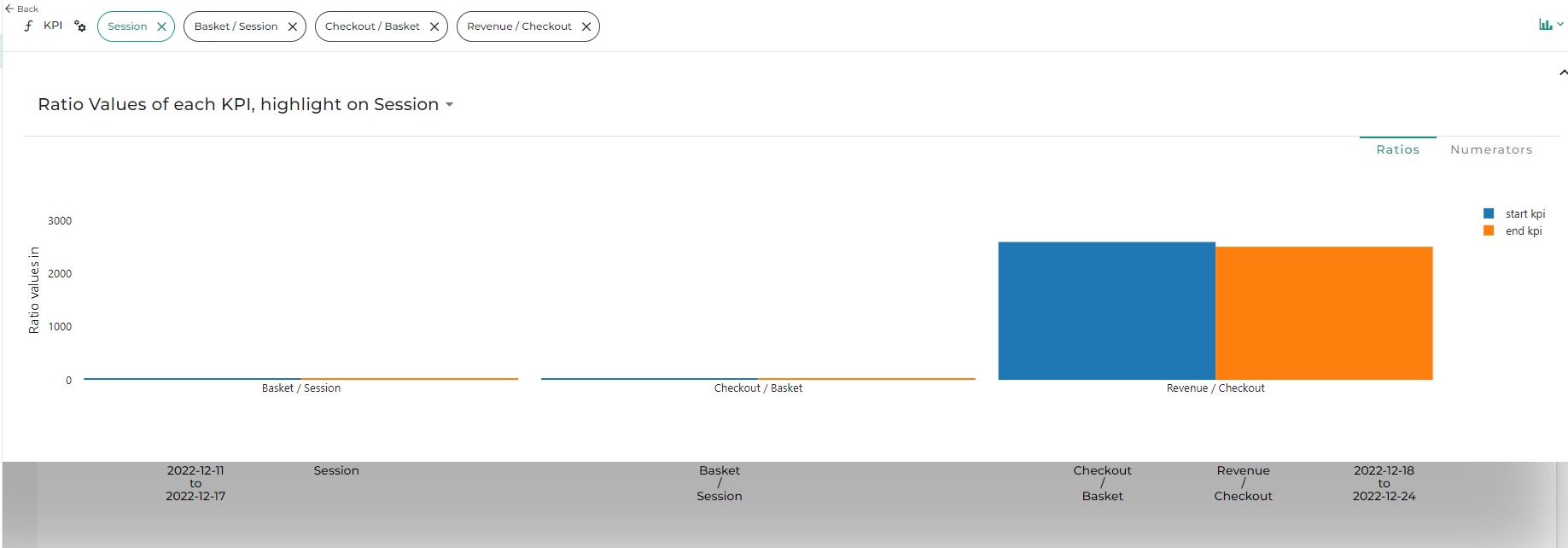
Change your comparison dimension or metrics by using the drop-down list in the title of the graph.

The graph represents in blue and orange what is selected as a comparison (start and end) in your analysis. The gray part is out of scope of your analysis (part of the data filtered or ignored in the start/ end definition).
You can also click on the drop-down list at the place of “Helpers” and change it to “New helpers”, you will get another helper view.

1.1 Hide or display some element
click on the legend to remove some bars (orange, blue or gray). This function for “Helpers” view but not for “New helper”.

2. Start/ End helper
The Dimension helper allows to visually see the performance of each period in the dataset.

Blue and Orange are what is selected as a comparison in your analysis and gray what is ignore in the analysis; As soon as you close the popup the calculation will be launched.

3. Ratio helper
Ratio helper is representing each step of your market equation (metrics relation) split by start and end definition (in blue and orange).