Detect - Settings
Find here the details of the main settings Datama Detect
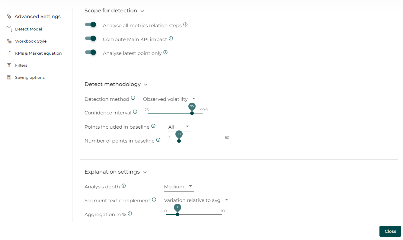
1. Scope for detection
1.1 Analyse All Metrics Relation Steps
Datama Detect can analyse one step or all the steps of your funnel. When all step are selected, you will be able to see in a dropdown menu every step with an anomaly.
1.2 Compute Main KPI impact
Active this function to see the dotted line representing the main KPI.
1.3 Analyse Latest Point Only
You can choose to display the anomalies of each date or only for the latest point in the data. In run mode (i.e. when sending alerts on a daily basis for instance), we recommand to activate this parameter, to avoid having all the anomalies raised.
2. Detect Methodology
2.1 Detection Method
Detection method defines which algorithm Datama uses to flag anomalies. Please refer to the detection method page to learn more.
2.2 Use smart interval
Smart Interval calculates a theoretical confidence interval instead of an observed interval. Please refer to the detection method page to learn more.
2.3 Level of Confidence
A confidence interval is a range of values that is likely to contain an unknown population parameter. If you draw a random sample many times, a certain percentage of the confidence intervals will contain the population mean. This percentage is the confidence level.
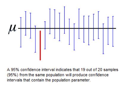
By changing the confidence interval you can modify the precision expected from the significance. Please refer to the detection method page to learn more
2.4 Flag anomaly when above/below confidence interval
This allows you to define which type of points (when it’s higher or lower than the confidence interval) will be displayed.You can display in both cases.
2.5 Points included in baseline
This allows you to define which type of points (same day, same hour etc) in your historical data the algoritm will consider for baseline. Please refer to the detection method page to learn more
2.6 Number of points in baseline
This allows you to define how many points within the defined type of points in your historical data the algoritm will consider for baseline. Please refer to the detection method page to learn more
2.6 Aggregate small samples
This allows you to aggregate previous data points when the volume is too small to declare anomaly.
3. Explanation settings
3.1 Analysis Depth
This is the level of analysis in the explanation part of the solution. How many detail will be given in the comment.
3.2 Segment text complement
Segment text complement allows to decide on what to display behind Segment name in the waterfall labelling. As a reminder, a segment is a attribute within a dimension of your dataset. Options for this input are:
- Variation relative to average (e.g. “x2.43”) - this is the default value and allows to spot easily “abnormal” variations way above average (i.e. above 1)
- Percentage Variation (e.g. “-46%”) - this is the % difference between start and end values
- Variation absolute change (e.g. “-3pts”) - this is the absolute difference between start and end values, displayed in the unit of the considered KPI
- Nothing
3.3 Aggregation in %
The level of aggregation that the model is using – e.g. if Level of aggregation is set at X%, segment within each dimension that represents less than X% of the Primary Numerator (e.g. Revenues) of the main KPI you’re analyzing will be clustered in one « Other » segment. X is set at 2 by default, but you may want to play with this parameter quite a bit because it can change significantly the calculation of mix effects.
Click on the drop-down arrow to display the settings menu Move the cursor to the right to increase the level of aggregation Click on « Pivot » to get results Segments are now aggregated at the requested level
4. Basic settings
4.1 Comparison
Datama Pivot can be used with a comparison. To activate this mode select a dimension and the element you want to compare. Each graph and the comments will be in a Compare mode reflecting the difference of the elements you are comparing.