Waterfall
The waterfall analysis is the main element of Datama COMPARE interface. It concatenates all the detailed analysis that appear in other graphs.
The waterfall panel consists of three distinct tabs, each providing a specific level of analysis. The following sections detail the role and functionality of each tab.
1. Waterfall Chart
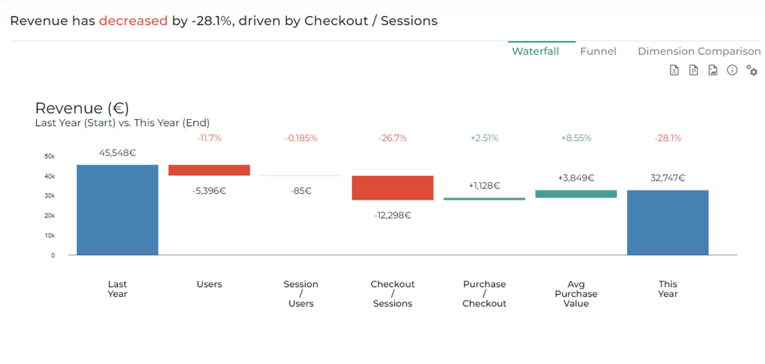
The Waterfall is the core element of the Datama Compare interface. It consolidates all the analyses into a single, structured view, allowing for a clear breakdown of performance variations.
1.1 Overview
This visualization helps users understand how different factors contribute to changes in a KPI by displaying sequential impacts in a step-by-step manner. Each step represents a specific driver, making it easy to pinpoint what is causing increases or decreases in performance.
By breaking down variations in this way, the waterfall simplifies the complexity of performance analysis and provides a clear, actionable interpretation of the data.
1.2 Market Equation
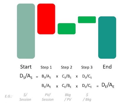
The Waterfall follows a structured approach based on a market equation, which links the different steps together logically. Each stage is interconnected, ensuring that the decomposition of variations remains coherent and actionable.
- By default the Steps are the multiplication of each ratio but can also be additive
For a more in-depth explanation of how the market equation structures the waterfall, refer to this detailed guide or you can read our dedicated article.
1.3 Dimension Scoring
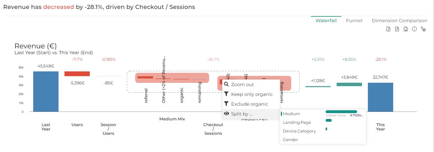
To enhance interpretation, Datama Compare integrates dimension scoring, a method that ranks and prioritizes the most impactful factors driving KPI variations. This approach enables users to focus on the most relevant insights first, ensuring a data-driven decision-making process.
By default, the most interesting dimension will be selected for this zoomed step. You can change the selected dimension for this zoomed step by changing right clicking on the boxes of a segment and select the appropriate dimension in the “split by”. You can unzoom by clicking on other steps or clicking on the box again.
2. Funnel
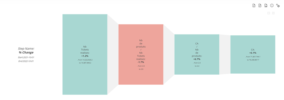
The funnel section shows the % change and absolute values of each KPI.
This funnel gives details on numbers behind waterfall chart. Each step of your conversion funnel is a box, total step is squared in black. Hovering gives you details on numerator and denominator behind the ratio. You can remove the funnel shape in display settings.
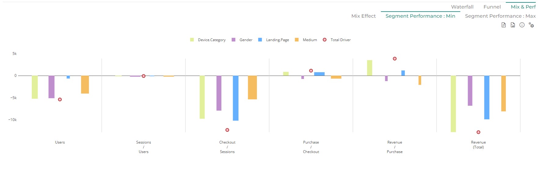
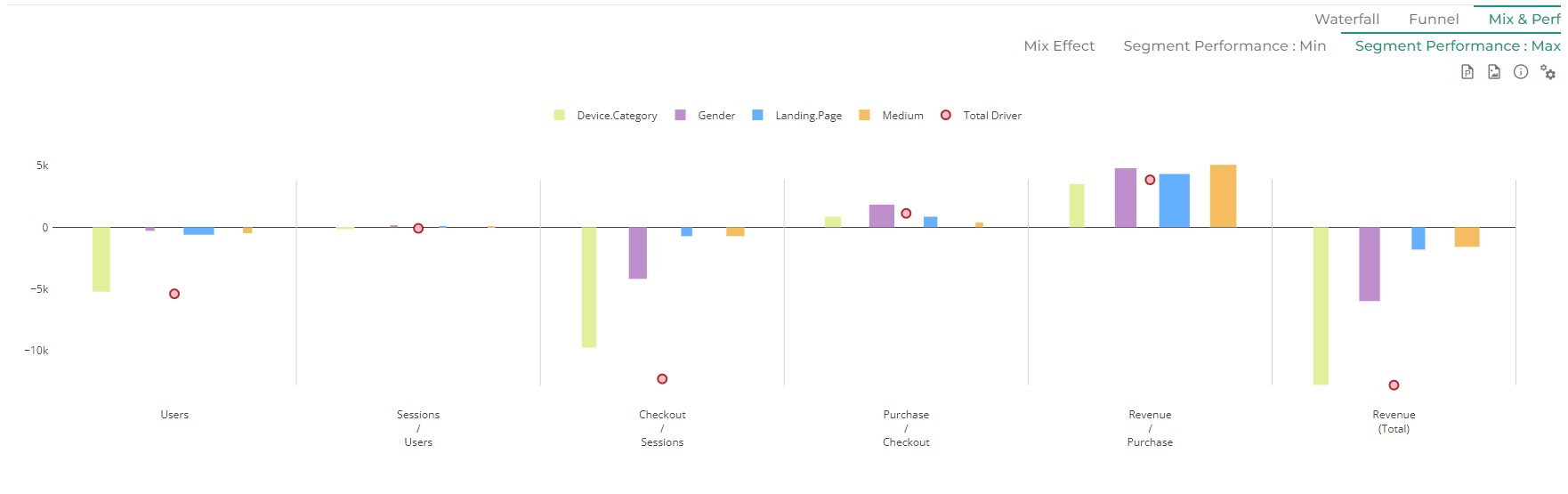
3. Dimension Comparison
3.1 Mix effect
For each step, it shows the total mix effect of each dimension (which has a mix effect).
>eg.The mix effect is the impact on your performance that is coming from an evolution of the distribution of your “denominator” in input. If you have more people in input with a better conversion rate, you will have a positive mix effect due to the type of client coming into your store or your website.
This graph represents the sum of the Mix impact of each dimension at each step of your funnel. The red circle represents the gap your are trying to understand at this step of the funnel, to allow evaluation of mix effect contribution to overall impact.
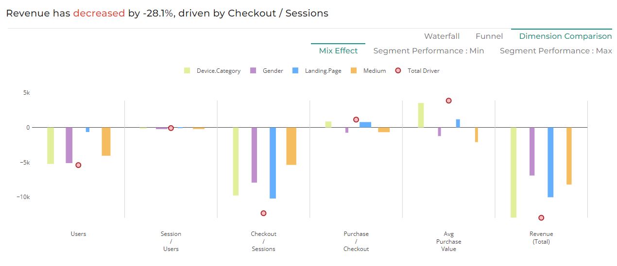
read more about Mix effect
3.2 Performance effect: Min
A performance effect is an observed difference in a performance. eg.As for example selling different number of car between two week is a performance effect. Having less user in a website is a negative performance effect.
All things being equal the performance effect is the evolution of a performance.
As presented below the performance effect could be represented at each step of your metric relation and for any dimension.
3.3 Performance effect: Max
For each step, within each dimension, it shows the segment having the biggest positive contribution in performance, net of mix effects, in bars. The width of the bar and the parenthesis ‘(x…)’ in the call outs refers to how fast this performance change is relative to the other segments.
Red dots refer to the total impact of that step (as in ‘Waterfall Chart’), to allow evaluation of segment performance contribution to overall impact.
4. Covariance Effect
When breaking down KPI variations, interactions between multiple factors can create covariance effects. These effects occur when changes in two or more dimensions influence each other, making it difficult to attribute the exact impact of each factor independently.
In the Waterfall analysis, covariance is managed by distributing shared effects proportionally across contributing factors. This ensures that each driver’s impact remains meaningful and prevents double counting of variations.
Understanding covariance effects is key to accurately interpreting results, especially when analyzing complex datasets with interdependent variables.