Summary chart
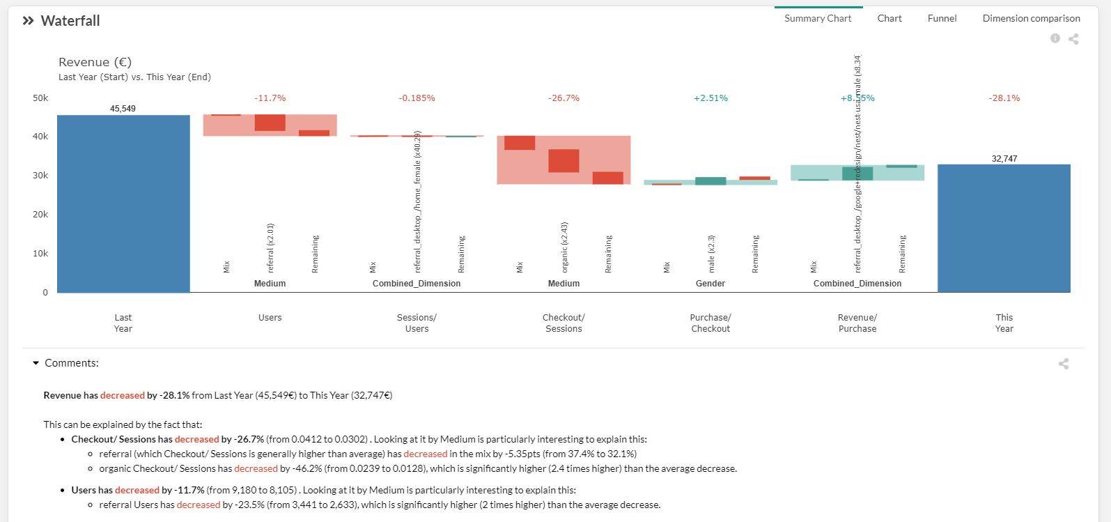
This analysis is made using the metrics and the dimensions appearing in your dataset. This allow you to understand the contribution of your dimensions and highlight for each step the dimension that has the main impact. Each step is calculated using the main KPI unit (e.g. Revenue in the above picture)
Each step is split in 3:
- Mix (on the left) represent the impact of the evolution of the distribution in input (see details about mix effect)
- Main performance (in the middle): main element of the main dimension that drive at the same time most of the value and most of the acceleration (figure in parenthesis – see explanation below) compare to the others elements in the same dimension (see more about performance effect)
- Dimension selection is based on “credit” logic between mix and performance calculations
- Dimension selection is intended to help decision taking and fasten dashboard readability – that doesn’t mean that other dimensions are not important
- Remaining performance (on the right): Represents the sum of the impact of the rest of the element from the dimension (except only the other main element represented in the middle).
Example
See below the same explanation using the example in the picture above using the 3rd step (Checkout/Sessions). The main dimension for this step is « Medium ». all the impact is calculated in the main unit « Revenue » (considering that Start is last month and End is actual month)
- Mix: impact of the evolution of the split of medium traffic. In that case the evolution of the distribution of Medium between Last month (Start) and This month (End) has a negative impact in the Checkout/ Sessions. (e.g. Less people from the medium « referral » came in the website this month. There conversion rate is better than the other type of medium which generated a negative mix effect)
- Main performance: main element at this step is the « organic » type of traffic which has the highest (negative) impact. The x2.43 in parenthesis say that: « organic traffic has a Checkout/ Session rate that fall 2.43 times faster than the other type of Medium (direct, cpc, …). »
- Remaining performance: sum of the impact of the rest of the medium type of traffic (direct, cpc, referral,) impacting the « Revenue ».
Acceleration of rise or fall (x2.43)
The figure in parenthesis explains the acceleration this element has compare to the other element in the dimension. « The fall of the referral traffic goes 2.43 times faster than the other type of medium traffic ».
If this figure is close to 1, this will say that the element you’re looking has the same rise or fall than the other element in the dimension. This will tell you that everything is rising or falling at this step and nothing in your dataset explain why this step is positive or negative. You should add some more dimension to explain this variation (weather, holidays, day-off, bank holidays, strike, price versus competition, …)