Chart
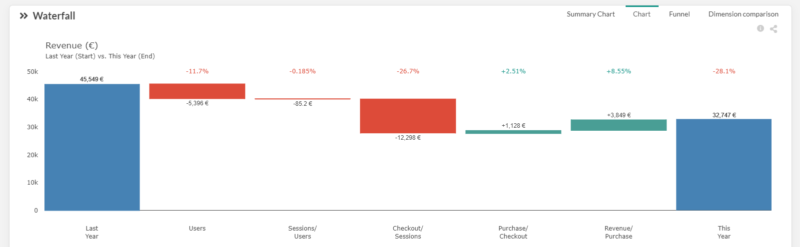
The blue bars on the left and on the right represent the Start and End dimensions. It is your main KPI. You can modify them in the top left menu of Datama COMPARE.
Each step of the waterfall represents an underlying element of your performance, your sub-KPI or PI (performance indicator). The unit uses for each step is the same as your main KPI (the figures written inside or above the green or red boxes). It represents the contribution of this step on performance of the main KPI.
The percentage written in the bottom of each step represents the evolution of this step between Start and End segment (e.g.: in the picture above, the number of users has decrease from 12% between Start and End which reprensents a loss of 5.397€)
You can zoom on the effect on one specific step by clicking on that step (see zoomed view)