Dimensions (Mix & Perf)
Dimensions and metrics are the two elements coming from your data that allow Datama COMPARE to properly work.
Datama COMPARE analyses the contribution of each dimension in the performance and split this contribution in performance effect and mix effect.
The below diagram helps you to understand the type of contribution we are analyzing when the performance evolves.
In another way, Mix effect is the impact due to the change of proportion in entrance.
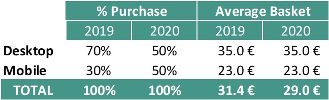
As in the example below, when your proportion of Purchase between Device change, that automatically change your Average Basket. In 2018 70% of purchase was in average at 35€ when it’s only 50% in 2019.
- If the proportion change it’s a Mix effect
- If the average price change, it’s a Performance effect
Please report to this article to learn more about metrics and dimensions.
Mix Effect
For each step on each dimension, shows the total mix effect in bars.
Red dots refer to the total impact of that step (as in ‘Waterfall Chart’), to allow evaluation of mix effect contribution to overall impact.
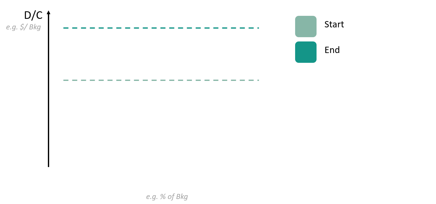
Segment Moves
X axis is the % of the denominator of the Step you Selected in ‘Detailed view − filter’ on the right.
Y axis is the value of the Step you selected in the ‘Detailed view − filter’ on the right.
Each line is a Segment of the Dimension you selected above, going from Start (small bubble at the beginning of the line) to End (large bubble).
Horizontal moves contributes to mix effect calculation (the value of your Step if performance of each segment would have remained the same, but the entry mix had changed.
Vertical moves contributes to segment performance calculation (the value of your Step if the entry mix of each segment would have remained the same, but the individual performance had changed.
Detailed Bridge
The impact of mix effect and segment performance for the Step and Dimension you selected, from Start to End.
Mix effect and Segment performance are split into top X segments contributing to the variation, other segments being gouped into ‘remaining’ bucket.
The negative and positive impacts of each segment for the Step and Dimension you selected, from Start to End.
Positive and Negative effects are split into top X segments contributing to the variation, other segments being gouped into ‘remaining’ bucket.
You can change the maximum number of segments displayed by playing with the slider
Biggest positive segment performance
For each step on each dimension, shows the segment having the biggest positive contribution in performance, net of mix effects, in bars.
The width of the bar and the parenthesis ‘(x…)’ in the call outs refers to how fast this performance change is relative to the other segments.
Red dots refer to the total impact of that step (as in ‘Waterfall Chart’), to allow evaluation of segment performance contribution to overall impact.
Biggest negative segment performance
For each step on each dimension, shows the segment having the biggest negative contribution in performance, net of mix effects, in bars.
The width of the bar and the parenthesis ‘(x…)’ in the call outs refers to how fast this performance change is relative to the other segments.
Red dots refer to the total impact of that step (as in ‘Waterfall Chart’), to allow evaluation of segment performance contribution to overall impact.
Step & Dimension selection
Select the Step and Dimension you want to see in second slide title or by opening and selecting the “split by” dimension in the overall waterfall
By default, the step that drives most of your variation and the most interesting dimension within that step are selected.
Dimensions are ranked by order of importance, or “Interest score”, i.e. by how helpful they are in explaining the gap of considered step.
This “Interest score” is based on how much each dimension has a abnormal biggest segment performance and significant mix effect contribution