What If scenarios in Datama Light
Related: Market equation Sub-steps · Settings
Purpose
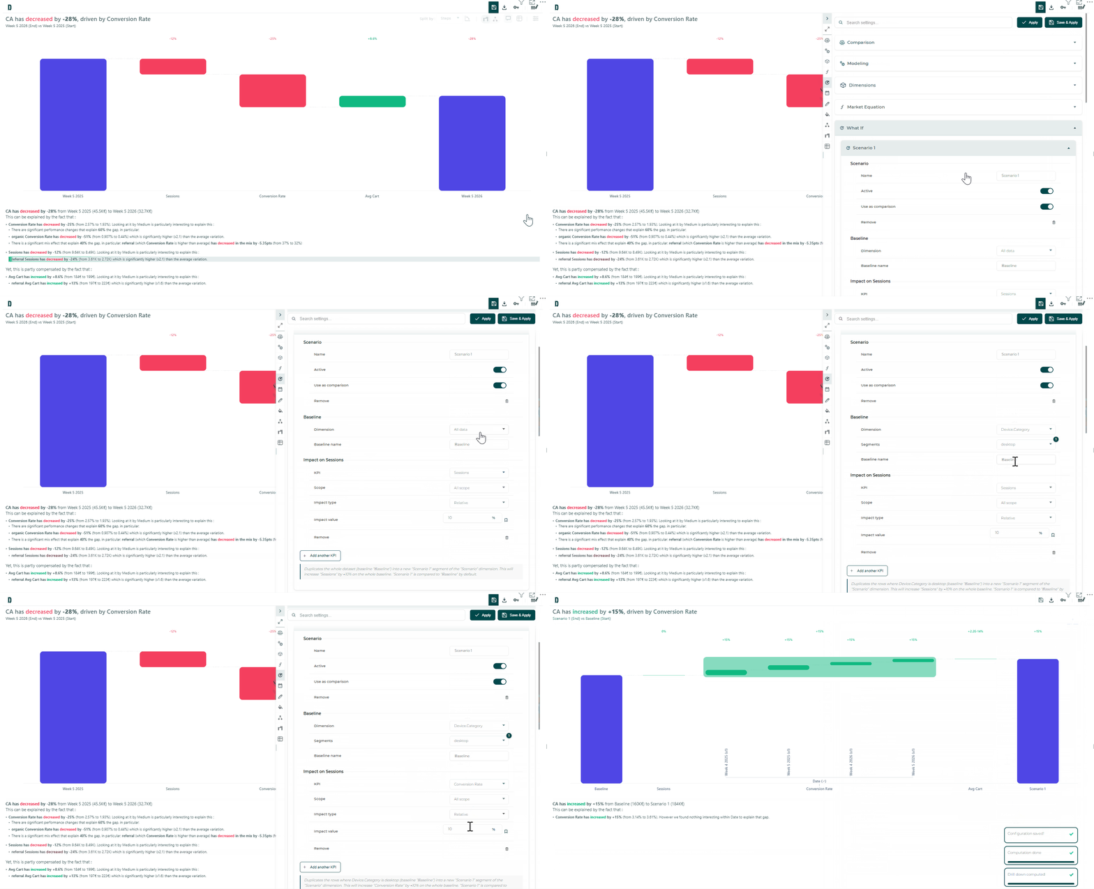
What If lets you simulate what happens to my KPI if I improve step X by N% on segment Y, then read the answer through the normal Compare / Explore / Assess views — not a bespoke simulation chart.
Under the hood, each scenario is materialised as extra rows tagged by a synthetic Scenario dimension (baseline label vs scenario name). Downstream charts keep working unchanged.
The Datama web app also offers a What If block in Prep, which writes a transformed dataset. In Light, scenarios are applied inside the extension instead.
Where it is available
| Solution | Settings tab | Right-click create |
|---|---|---|
| Compare | Yes | Waterfall bars / variations |
| Explore | Yes | Dimension bars |
| Assess | Yes | — (settings only) |
| Detect | No | — (out of scope) |
When a scenario is enabled and marked Use as comparison, Compare switches the default comparison to baseline vs scenario.
Create a scenario
From settings
- Open the side settings panel → What If.
- Add a scenario: name, active flag, Use as comparison.
- Define the baseline:
- whole dataset, or
- one dimension + selected segments, or
- a date range baseline when the comparison axis is time-based.
- Add one or more KPI impacts:
- target = a market-equation step (or its numerator),
- optional scope (dimension → segments; empty = all),
- relative (%) or absolute impact,
- optional pin to surface the impact as a live plot shortcut.
- Apply. The waterfall / tree / chart recompute on the simulated source when the analysis axis can read scenarios (see below).
A sentence summary at the bottom of each scenario block describes what is being simulated (same wording appears on the Compare End-bar hover when relevant).
From the context menu
Right-click a waterfall step or an Explore bar → create / open a scenario with baseline, step, and segment scope prefilled from the selection.
How to read a scenario
Scenarios only appear in the rendered source when the analysis axis can separate baseline rows from simulated copies. Otherwise baseline and scenario would be summed and inflate every aggregate.
| Solution | Axis that makes scenarios readable |
|---|---|
| Compare | Comparison context = Scenario (usually via Use as comparison) |
| Explore | Context / primary / secondary axis includes Scenario |
| Assess | Context / second dimension includes Scenario |
The Scenario dimension stays selectable in Start / End (or Explore axes) even before it is materialised, so you can switch back to a scenario comparison without reopening the What If tab.
Pinned impact shortcuts are shown only when the current view actually reads scenarios — otherwise they would move nothing on screen.
Impact cascade
Impacts are applied to step ratios, then metrics are rebuilt in market-equation order so upstream changes cascade into downstream denominators (same idea as the Prep What If transform in the Datama web app).
- Relative:
ratio × (1 + value / 100) - Absolute:
ratio + value
Zero-impact or out-of-scope rows are left unchanged. Rows outside every scenario baseline are tagged Out of scope when needed.
Limits and tips
- Not Detect — What If is not exposed there.
- Prefer Use as comparison when you want the waterfall to answer the scenario question immediately.
- Distinguish from Prep › What If in the Datama web app, which writes a transformed dataset for the whole workbook rather than simulating inside one extension.
- Distinguish from Sub-pillars (visual checkpoints on the waterfall) and from Sub-steps (nested market-equation structure) — What If changes the numbers, not the equation tree or the chart decorations.
See also
- Market equation Sub-steps
- Prep What If (Datama web app): Refine data