Comparison
Find here how you can use the Dimension Comparison of the subheader of the Datama solution
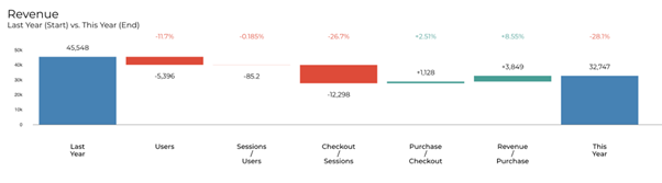
Defining what you want to compare is the very first step of your analysis in Datama Compare. In the waterfall you can either compare dates (start period vs end period) or segments of other dimensions. This menu will also allow to compare a comparison.
1. Start/ End Comparison
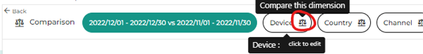
1.1 Select Dimension used for comparison
By default, Datama selects the first column of your dataset as the comparison dimension.
You can change the comparison dimension as following:
- Click on the comparison icon on the top left corner and then click on the gear icon to access the dimension you want to use for comparison
-
Click the drop-down list do choose the dimension you want to compare.
-
And select the dimension you want to compare on :

- Then select your segments for each of your comparisons.

- The graph will appear with in the subheader the selected comparison.

Dimension Helper chart can also help you to understand what you want to compare, in case you don’t know 😅
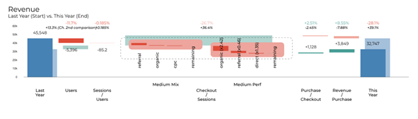
2. Secondary comparison
Previously known as “Compare of Compare”, this mode allows you to compare two waterfalls. The secondary waterfall is defined by turning the secondary comparison on (on any available dimensions) and then defining the start and end of your secondary waterfall.


In the background, Datama will then run the same analysis for the two defined start and end points, then display secondary analysis results. Main output is :
- In the Waterfall « Chart », the secondary waterfall is displayed in the background.
- In the Comments, the trend between secondary and primary analysis will be described.
2.1 When to use it
The secondary comparison mode is particularly useful when you regularly run the same analysis for different time periods. We can take the example of this dataset.
You’re in Week 3 of 2022, and want to compare it to Week 3 2021. Using Datama Compare, you’ll get the following result:
Now, the key question that you’re asking when you run this every week (so you ran this also in week 2) is: how does this differ from last week?
This is where you activate Compare of Compare, and add Week 2 YoY analysis as a secondary waterfall (assuming you’ve also kept the data for week 2 in the source you’re analyzing).
2.2 Specific display
The second graph can either be displayed in overlay (by default), below or right close to the first comparison. To change the display click right > Display > secondary comparison > Right / below or overlay.

Other Specific display: Dimension then Dimension, Dimension then step…
Tip of the week 134: See how far the analysis of just one metric can take you with Datama auto unpivot function! 🌟
Got a single summable metric in your table without an suggested market equation? Unlock its full potential with the Datama Unpivot function! 🌟
This tool suggests you unpivoting your unique metric on a dimension of the dataset and automatically create the market equation to match the sum of each segment of that dimension. 👇
You can then easily analyse by “Dimension then Dimension” in Datama Compare! 👇
How to use it: 🔧
- Upload your data source with a single metric, and click “Apply” of the pop-up at the bottom right. ➕
- Select Datama block then click “Define steps” to review the automatically summarized metric equations by dimension categories in the left panel. 📂
- Click below “Open in Compare” to explore metric KPIs across dimension categories. ✅
📊 Make your limited data source tell more than expected!
