Compare - Settings
Datama Compare settings allow you to customize your analysis according to your needs. You can access them by clicking on the gear icon in the top bar.

1. Settings level
In order to customize your analysis to your needs, Datama allows you to save user preferences at Use Case level or at your profile level. Color palette and default language for example can be modified at both level.
2. Compare Model

2.1. Methodology
2.1.1. Drill down hierarchy
Drill down hierarchy is unactivated by default.
The drill down input allows to define the methodology to break down main KPI variation. 3 options are available:
- By Steps then Dimensions (default)
- By Dimensions then Steps
- Auto
By activating the “Dimensions then Steps” option, you will see the impact of the top 5 segments of the most interesting dimension for the total step variation to explain the gap. Then, by clicking on a given segment, you will be able to get the details of the impact of each step of your market equation on that specific segment.
Discover more on this setting.
2.1.2. Split Mix and Perf
This settings sets how Datama will act regarding Mix & Performance visualisation. By default Datama will automatically choose to split or not the Mix and Performance effect. If the Mix is too small, only Negative and Positive Segments will be displayed.
But you can disable this auto choice, and choose to always split the Mix and the Performance effects or Never split Mix and Perf. If so Datama will only make a split by Positive and Negative Segments.
2.1.3. Negative Driver First
By default Datama automatically choose to display the segment that are following the variation. If your step is increasing, the segments displayed will be the one that drive this increase. On the contrary, when your step variation is going down, Datama will choose to display segments that are explaining the decrease.
This could be changed by activating the “Negative Driver First”. Negative Segments will be displayed first in the waterfall whatever the variation. Because you more often will need to improve what’s driving your business down!
2.2. Text and comment
2.2.1. Analyse Depth
This selection allows to adapt the level of detail available in the contextual help (Comments,…). By default the contextual help is at Medium. At Max all the available details regarding graphs will be available.
2.2.2. Segment text complement
Segment text complement allows to decide on what to display behind Segment name in the waterfall labelling. As a reminder, a segment is a attribute within a dimension of your dataset. Options for this input are:
- Variation relative to average (e.g. “x2.43”) - this is the default value and allows to spot easily “abnormal” variations way above average (i.e. above 1)
- Percentage Variation (e.g. “-46%”) - this is the % difference between start and end values
- Variation absolute change (e.g. “-3pts”) - this is the absolute difference between start and end values, displayed in the unit of the considered KPI
- Nothing
2.3. Advanced Settings
2.3.1. Aggregation in %
Level of aggregation: The threshold used by the model to group small segments. For example, if the level of aggregation is set at X%, any segment within each dimension that represents less than X% of the Primary Numerator (e.g., revenues) of the main KPI being analyzed will be clustered into a single “Other” segment. By default, X is 2%, but adjusting this parameter can significantly affect the calculation of mix effects.
2.3.2. Covariance roll up
By default in Datama Compare, the covariance between each step of the market equation is distributed on total computation level.
However in some cases, you might want this distribution to be done at a lower level within a given dimension, so that when summing up the impact of each steps for each segment of that dimension at total level, you end up with the exact same total. This is particularly true when you systematically deep dive on each segment of a dimension (e.g. by Country) and also display to your end users the sum of all those segments (e.g. worldwide)
“Covariance roll up” toggle helps you do this calculation pattern, by computing the impact for each segment of a given dimension, and then sums them up at total level.
To use it :
Activate the covariance roll up toggle.
Select the dimension you want for sub-segment distribution of covariance.
2.3.3. Max segment displayed
Decide how many segments you want to display in every waterfall graph. By default this parameter is set at ‘4’.
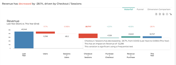
2.3.4. Significance test
When owning a license of Datama Assess (aka Datama Impact), you can activate the significance test.
Switch on to compute significance of steps variations, using Datama Assess methodology. Signficative variations will make % appear with a star (*) in the overall waterfall chart.
The test performed is a Frequentist test.
2.3.5. Include 0 for Y axis
By default active, this makes the 0 line appear on the waterfall When deactivated Datama will adapt the Axis to your dataset. This help to better display small variations.
3. Workbook style

3.1. Language and colors
3.1.1. Analysis language
Datama is available in English and French. By default, Datama is in English.
- You can change the language for a specific Use Case (Settings > Analysis Language)
- or globally for all Use Cases (Profile icon > User preferences > Analysis Language)
3.1.2. Colors palette for plots
Graph colors are customizable in 3 different ways:
- Grayscale (gray levels)
- Scattered (dispersed colors)
- Custom (personalized)
The custom method allows you to refine color by color all the graphs available in the solution.
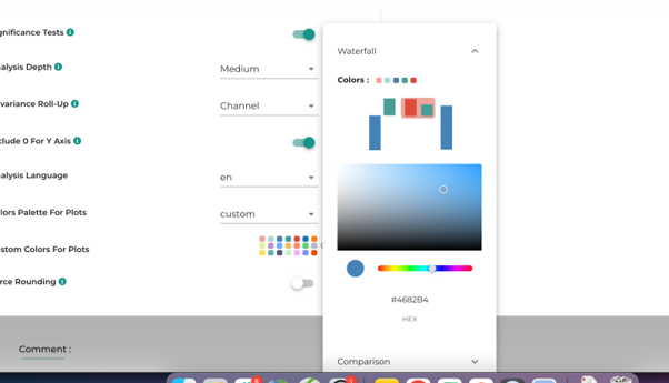
To customize colors:
- Select “custom” in the “Colors Palette for plots” dropdown menu
- Click on the palette to edit colors
- Select the graph you want to modify
- Select the color you want to change by clicking on the graph part
- Select a new color and close the popup (no Apply or OK button… it’s automatically saved)
- Datama will refresh the graph with the new color
3.1.3. Reverse palette
The “Reverse palette” function allows you to invert the colors used to express growth or loss. This is particularly useful when you’re using a “negative” KPI where an increase is not good news, and should therefore be displayed in red rather than green (like cost).
3.2. Number display
3.2.1. Compact numbers
Compact numbers are used to display large numbers in a more readable format. For example:
- 1,000,000 becomes 1M
- 1,500,000 becomes 1.5M
- 1,000 becomes 1K
This setting allows you to toggle between compact and full number display.
3.2.2. Force rounding
This setting allows you to control the number of decimal places displayed in your analysis. When activated, all numbers will be rounded to the specified number of decimal places. This is particularly useful for:
- Ensuring consistency in number display across your analysis
- Simplifying complex numbers for better readability
- Standardizing the presentation of results
4. KPI & Markets Equation

The market equation is the foundation of your analysis in Datama Compare. It defines how your metrics are related to each other to compute your main KPI. For example, in retail, Revenue can be broken down as: Revenue = Volume * (Revenue/Volume), where Volume represents the number of products sold and Revenue/Volume is the average price per unit.
Each step in your market equation becomes a step in the waterfall analysis, helping you understand how different factors contribute to your KPI variations. You can customize your market equation in the Settings menu, choosing between:
- Product of ratios (default)
- Sum of metrics
- Custom formula
For more detailed information on how to build and optimize your market equation, please refer to our dedicated documentation.
5. Dimensions

5.1. Comparison
When comparing two ranges of dates with same number of days, Datama now automatically creates a “Comparable_date” dimension which allows to compare similar objects between different time frames (e.g. January, February… December when comparing two years together, or Monday, Tuesday… Sunday when comparing 2 weeks)
You can add filter to include or exclude the dimension, the segement you want, it also works in a dynamic way bu checking “use ascending/descending position instead of fixed values when saving”.
5.2 Auto-generated dimensions
5.2.1. Comparable Dates
Comparable Date: When comparing two ranges of dates with same number of days, Datama now automatically creates a “Comparable_date” dimension which allows to compare similar objects between different time frames (e.g. January, February… December when comparing two years together, or Monday, Tuesday… Sunday when comparing 2 weeks)
5.2.2. Combined Dimensions
By default Combined Dimensions is activated. Datama creates an additional Dimension in your analyse which is the combination of all your dimension.
You can’t change the selection of the combination, but you can concatenate two columns in your dataset if you want a specific combination or use the smart Dimension (see below)
5.2.3. Smart dimension
For each step of the waterfall analysis, the Smart dimension identifies the pair of dimensions which is most relevant in explaining performance variation. It comes in addition to the Combined dimension which crosses all dimensions.
Example
Consider the scenario in which your performance is entirely explained by a performance decline on mobile users with the Firefox browser. When turning on Smart dimension, Datama Compare will identify the Device*Browser dimension as the most relevant dimension. However, when leaving the Smart dimension option off, Datama Compare will attribute the performance variation to either the Device or Browser dimension.
Activate Smart Dimension
To activate Smart Dimension, click in Settings and switch on the Smart dimension button. Combinaison of smart dimension will appear in the waterfall only if they are more relevant than an alone dimension.
You can’t change the selection of the combination, but you can concatenat two columns in your dataset if you want a specific combination.
Since it implies a longer computation time, this option is off by default. However, we recommend you turn it on if you have a small set of dimension (less than 10).
5.3. Clustering Settings
5.3.1. Choose clustering method
Clustering
Clustering is necessary for dimension analysis
- For discrete dimensions, anything below X% (X=2) of primary numerator is aggregated into “other”
- For continuous dimensions, cuts are made using weighted decision tree methodology, in order to create coherent buckets.
Read docs related to continuous dimension
5.3.2. Aggregation in %
Level of aggregation
The level of aggregation that the model is using – e.g. if Level of aggregation is set at X%, segment within each dimension that represents less than X% of the Primary Numerator (e.g. Revenues) of the main KPI you’re analyzing will be clustered in one « Other » segment. X is set at 2 by default, but you may want to play with this parameter quite a bit because it can change significantly the calculation of mix effects.
- Click on the settings menu on the header
- Move the cursor of the aggreation to the right to increase the level of aggregation
- Close the panel to recaculate the results
Segments are now aggregated at the requested level
6. Artificial Intelligence
Datama uses artificial intelligence to enhance your analysis by generating contextualized comments about your KPI variations.
6.1. Contextualized Comments
6.1.1. Initial Comments
Datama first analyzes raw data to identify and quantify variations in key performance indicators (KPIs). The system generates insights that explain these variations.
6.1.2. OpenAI Integration

The generated insights are then processed by OpenAI’s language model. OpenAI enhances these narratives by adding contextual insights, ensuring that explanations are complete and tailored to the specific context of your data and business.
6.1.3. Usage Steps
- Accept OpenAI Terms of Use: Click on the OpenAI sparkle icon next to the comments to accept the terms of use.
- Add Context: Click on the “[add context]” button to display a window where you can write context that will be used with OpenAI.
- Generate and Use: Click on the “generate” button to see examples, then “Use this comment” if you are satisfied.
7. Saving Options

7.1. Basic Save
- Click on the “Save” icon to update your current use case
- Click on “Save As…” to change the name and save options
7.2. Save Options
- Save Name: name of the use case
- Set as Default: this use case will be loaded when opening the solution
- Keep Information: the information text will appear when loading the use case
- Dynamic Save of Start & End: If selected, Datama will consider Start & End as a dynamic input and automatically update the data
- Use Descending Order: This function is linked to dynamic save, when your Start & End dimensions are numbers