Page "Detailed View" on Compare
« Detailed View » is the second page of Datama Compare and allows to deep dive on each step and each dimension.

By default, the drop-down menus are automatically selected in both main step and main dimension of your analysis. You can change the selection of either a step or a dimension. Each time you run the calculation, the default selection in the drop-down menu will be reactivated.

The selection is dynamic: selection made on the « Detailed view – filter » will affect the waterfall above and vice & versa.
3 different tabs are available for this « detailed view ».
1. Moves
In the Detailed View the graph « Moves » represents a key element. It allows you to deep dive in all and every dimension and elements of your dimension and understand Mix effect and Performance effect with arrows.
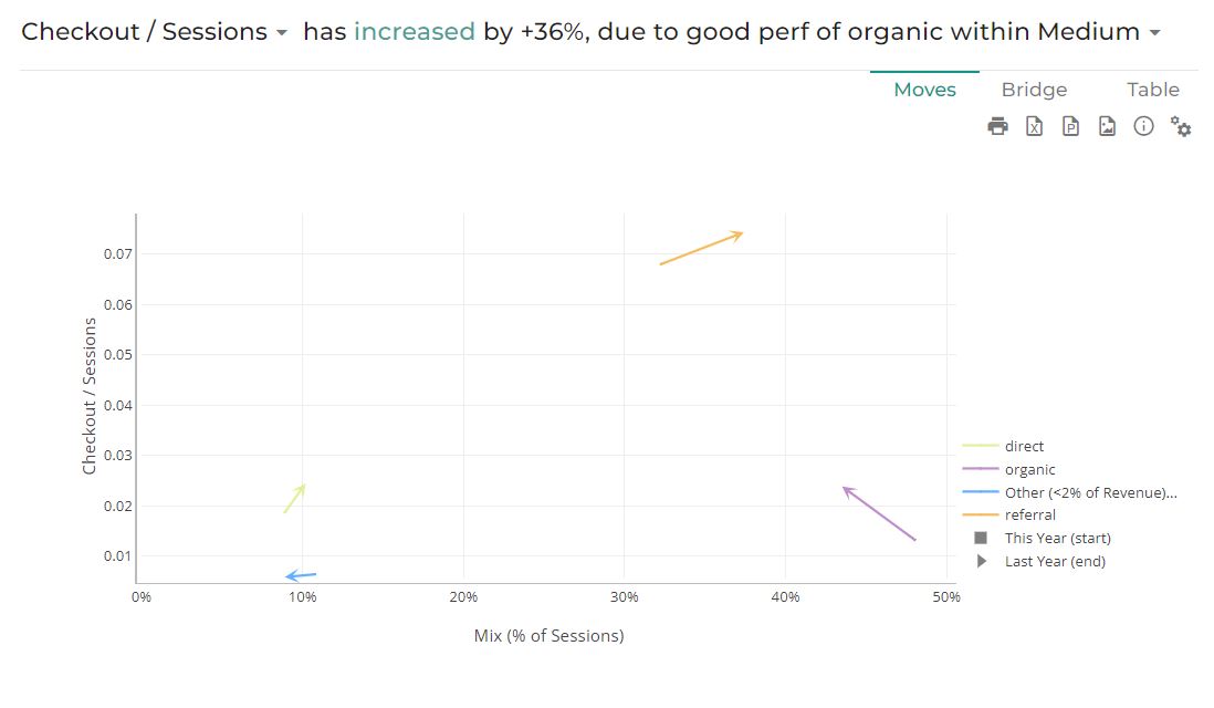
This graph shows the performance effect and the mix effect within a single serie of arrows (or vectors). The start of the arrow represents the Start point (eg. “Last Month”) of your analysis and the end of the arrow represents the End point (eg. “This Month”) of the analysis. An arrow is either an evolution of the performance effect and the mix effect from Start point to End point.
1.1 How to understand this graph?
Read more details on Mix & Performance Effects.
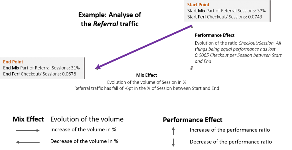
Abscissa of this graph is the Denominator of the Step, what we call the mix effect. It represents the evolution of the breakdown in input and in output (e.g. in the picture above, the abcissa is the % of Session by type of Medium. The orange arrow « Referral » goes from 37% of the Session in input to 31% at the End. This will have a mix effect. There is a decreased in % of this type of traffic).
Ordinate of the graph shows the ratio of this step Numerator / Denominator (e.g. in that case: Checkout/ Sessions). This is the performance effect of your analysis. (e.g. in the picture above, the ordinate is the performance of the Checkout/ Session as if the Session was equal betwen Start and End. The orange arrow « Referral » goes from 0.0743 Checkout per Session in Start to 0.0678 at the End. This have a negative performance effect).
1.2 Help on the read of this graph
To have keys to read this graph, you should know few tips:
- The higher the arrow the higher the performance. In our example, the orange arrow is higher than the others, which tell us that the Checkout/ Session of the referral traffic is the best among all the type of medium. If the volume of referral traffic decrease, there will be a direct negative mix impact on your activities, you will have more traffic coming from type of medium with a lower conversion rate than the referral traffic.
- Others (<2%) grouped: Datama aggregates within a dimension, elements that represent less than 2% of the total. This will appear as a row in the graph, but you can change the aggregation level from 2% to 0% or whatever you want, depending on the details you want to display.
- Show average ratio: This allows to show the weighted average of all segments on horizontal lines, for both start and end. It helps you understand which segments are above or below the total average.
2. Bridge
For the selected step and dimension the Bridge shows the Mix effect and the performance effect via a Waterfall.
The bridge focuses on one KPI at a time. It shows the impact that each dimension has on the value of the KPI (whilst on the main waterfall the impact is on the overall KPI).
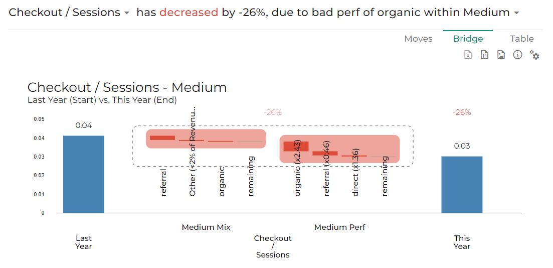
For the selected step and dimension (you can change what’s selected in the slide title) this bridge shows the impact of each segment variation on the step’s global variation. Changes are grouped in Mix effect and Performance effect, or Negative and Positive moves.
Some key elements:
- The percentage is the evolution of the Mix and the Performance effect between Start and End dimension. (e.g.: evolution between last month and current month)
- The unit used for this graph is real unit of the step (e.g. in the picture above, we selected the Checkout/ Sessions step which is our unit for this graph. The performance effect of Organic has a negative impact of -0.00517 on Checkout/ Sessions)
- The Coefficient (e.g. “organic (x2.43)”) The figure in parenthesis explains the acceleration this element has compare to the other element in the dimension. « The fall of the referral traffic goes 2.43 times faster than the other type of medium traffic ». If this figure is close to 1, this will say that the element you’re looking has the same rise or fall than the other element in the dimension. This will tell you that everything is rising or falling at this step and nothing in your dataset explain why this step is positive or negative. You should add some more dimension to explain this variation (weather, holidays, day-off, bank holidays, strike, price versus competition, …)
3. Table
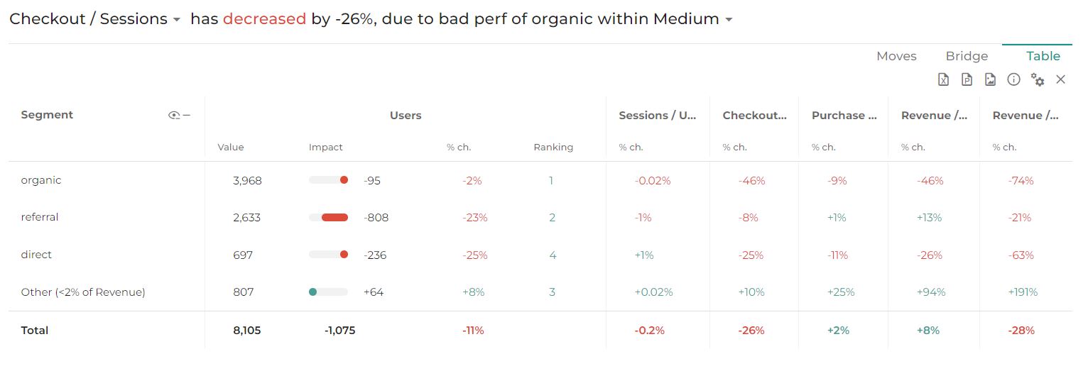
Table is gathering all the figures that helps to understand step variation and dimensions impact.
The table allows to access a detail view of the data with the ability to refine what you want to display.
3.1 What’s available on the table?
By changing the settings of the table you can choose to display 5 types of information:
- Value: new value of the ratio. (e.g: 2633 Users in referral for “this year”)
- Impact: the impact of the change between Start and End on the considered KPI
- Main KPI Impact: the impact of the change between Start and End on the total KPI in your market equation
- %ch: evolution in percentage between Start and End
- Ranking: Ranking of each element of the dimension by size at the End
- Ranking change: evolution of the Ranking between Start and End
Note that when activating a “Secondary Comparison”, the secondary comparison values are displayed in the table in a subline in italic under “2nd comparison”
3.2 How could it look like?
Change Formatting of the table by clicking on the Settings icon:

The display is adaptable according to your needs.
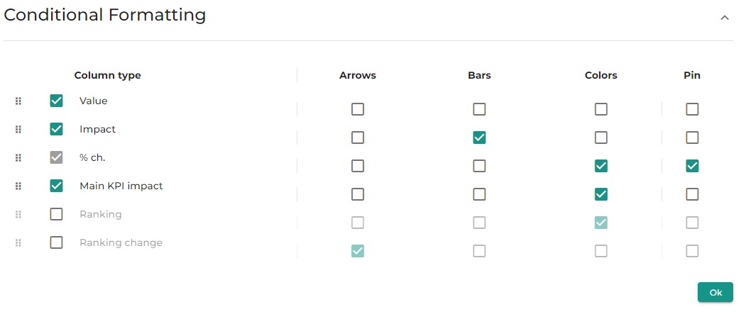
- Arrow: Displays an arrow that goes up or down depending on the positive or negative variation
- Bars: Displays a bars filled according to the impact on the total variation of this step
- Colors: Figures are colored according to the positive or negative variation
- Pin: Displays the figures even if the Step is closed. By default only “%ch” is pinned.