Ratio Helper
The Ratio Helper tabset helps you understand which ratio you want to analyze. You can display this tabset by clicking on the ‘÷’ sign in the ‘definitions’ section of Impact/ Pivot or the chart icon in the Settings>Included Steps of Compare
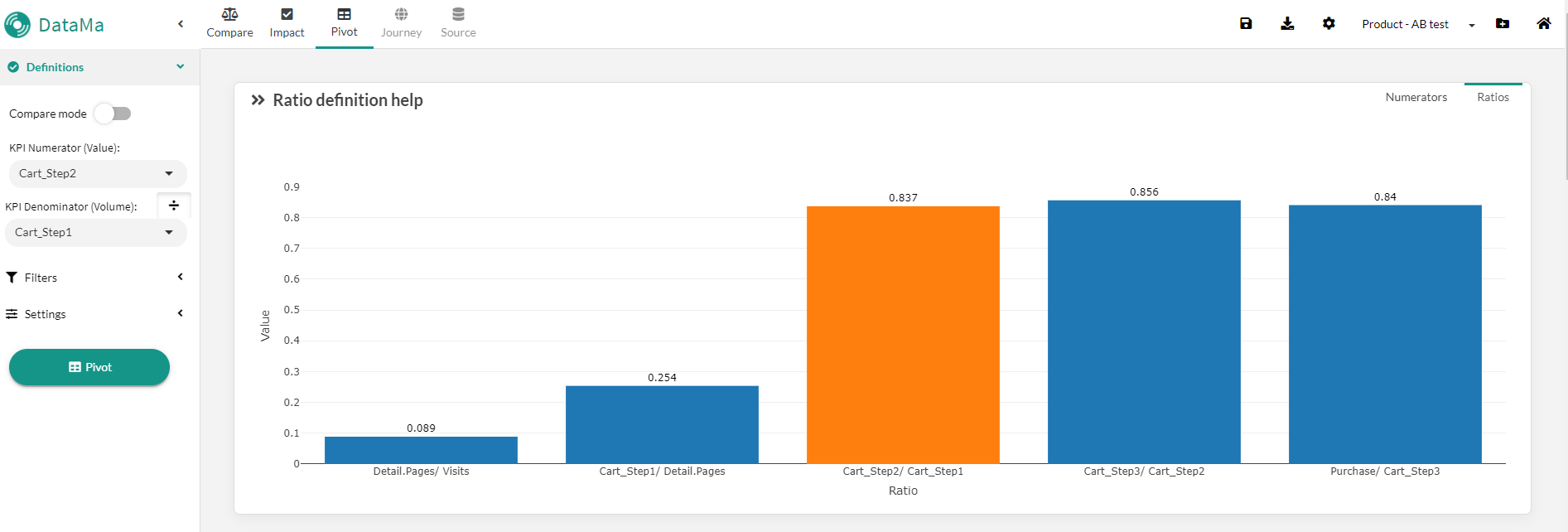
Ratio view
The Ratio view displays the value of each ratio defined as steps in your metric relation The ratio defined by the Primary Numerator and Denominator appears in orange (if matching) Note that you can skip/ merge some ratios using the included steps setting in Datama Compare.
This chart should help you understand which ratio is high/ low relative to others, so that you can focus on analysing the right one
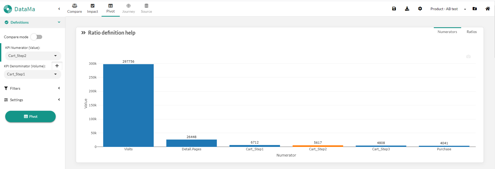
Numerator view
The Numerator view displays the value of the numerator for each ratio defined as steps in your metric relation The ratio defined by the Primary Numerator appears in orange (if matching) Note that all numerators appear on the same Y-scale. This only makes sense when units are the same for the numerators
This chart is particularly helpful to materialize a funnel analysis, where all numerators are comparable and are in fact users reaching different steps of the funnel